
Case Study
Project Overview
Furever Home is an app that allows users to help catch stray and missing animals and bring them to either a shelter or rescue. The goal for using this app is to rehome as many stray animals as possible. The app also contains a section about pet responsibility. Lack of pet responsibility leads to animals escaping their homes, behavioral issues, and an overall unhappy pet. By using Furever Home, users can help improve the environment by homing stray animals while also learning about what it means and takes to be a responsible pet owner.
My Role: UX Designer / Researcher
Tools: Figma, InDesign, Illustrator
Responsibilities: Research, Sketch, Wireframe/Prototype, User Testing, Finalize All
The Problem
The problem of irresponsible pet ownership is affecting those who work in shelters by overwhelming the staff. The costs of vaccinations also impact shelters by using time and money because most shelters must vaccinate new animals. Irresponsible pet ownership and uneducated pet owners are a problem because it leads to stray animals as spaying and neutering is not required in the United States
The Goal
By implementing UX Design, stray animals can be reduced by creating an app that allows missing or stray animals to be found and sent to shelters or foster homes. The final goal is to develop an app that helps stray animals get off the streets and owners to become more confident and responsible pet owners.
User Research
The problem of irresponsible pet ownership is affecting those who work in shelters by overwhelming the staff. Shelters are impacted by stray animals because they are running out of room to shelter each animal. Diseases also spread quickly in shelters because there are many animals in close proximity. Volunteers who work for shelters may also have little to no training to be able to care for each animal. The costs of vaccinations also impact shelters by using time and money because most shelters must vaccinate new animals.
Pet owners are not finding the resources anywhere else because it isn’t brought to their attention when buying a pet, such as through a breeder or an online ad. When owners buy a pet, the person selling the pet assumes the owner does know how to take care of it without doing any background checks. Owners who abandon their pets do not want to surrender their pets to a shelter, possibly due to a surrender fee. The reason most animals are abandoned is due to relocation, loss of interest, and financial troubles.
Pain Points
- Why Care?: Why should people care if it has nothing to do with them or provide any rewards?
- Finances: Costs of driving and lack of resources on a person’s part may affect their ability to use the app
- Wasting Time: Users who browse the app may give up after some time when they see the amount of work that goes into catching a stray
- Liability: Users may experience high risks when catching a stray dog and may not want to for their own safety
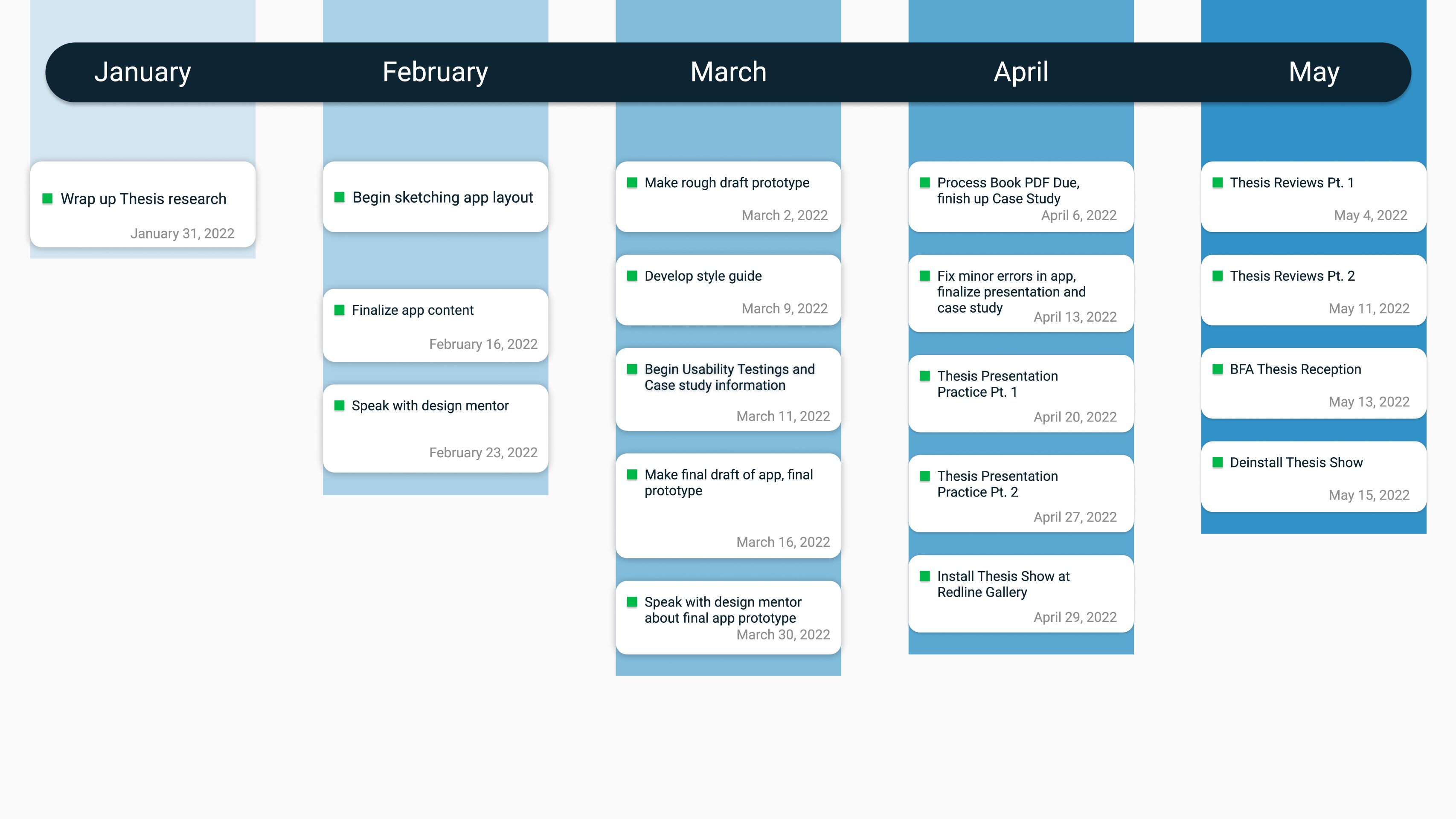
Timeline
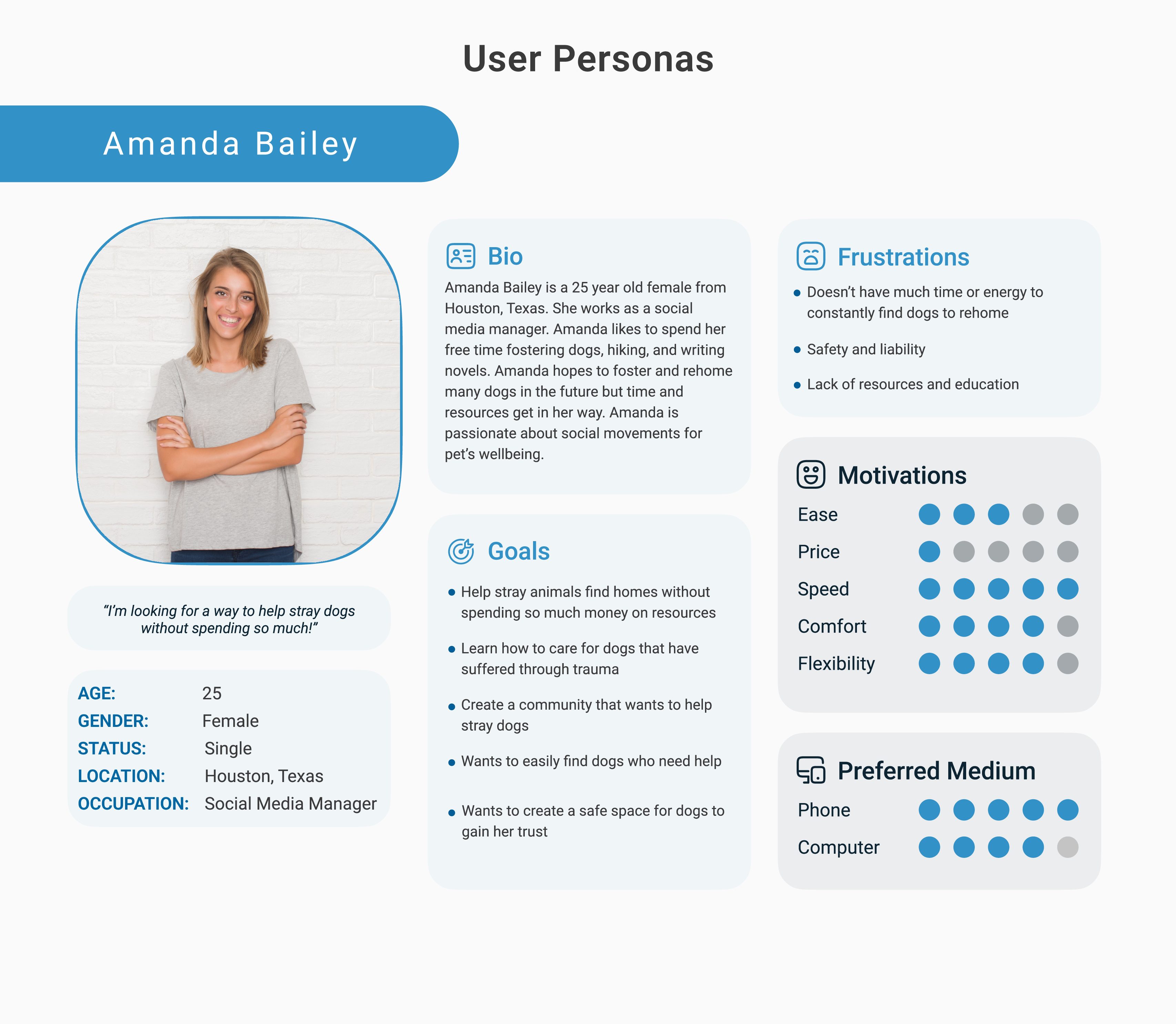
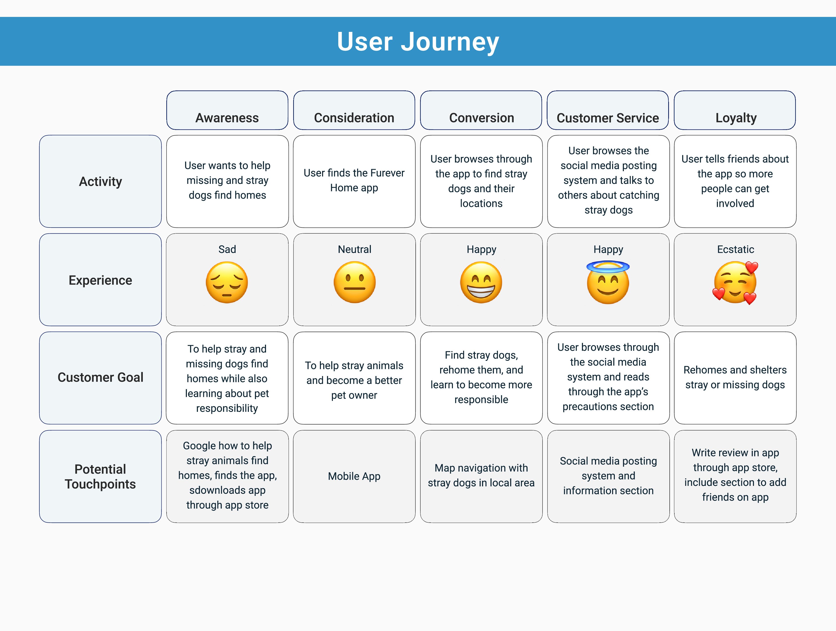
Persona & User Journey Map
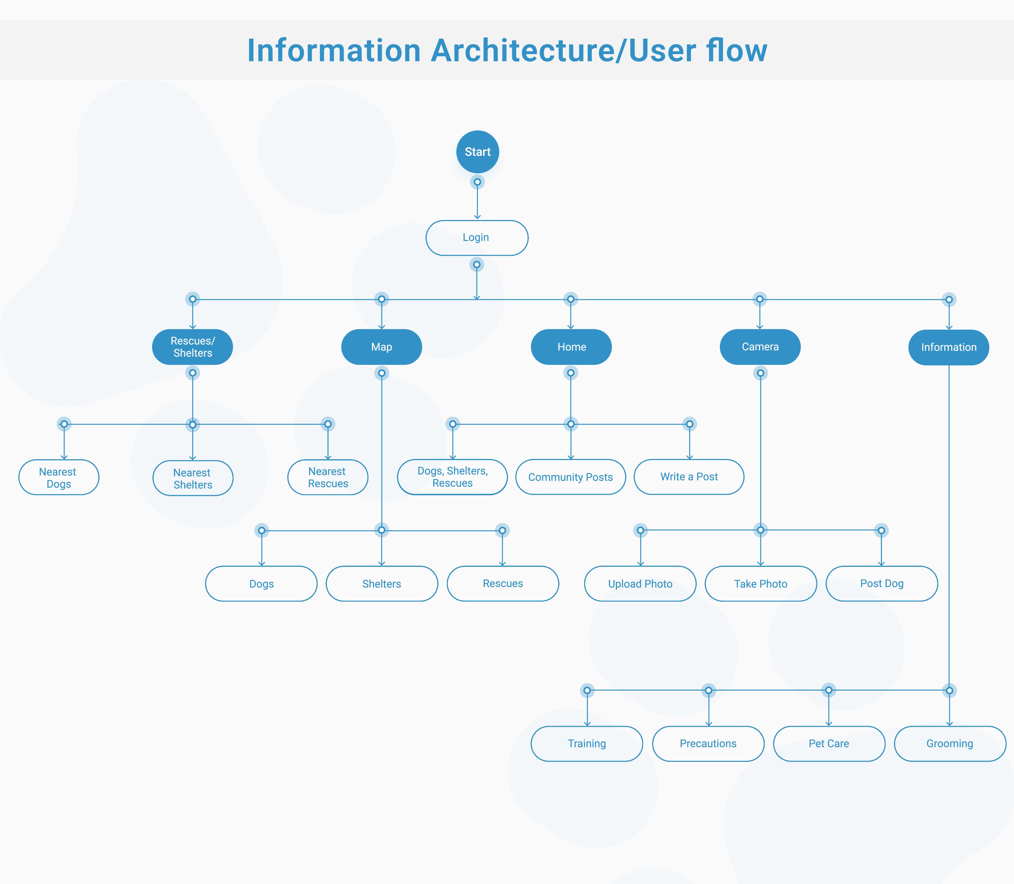
Flow Diagram
Unique In-App Features
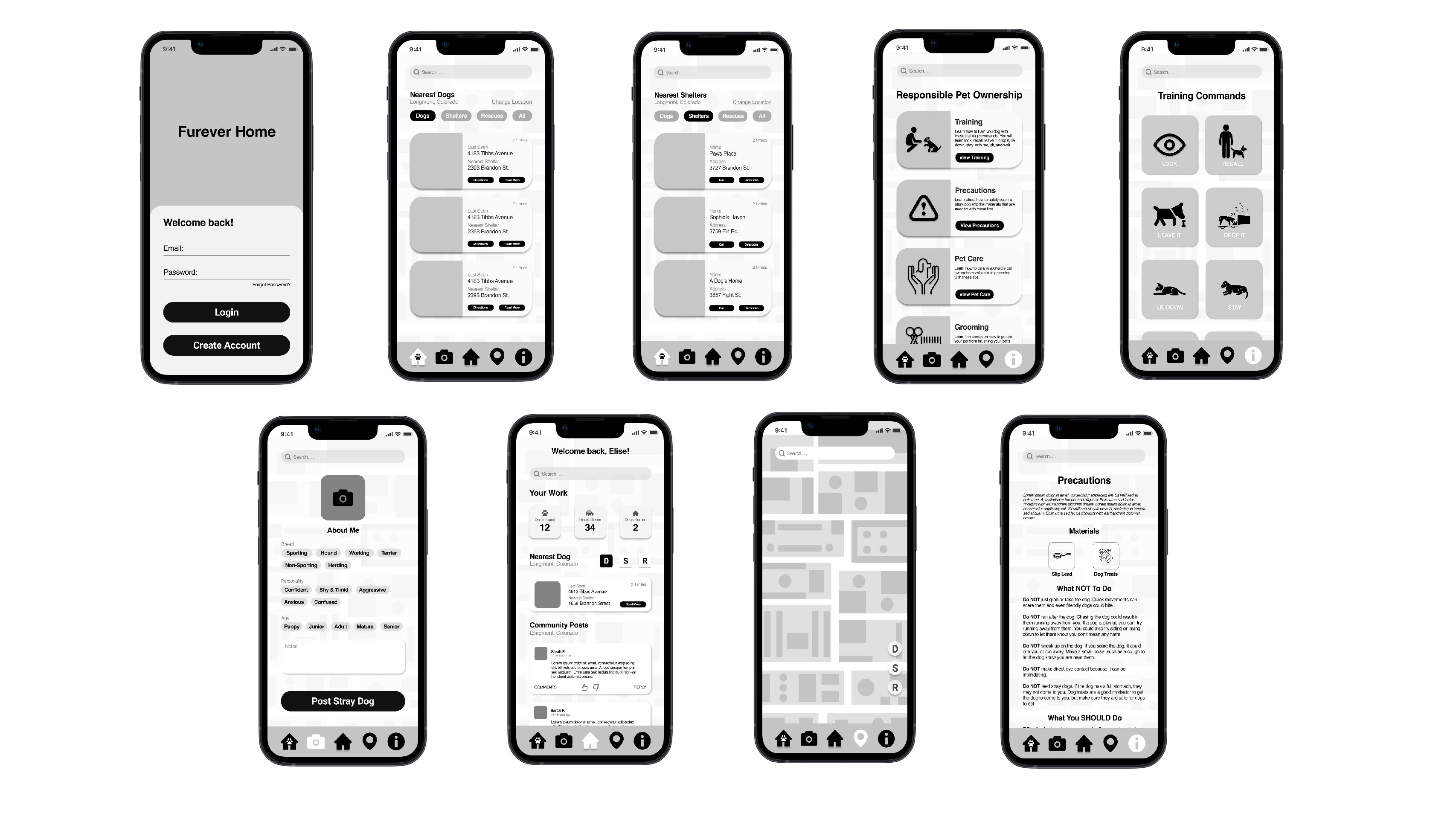
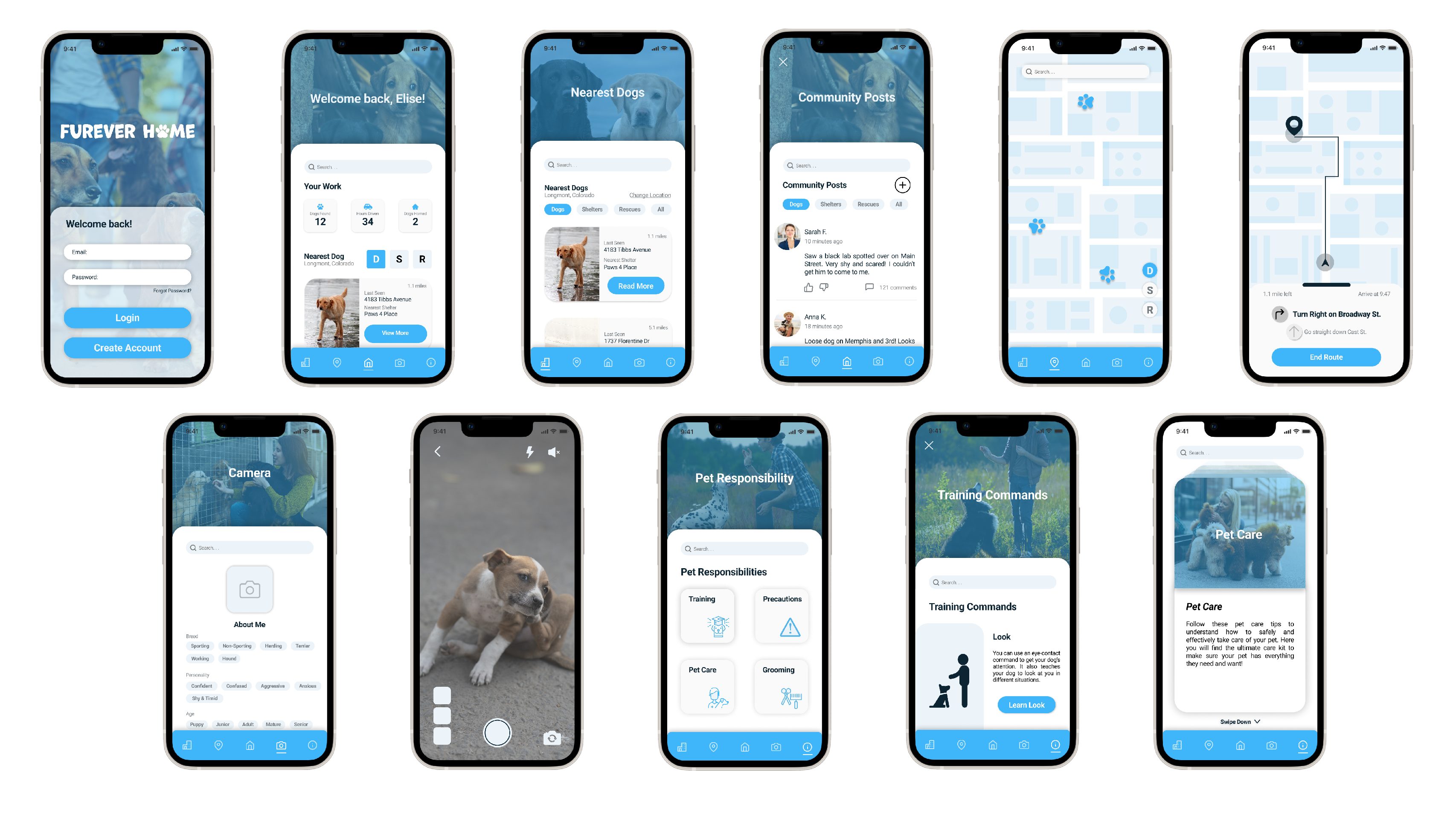
- Social Media Posting System: A social media posting system is available for communities to come together and strategize their plans with one another
- Shelters, Dogs, and Rescues Near You: Multiple sections with a navigation system that allows users to see dogs and shelters in their area
- GPS Navigation: A built in GPS navigation system installed in the app for users to easily track down dogs and shelters without leaving the app
- In-App Camera: A built in camera for users to post photos of stray dogs they see without leaving the app to take a photo
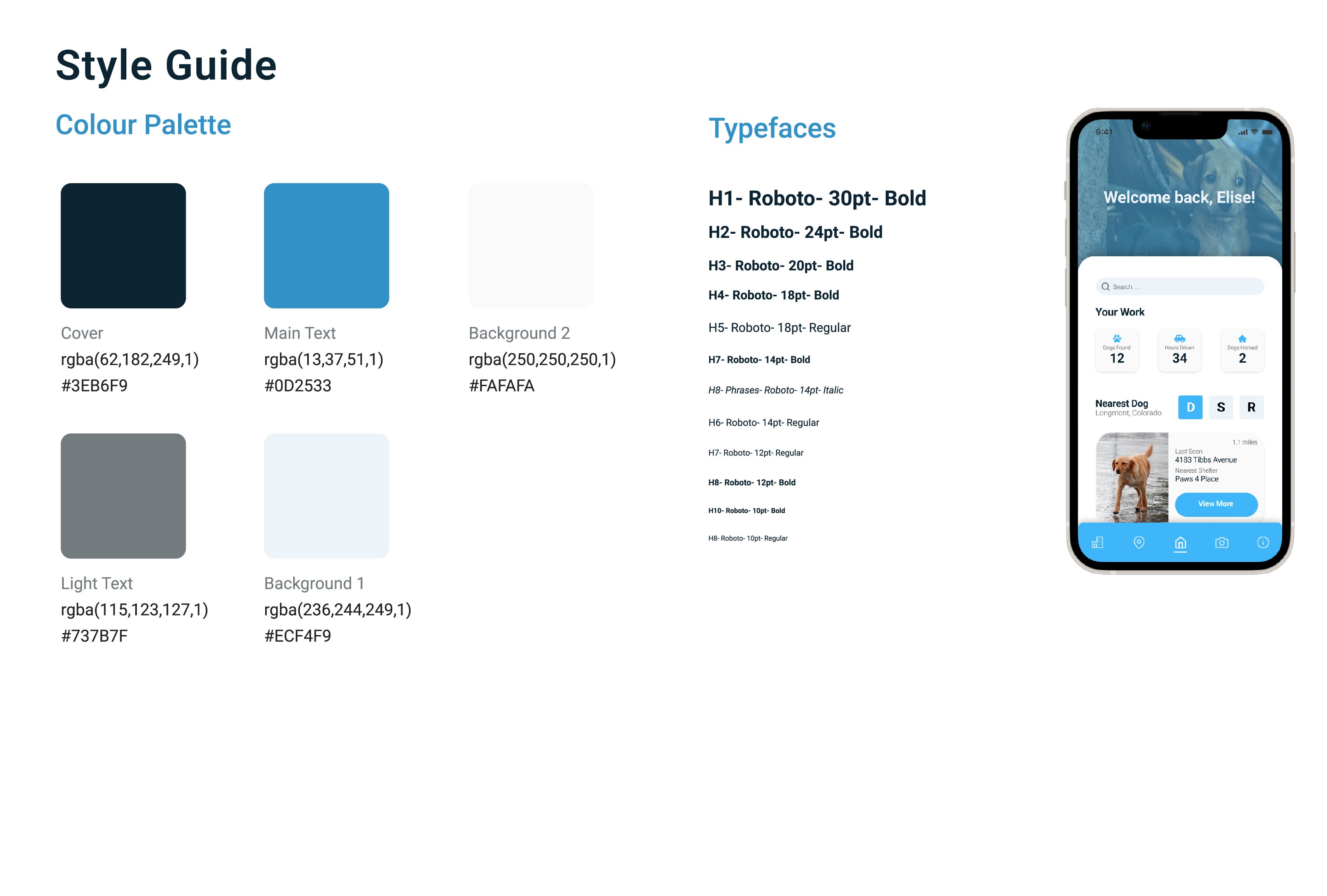
LoFi & HiFi Wireframes

Lessons & Next Steps
Lessons Learned
Throughout the design and prototyping experience, I was challenged to think differently for this project and think about others, rather than just design to what I wanted to design. I talked with Connor Schmitt who guided me through this journey. He opened my eyes to design usability and fluid patterns that helped make this app what I would call my best one yet. I conducted 2 interviews with those around me to see what should change through design and usability.
- I found that users want direction when browsing through an app and that just because the app has fluidity, that doesn’t mean direction is provided.
- I learned that layout is everything when developing an app and that the designer’s directions do not always mirror the user’s directions.
- I realized I lost sight of my target audience early on during the design phase of this project. I questioned myself rather than questioning what my target audience would want.
Next Steps
After designing one of the most challenging projects, my next steps are to take what I’ve learned throughout this journey and bring it into new and upcoming projects. While I still have much to learn, this project has opened so many more design opportunities and challenges that I will gladly take with me. This app is not perfect, but it is a major improvement in my UX Design career. Thank you for sticking around and experiencing my journey and greatest achievement to date.