Daily UI: #001 - #010
#001 | Sign Up
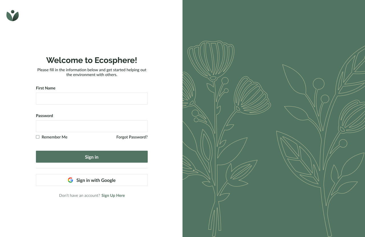
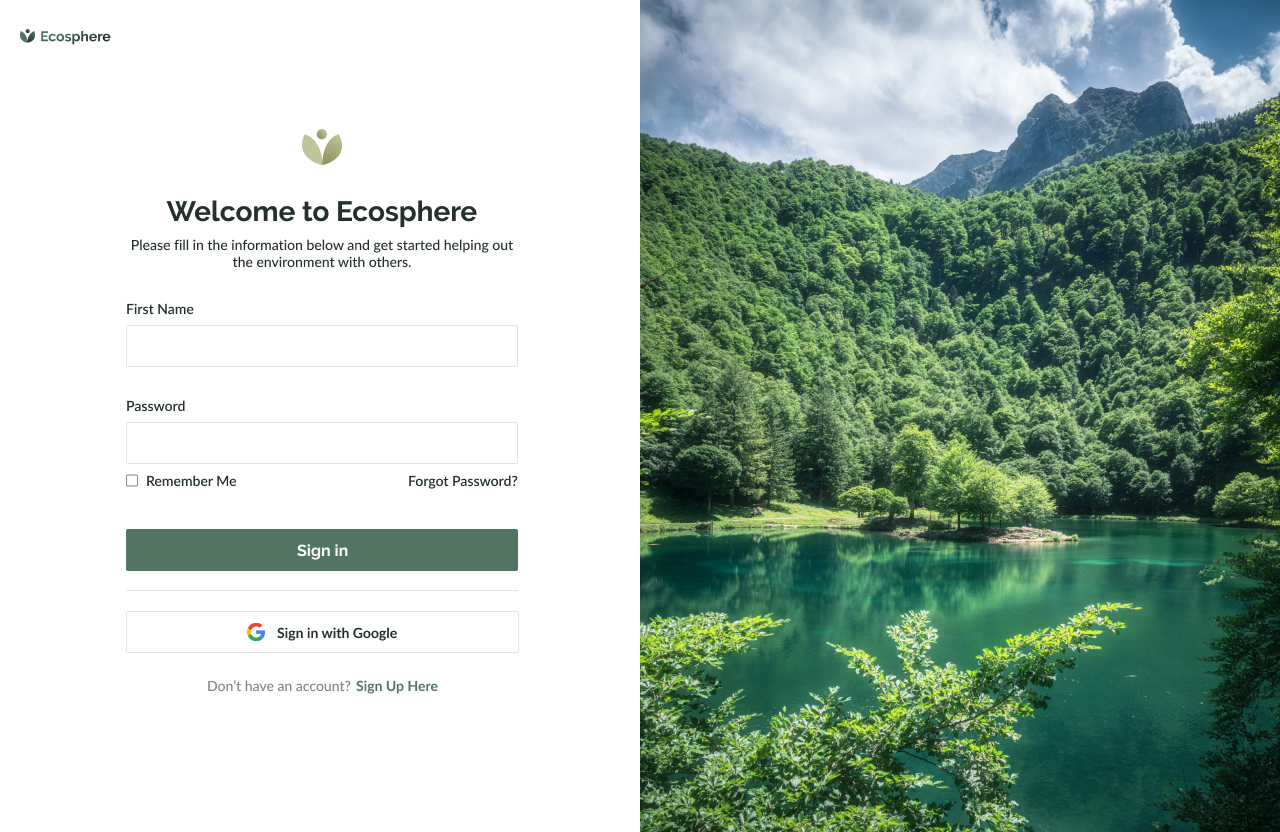
Daily UI’s #001 challenge is to design a sign up page or form. For the first challenge, I decided to design a sign up form for a platform about sustainable living and meet-up groups surrounding environmental care. I challenged myself to design a platform that connects individuals who are passionate about sustainable living and want to make a positive impact on the environment by collaborating with other users who wish to do the same.
Ecosphere offers a variety of features, such as sharing eco-friendly tips, organizing local clean-up events, sharing resources for reducing waste, connecting with sustainable businesses, etc.
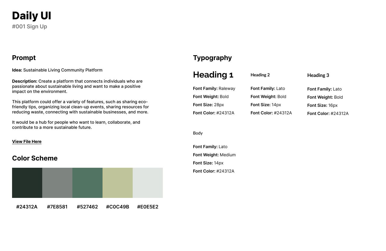
The platform is a hub for people who want to learn, collaborate, and contribute to a more sustainable future. For the design, I chose an earthy green color scheme because it represents nature. For fonts, I used Raleway for headlines and Lato for body text. Raleway is a beautiful headline font that is very welcoming and classy. Lato is simple, easy to read, and pairs perfectly as two Sans-Serif fonts should be.
I couldn’t decide on just one design so I chose a design with an illustration and a more open design with an image. The logo is inspired by Health and Nature and the idea that being out in nature can be very relaxing and provide good benefits for the user.
View Link Here. Illustrations and images are from Adobe Photos.
#002 | Credit Card Checkout
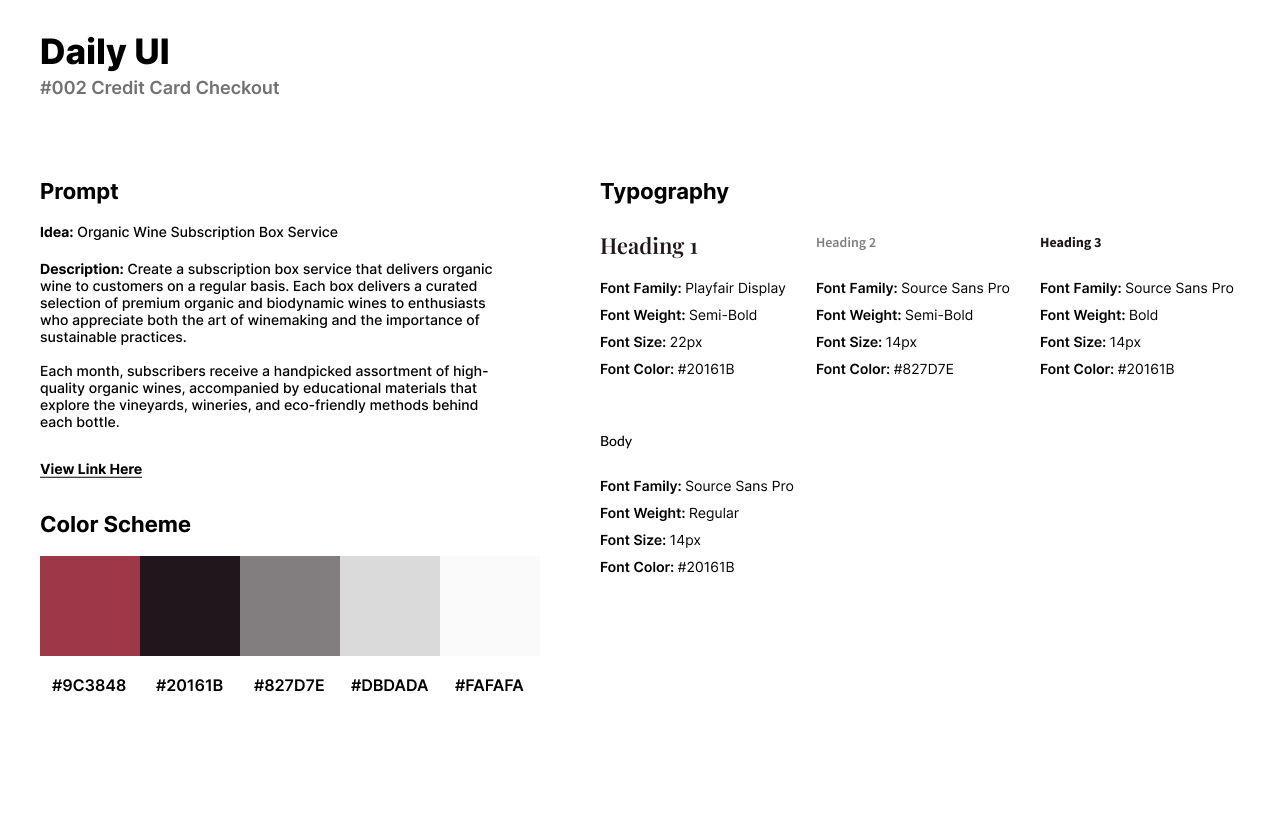
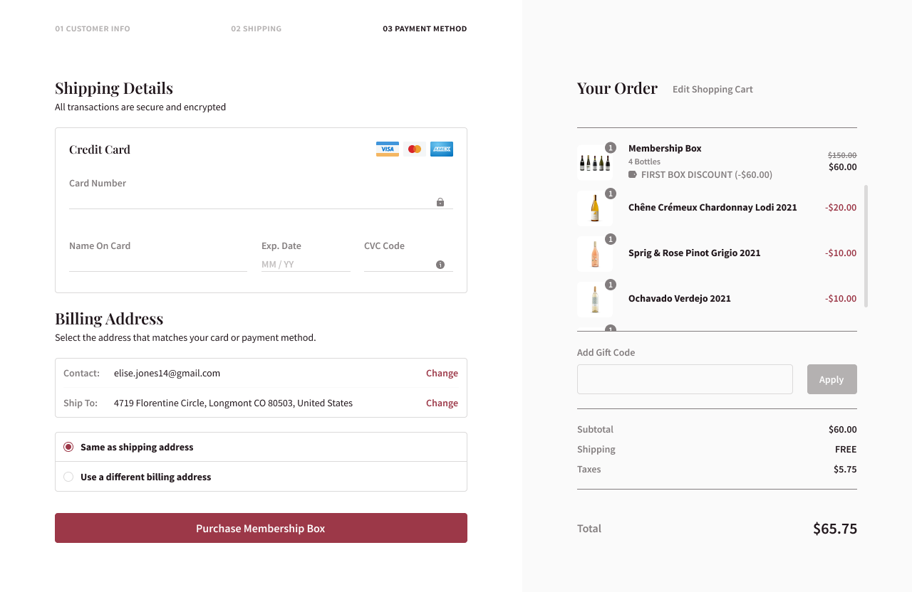
The second challenge by Daily UI is to design a Credit Card Checkout. For the second design, I chose to design a checkout form for an organic wine subscription box service. I was tasked to create a subscription box service that delivers organic wine to customers on a regular or monthly basis. Each box delivers a curated selection of premium organic and biodynamic wines to enthusiasts who appreciate both the art of winemaking and the importance of sustainable practices.
Each month, subscribers receive a handpicked assortment of high-quality organic wines, accompanied by educational materials that explore the vineyards, wineries, and eco-friendly methods behind each bottle.
For the overall design, I chose a red and black color palette to represent red wine with muted yellow-grays to represent white wine. I chose a Serif and Sans-Serif font, Playfair Display and Source Sans Pro to represent the Elegant and Classy style of the wine services. The format of the page has the user’s information to the left, shipping details and billing details. The right part of the form holds the user’s shopping cart order and total price of the box service.
View Link Here. Images are from Adobe and Google Photos.
#003 | Landing Page
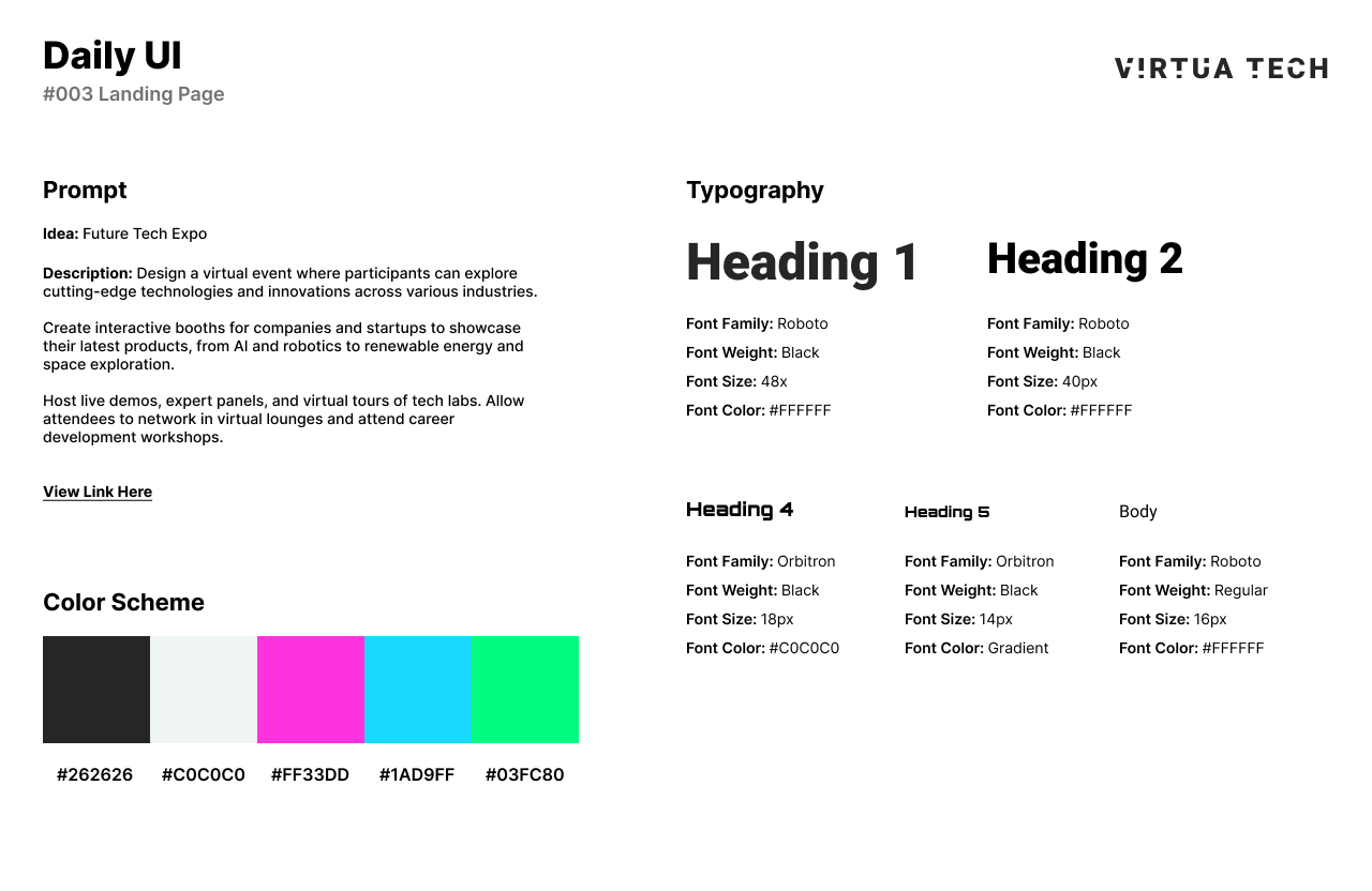
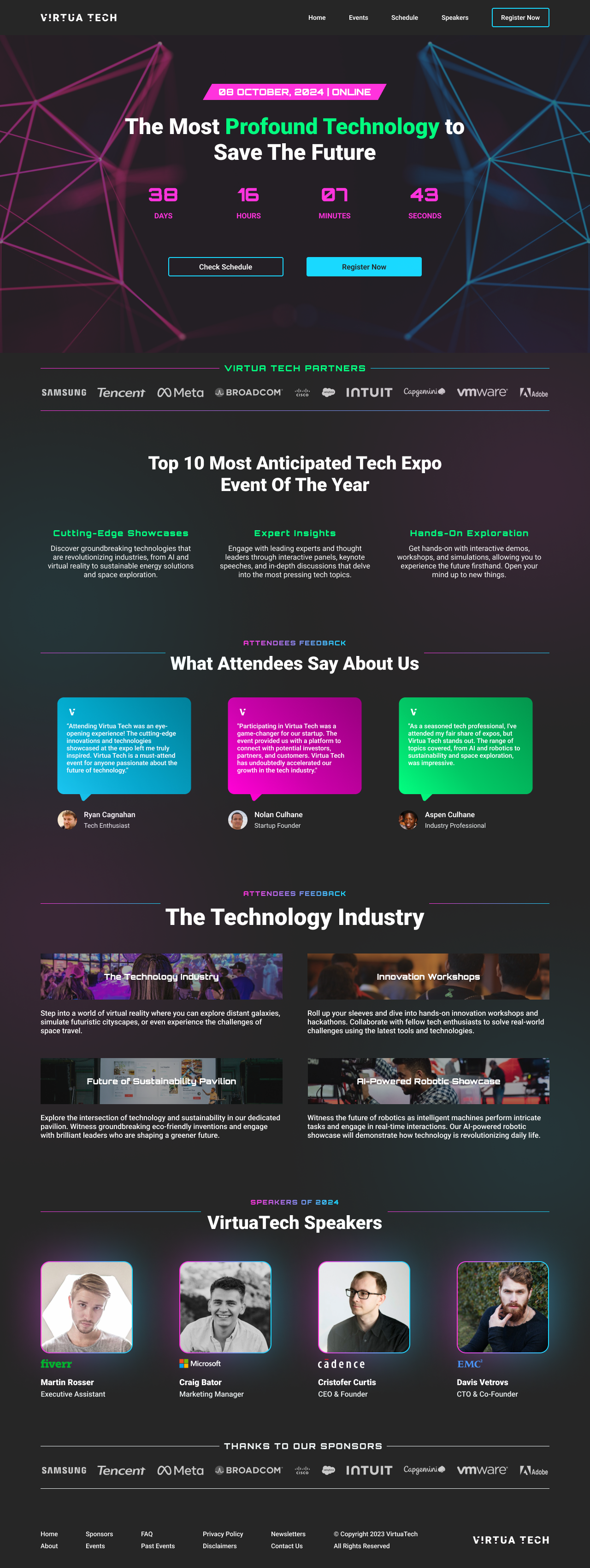
Daily UI’s third challenge is to design a Landing Page. For this challenge, I decided to base the landing page design off of a future tech expo. Virtua Tech is a virtual event where participants can explore cutting-edge technologies and innovations across various industries.
Companies and startups can showcase their latest products, from AI and robotics to renewable energy and space exploration. They can also host live demos, expert panels, and virtual tours of tech labs. Attendees can network in virtual lounges and attend career development workshops.
For the design, I chose a neon-themed color palette of pink, blue, and green with technology themed illustrations and neon drop shadows for a colorful depth. For fonts, I chose Roboto for a readable headline and body text. I used Orbitron for headings to add a space and technological feel to the landing page.
View Link Here. Images and illustrations are from Adobe and the Figma Plug-in, Photos.
#004 | Calculation
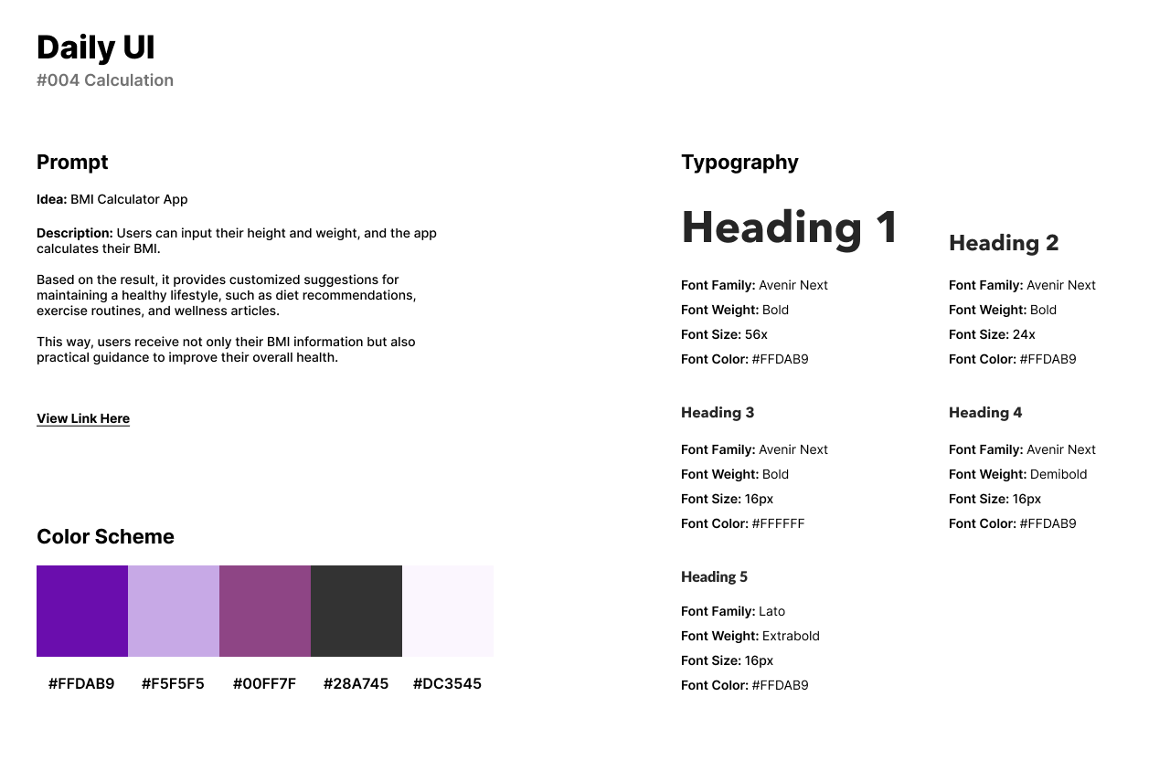
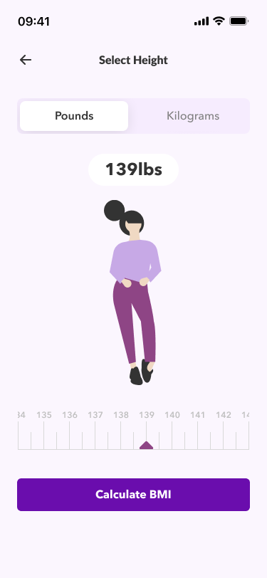
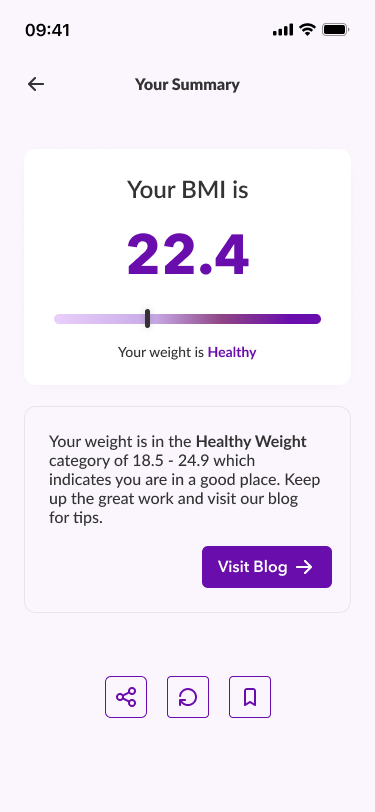
The fourth challenge from Daily UI is a Calculation Design. Instead of designing an average calculating calculator, I designed a BMI Calculator App. Users can input their height and weight, and to calculate their BMI. Based on the result, it provides customized suggestions for maintaining a healthy lifestyle, such as diet recommendations, exercise routines, and wellness articles. This way, users receive not only their BMI information but also practical guidance to improve their overall health.
For the design style, I chose a purple color scheme for calmness as BMI could be surprising in good or bad news to users. For the app’s headline, I chose Avenir Next as a nice and readable Sans-Serif font and Lato for body text.
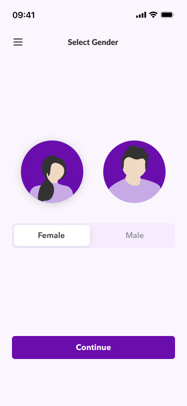
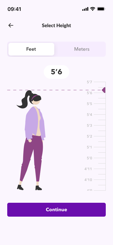
The first screen asks users to choose their gender, either male or female. The second screen asks users to enter in their height in feet or meters. Next users are asked to enter in their weight. Finally, the user submits their information and their BMI results are calculated. For the design style, I used illustrations from Undraw as they have a 2D style of illustration that it in well with the design’s color scheme and fonts.
#005 | App Logo
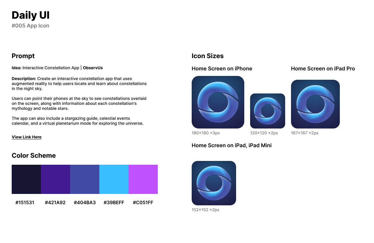
Daily UI’s fifth design challenge is to create an App Logo. I created an app logo based on a fake company called ObservUs, an interactive constellation app. The app uses augmented reality to help users locate and learn about constellations in the night sky.
Users can point their phones at the sky to see constellations overlaid on the screen, along with information about each constellation's mythology and notable stars. The app can also include a stargazing guide, celestial events calendar, and a virtual planetarium mode for exploring the universe. The design of the app icon needed to be astronomy related and hold depth.
For the design style, I used dark blues and purple gradients with a lighter blue and purple for spark. Fonts were not needed in the design as I chose a symbol or the company’s logo in the app icon. The logo is swirl made of the letter U to create an O shape for “Observe Us” and made of vector shapes so the icon can be easily sized up for different models.
#006 | User Profile
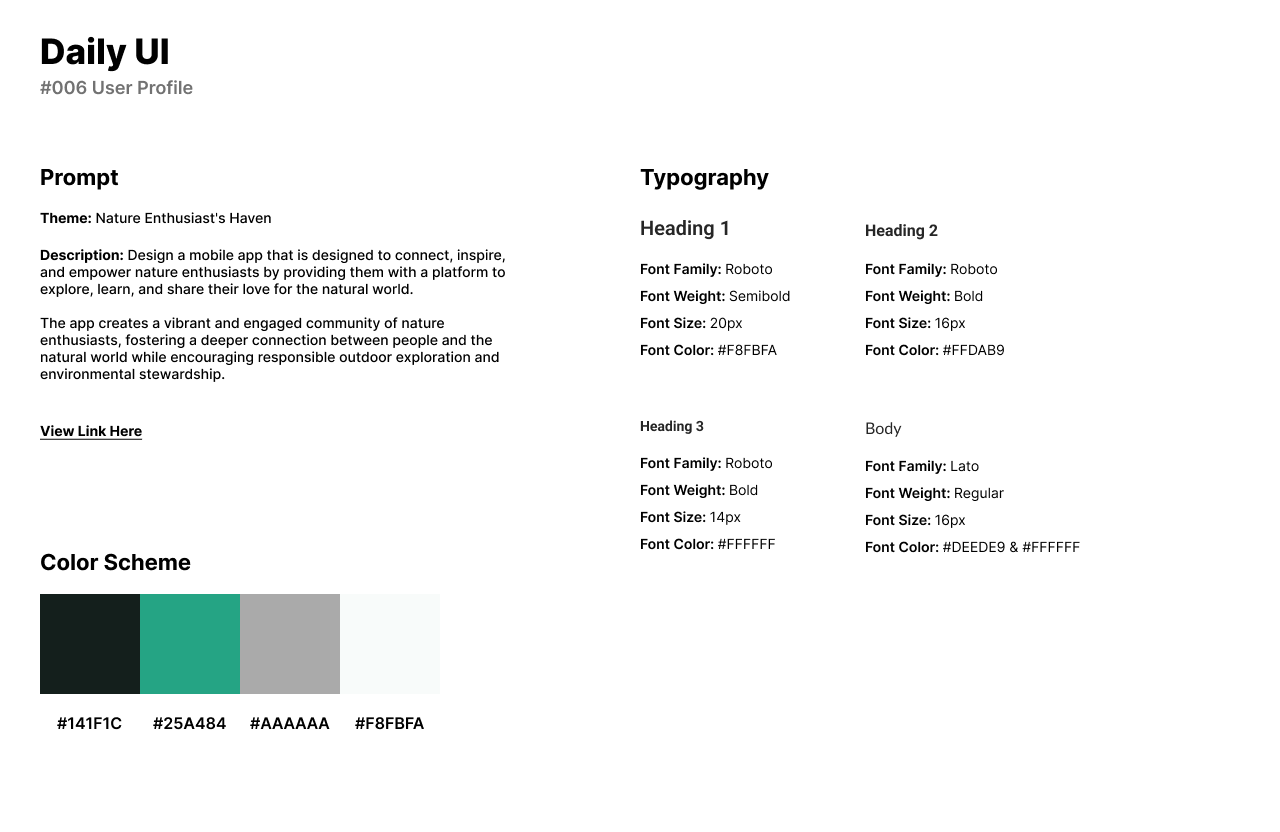
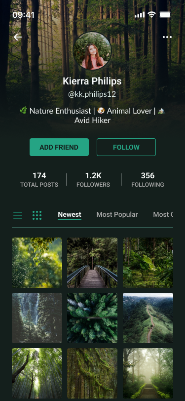
The sixth design challenge by Daily UI is “User Profile. For this challenge’s theme, I chose a Nature Enthusiast’s Haven social media app. I challenged myself to design a mobile app that is to connect, inspire, and empower nature enthusiasts.
The app provides users with a platform to explore, learn, and share their love for the natural world. The app creates a vibrant and engaged community of nature enthusiasts, fostering a deeper connection between people and the natural world while encouraging responsible outdoor exploration and environmental stewardship.
For the overall style, it made sense to include a deep forest green for nature and a muted black for depth as nature is full of mystery. Roboto makes a perfect Sans-Serif font for headlines, while Lato is one of my favorite fonts for body text.
User Profiles typically feature the user’s PFP at the top center of the screen with a description or biography under the image. Users can follow and/or befriend the user and view their total posts, followers, and number of whom they are following.
View Link Here. Images are from the Figma plug-in UnSplash.
#007 | Settings
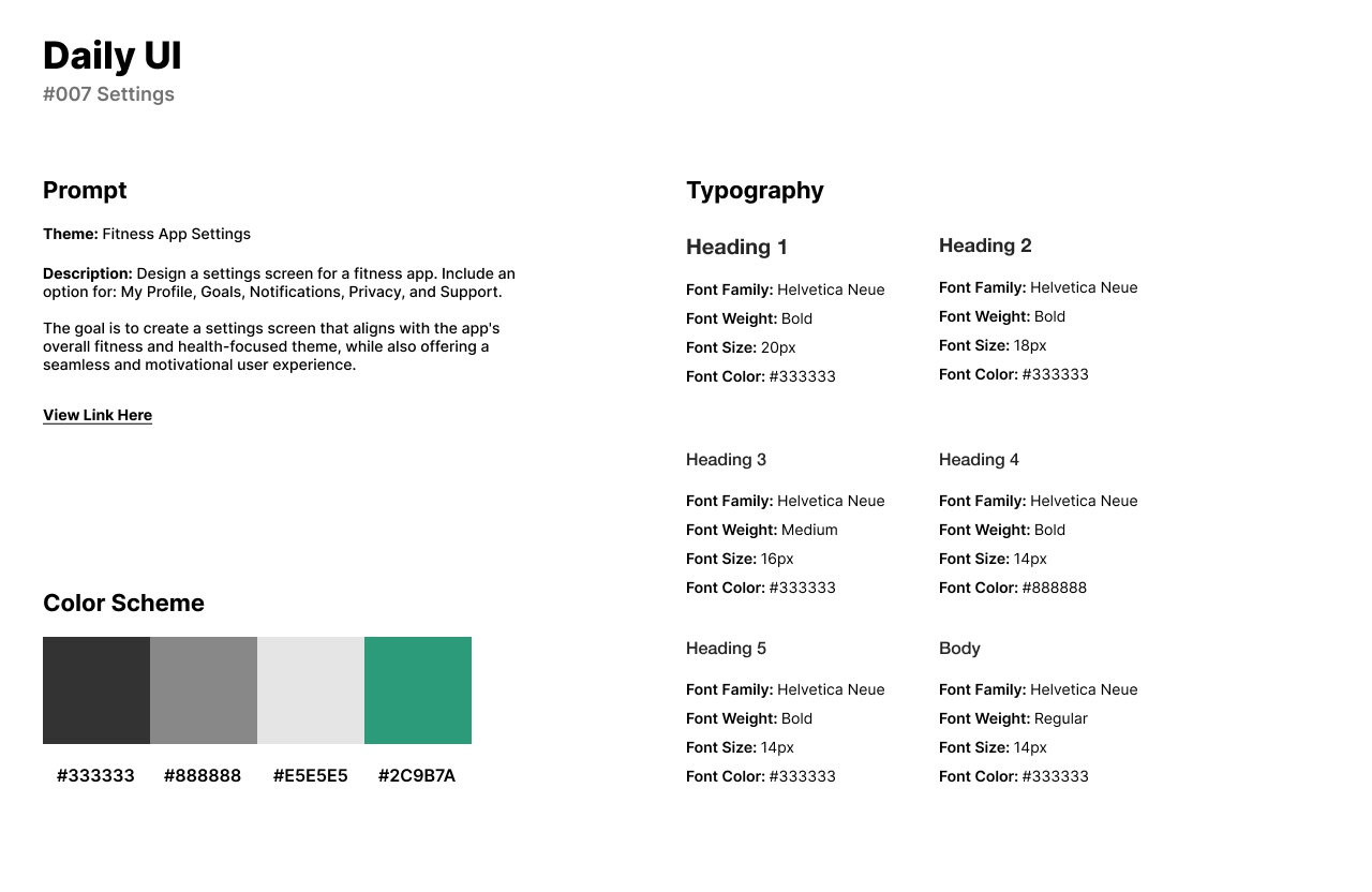
The seventh challenge from Daily UI asks users to design for Settings. The theme of this design is a Fitness App for their settings screen. I challenged myself to design a settings screen for a fitness app. I needed to include an option for: My Profile, Goals, Notifications, Privacy, and Support to be a fully functional and useful Settings screen.
The goal was to create a settings screen that aligns with the app's overall fitness and health-focused theme, while also offering a seamless and motivational user experience. Throughout my time researching Settings designs, I found them to be very basic but functional in accessibility.
For the design style, Fitness to represents health and wellness so I chose aa green color scheme. For the app’s headlines and body text, I chose Helvetica Neue as it is a readable and modern Sans-Serif font.
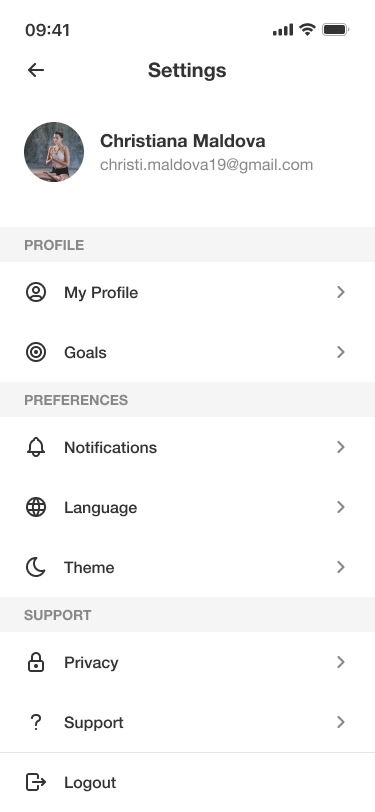
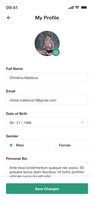
The first screen of the app is the first screen into the Settings section which includes options for users to choose their Profile, Preferences, and Support. The second screen is designed for a “My Profile” screen where users can edit their profile information.
View Link Here. Images are from the Figma plug-in UnSplash.
#008 | 404 Page
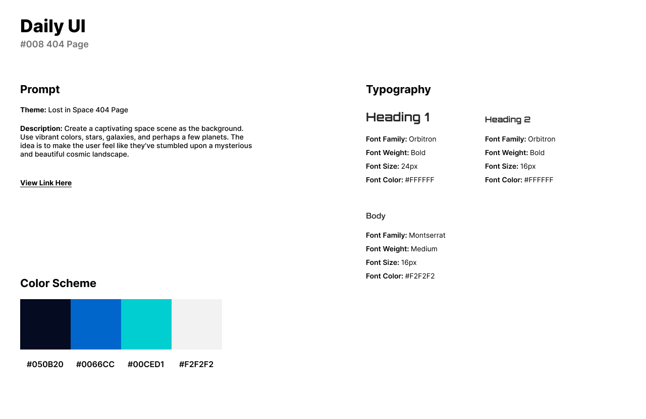
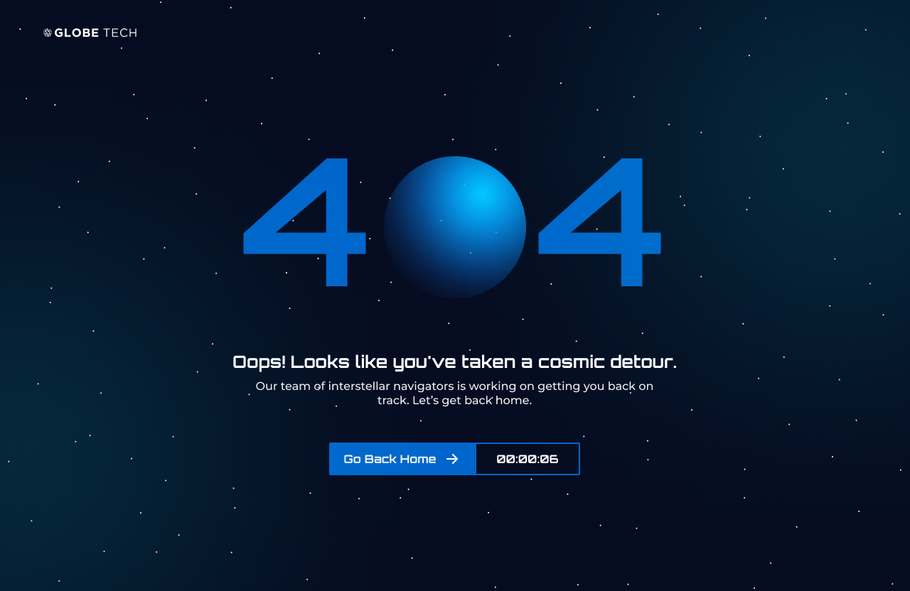
For Daily UI’s eighth challenge, I designed a 404 Page or a page users see on a website when the link is missing. The theme of this challenge is a Lost in Space 404 Page. I challenged myself to design a 404 page with depth and a scene that hasn’t been designed for an astronomy 404 page before.
Globe Tech’s 404 Page is a captivating space scene as a background that uses vibrant colors, stars, and galaxies. The idea is to make the user feel like they've stumbled upon a mysterious and beautiful cosmic landscape.
For the style of the design, I used deep blues and purples to create depth of deep space and a turquoise green for the galaxies or drop shadows. Oribitron made for a great space font for headlines while Montserrat matched perfectly as another flat and short font for body text.
Users can see planets, stars, and galaxies through the design. The #0 is the 404 is a planet with a dark blue gradient that fades off into the depth of space. White eclipses or circle vectors are sprawled across the screen to portray stars. In the top and bottom corners, the green drop shadows represent galaxies and colors of space.
View Link Here. Illustrations and Vectors are from Adobe Images.
#009 | Music Player
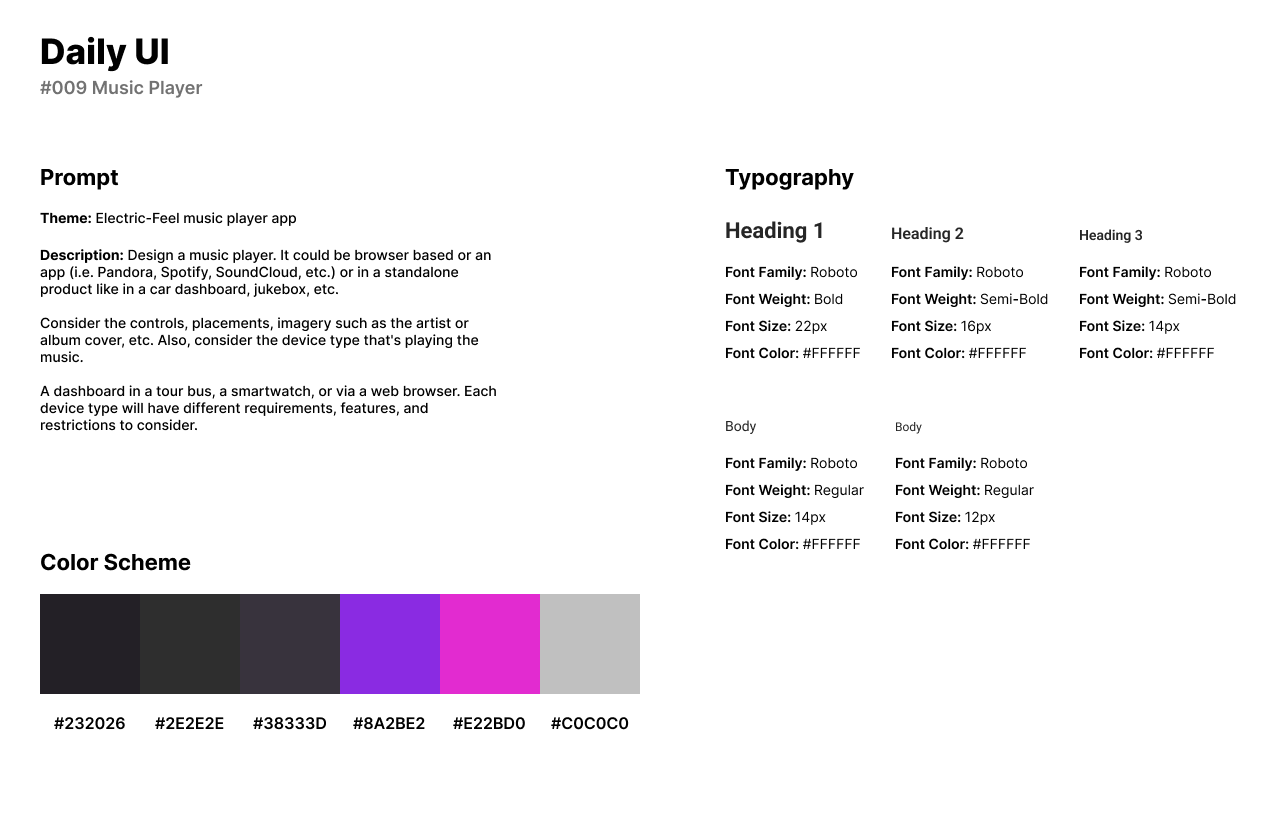
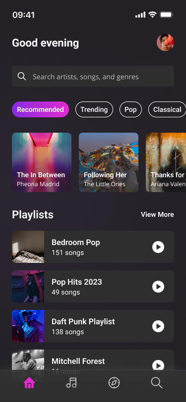
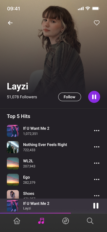
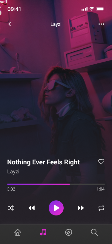
Daily UI’s ninth challenge asks users to design a Music Player. For the music player’s theme, I designed an Electric-Feel music player App. I challenged myself to design a music player app that provides a futuristic and visually engaging music player experience, making the act of listening to music a multisensory and immersive journey.
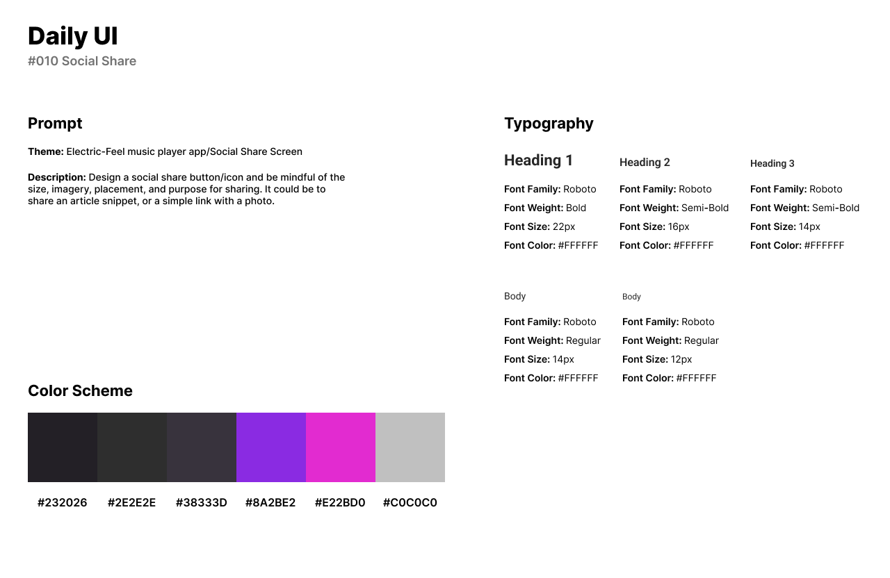
For the app’s futuristic design style, I included muted blacks and grays with a neon purple and pink. Roboto is a font that is perfect for any futuristic, yet modern design style. Roboto fit in well for headlines and body text.
The first screen of the app is the user’s Home page which includes different tags (Recommended, Trending, Genres). Underneath the tags is the user’s Playlists that they have created.
The second screen is the Music Player system that shows the song being played, and basic music player functions such as Play, Skip, Repeat, etc. The third screen appears when the user taps on the artist’s name. The user will be able to view the artist’s songs and albums.
View Link Here. Images are from the Figma plug-in UnSplash and Google Images (Artist Photos).
#010 | Social Share
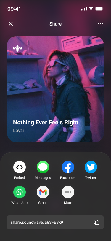
The tenth challenge by Daily UI is to design a Social Share. A social share is a function that allows users to share something to another platform, share to messages, and copy a link. I based the theme of this design after the last Daily UI challenge, Music Player.
The design features a full-coverage share screen which features the album cover of the song being shared. At the bottom of the image is the social media components. Users can choose between embedding the link, sharing to messages, a social media platform, and through an email.
The style of the design is roughly the same as the Music Player’s style guide but features a smaller font for the titles of the links. Users can also create their own link by tapping the text in the input field.
