Daily UI: #091 - #100
#091 | Curated for You
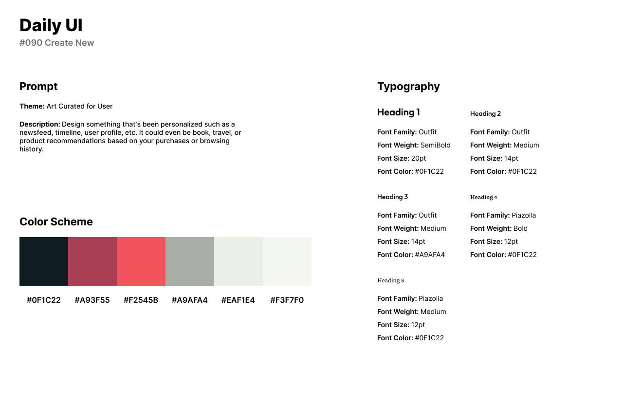
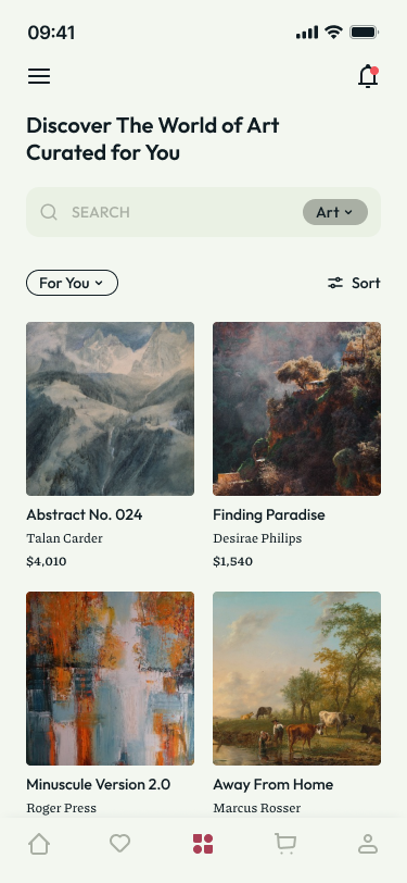
The ninety-first challenge by Daily UI is a Curated for You UI. For the theme of the challenge, I created an art retail app that features a Curated for You section. The app automatically finds art pieces specifically designed to meet the user’s needs or wants.
The style of the app has a muted and desaturated shade of red with a touch of brown. It has a medium to dark tone and can be described as a warm, earthy red for the app’s primary color. The background of the app is a very light and nearly neutral shade of off-white or light gray. It has a subtle hint of warmth and is a soft, serene color. For the headlines and input fields, I use Outfit. I use Outfit for its geometric style and rich ligatures. For secondary titles, I use Piazolla which is a serif font for its dynamic and contrasting style.
The design is the Discover screen of the app where users can discover new art, specifically curated for them. The screen has a search bar at the top for users to search for styles or types of art. Below the search bar, users can browse the hundreds of pieces of art. Each card has the title of the art piece or painting, the artist, and the price.
#092 | FAQ
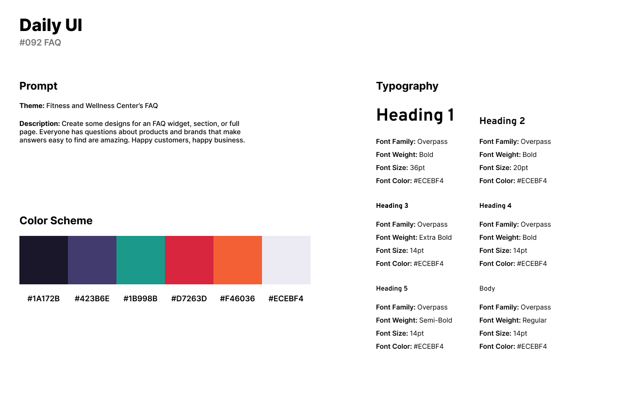
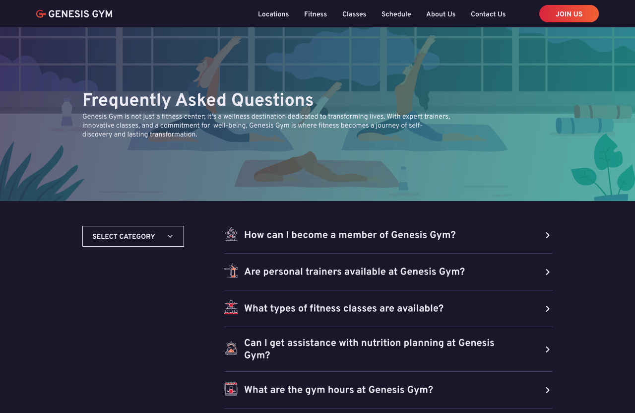
The ninety-second design challenge by Daily UI is an FAQ. I created a fitness and wellness center or gym called Genesis Gym. The gym offers equipment to work out, in-class and online workout sessions, and dietary advice.
The style of the design has a midnight blue color as the website’s background. The primary colors are a vibrant red and orange which provide a fierce and energetic feeling. I use a dark sea foam green as an accent for coolness. I use a yoga class illustration from Adobe Photos as a cover image at the top of the screen. Overpass is used for headlines and body text known for its clean, modern, and legible design.
The design features an FAQ with a list of questions. The user can click on a question and the answer is animated through a collapse. Users can change the category to fit their needs. Each question includes a fitness icon or illustration from the Figma community.
#093 | Splash Screen
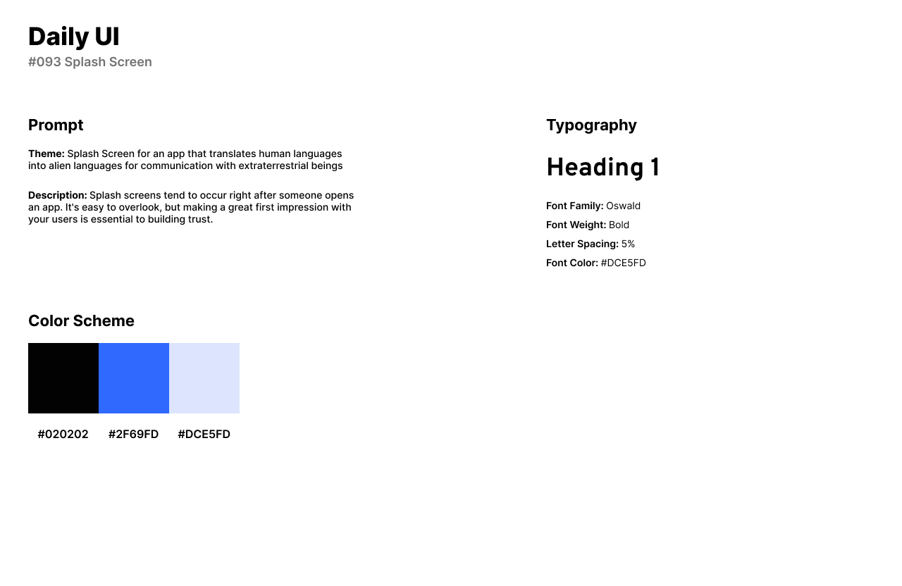
The ninety-third design challenge by Daily UI is a Splash Screen. A splash screen is a graphic or loading screen that briefly appears when launching an application, often featuring branding elements or visuals before the main interface is displayed. I designed an app called Alienwire. The app translates human language into alien language for humans to communicate with extraterrestrial beings.
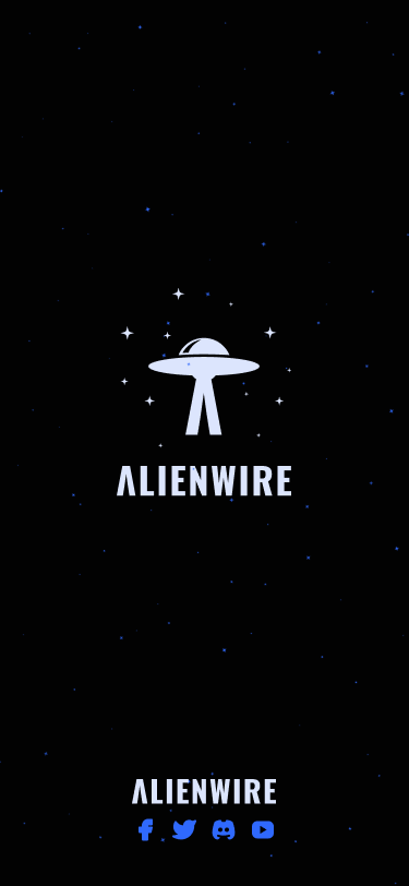
For the app’s design style, I use a very dark shade of black as the background representing space. For the accent color, I use a bright and vivid shade of blue for its cool, electric appearance. I use a light and soft shade of blue for its serene and calming quality as the primary color. The app consists of one font for the Alienwire logo, Oswald. I adjusted the font by removing the slash in the letter A and giving the text a letter spacing of five-percent.
The Splash Screen consists of a single screen with the apps’ logo in the center and a UFO illustration above. The letter A is featured in the illustration through the UFO’s glare. The UFO is surrounded by white stars with subtle blue stars in the background. The bottom of the screen has the app’s social media platforms in the form of icons.
#094 | News
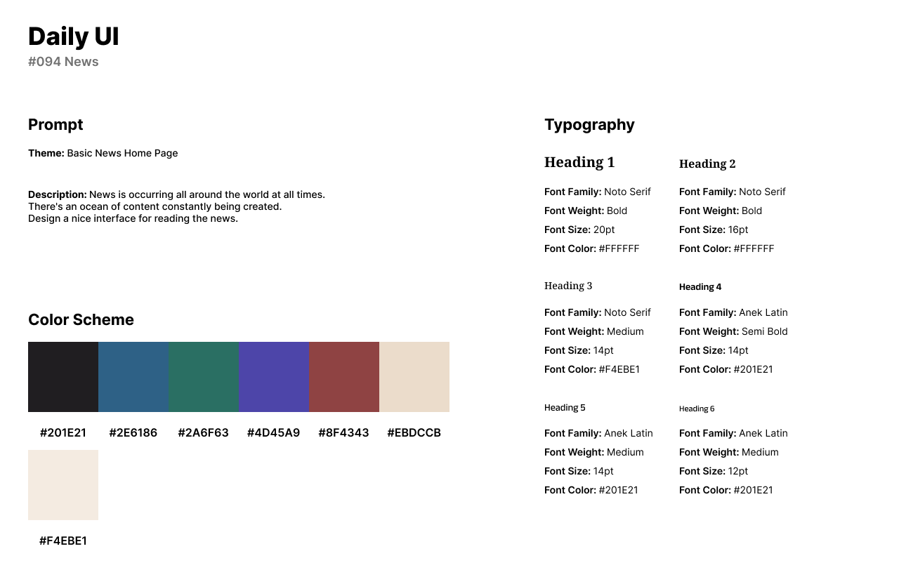
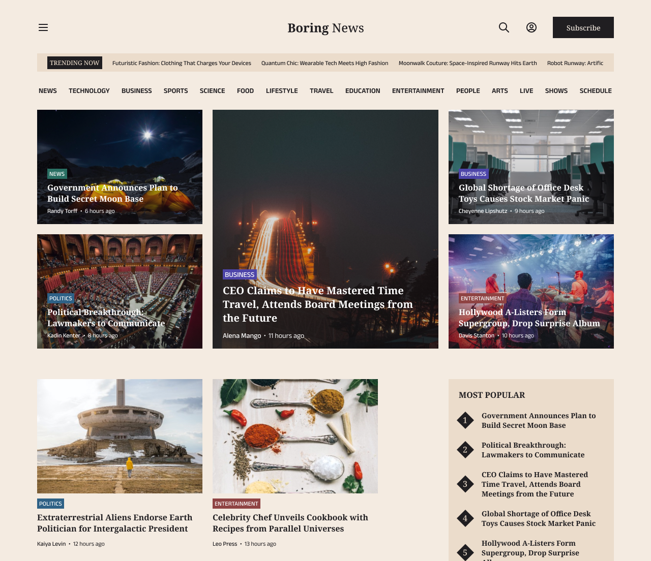
Daily UI’s ninety-fourth design challenge is a News UI. I designed a home page for a news company called, Boring News. The website features a variety of news from technology to lifestyle. Each article or card is fictional and written by ChatGPT with images from Unsplash.
The style of the design has a beige and black color scheme. The black is used in the text and CTA buttons and provides a deep blackish-brown, as a rich black with subtle undertones. The beige color is used as the website’s background for its subtle creaminess and a gentle, neutral tone. I use Noto Serif for the logo and headlines which provides a classic and readable design perfect for news platforms. Anek Latin is used in the design for secondary headlines and body text.
The design features a menu icon to the left for users to access more information or links about the platform. To the right, users can subscribe to the platform, sign in, or search for any kind of article. The layout of the home screen consists of five news articles, each categorized through the titles above the articles. Below the home page, users can access more news articles and view the most popular articles that are currently trending. Each card contains a category, title of the article, author, and recent time posted.
#095 | Product Tour
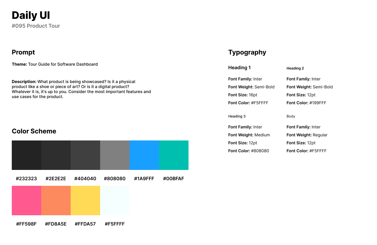
The ninety-fifth design challenge by Daily UI is a Product Tour UI. For the theme of the challenge, I reused the Statistics design from the #066 design challenge. A product tour is an interactive experience that introduces users to the features, functionalities, and navigation of a digital application or website, enhancing user onboarding and understanding. I designed a product tour as a navigational feature for a software’s dashboard.
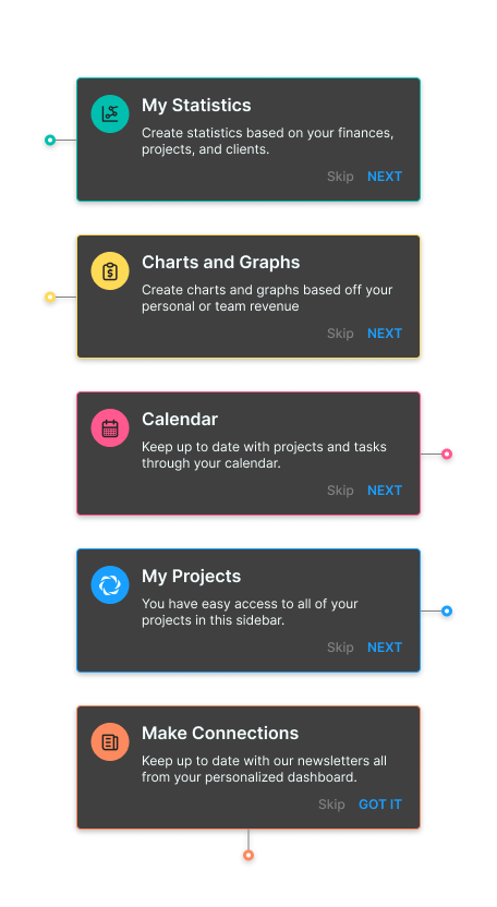
The style of the design has dark grays and blacks for the card’s background. Each card is outlined with a vibrant color: Sky Blue, Sea Foam Green, Hot Pink, Sunset Orange, and Sunny Yellow. I reused the original font from the #066 design, Inter for its clean and accessible character. The product tour cards each include an icon corresponding to their title by Tabler Icons.
The first screen features a card for the Statistics icon in the side bar navigation menu. The second card guides the user to the large graph in the center of the page. The third screen takes the user to the right to view the calendar. The fourth screen draws the user’s attention below the calendar and to the projects that are easily accessible from the dashboard. The fifth screen introduces the user to the final product tour card about keeping up to date on any software updates or news.
#096 | Currently in Stock
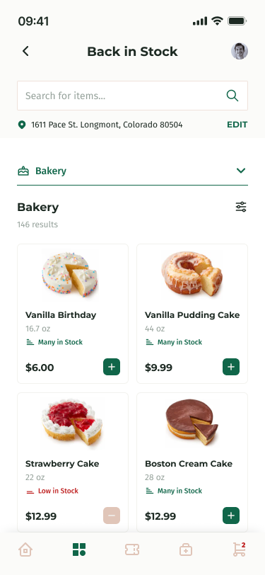
The ninety-sixth design challenge is a Currently in Stock UI. I designed a Currently in Stock/Back in Stock UI, specifically for bakery items on a grocery store’s mobile app. The app allows users to browse for grocery items, redeem or collect coupons, and purchase items online.
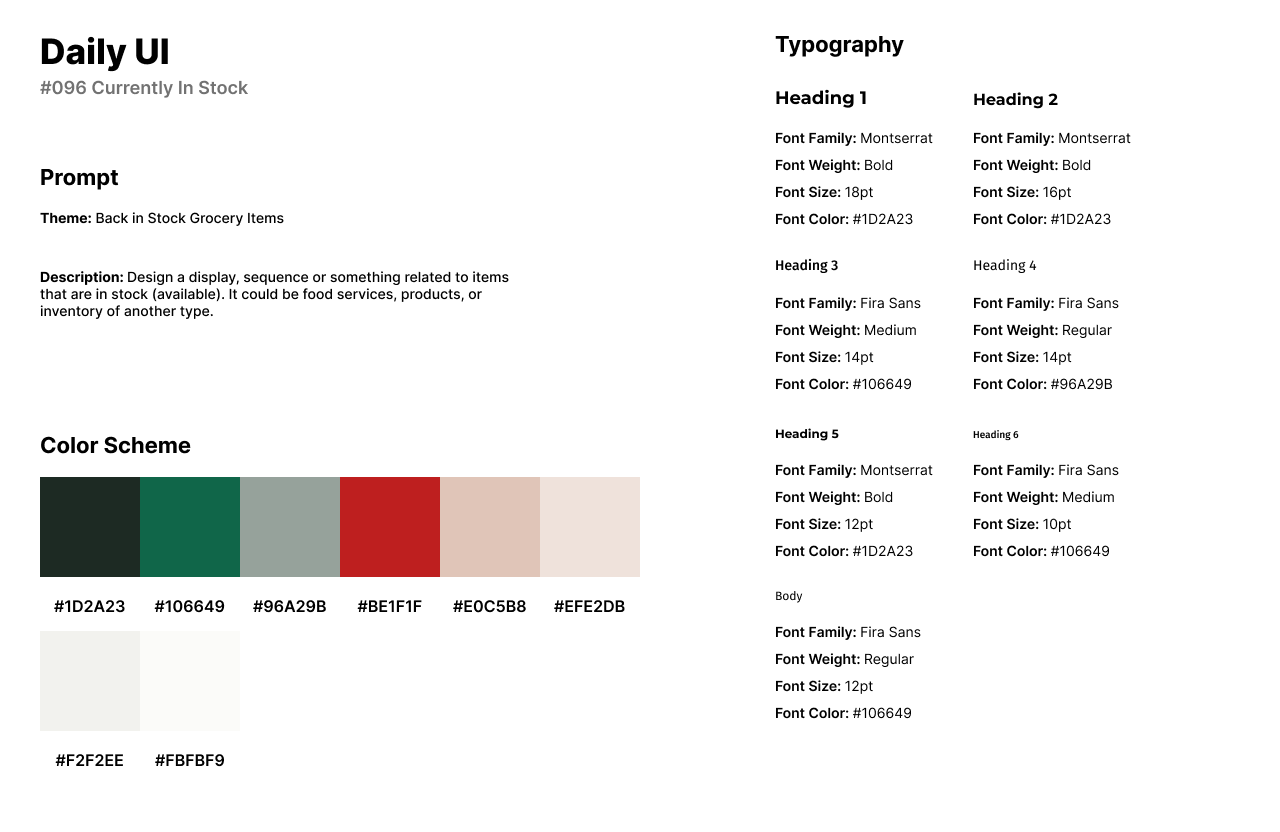
The design of the app has a primary color of a dark, muted shade of green, resembling a deep forest or pine green with low to moderate saturation. I used a soft and warm shade of beige for accents to provide a gentle, neutral aesthetic. I use Montserrat for headlines as it has friendly and modern appearance, perfect for a grocery store app that anyone from teens to elders. I use Fira Sans for secondary titles and body text because it has a geometric influence and provides a balanced and legible appearance.
The design of the Currently in Stock UI is the Discover screen. Users can use the search bar to browse for items and change the location of the store. The navigational menu allows users to browse for certain categories in which this design, the user is browsing for bakery items. Below the menu, a list of cards or items is featured and users can add an item to their cart through the plus icon.
#097 | Giveaway
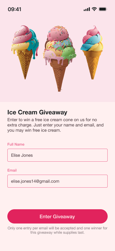
The ninety-seventh design challenge by Daily UI is a Giveaway. For the theme of the design, I designed a free entry giveaway design or form for an ice cream giveaway. Users enter their information into the form to enter to win a free ice cream cone.
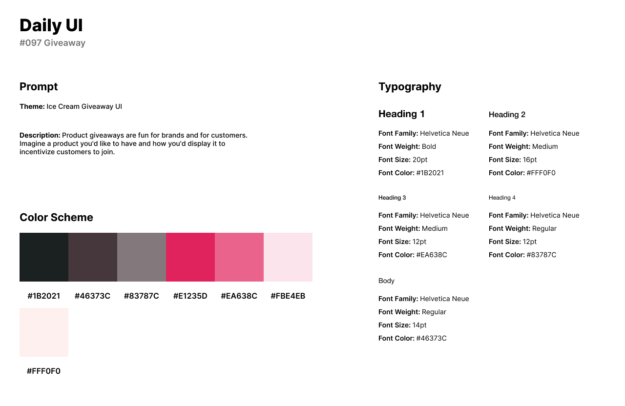
The style of the design isn’t unique through the layout of the form, but through the 3D ice cream illustrations which I created in Adobe Illustrator’s AI generator. The design has a pink color scheme with three shades of pink. The vibrant shade of magenta or fuchsia is used as the primary color for its energetic and trendy appearance. The soft and muted shade of pink with a touch of mauve, conveys a delicate and gentle aesthetic, and is used as the input field’s outlines. The very light pink is used as the background of the app for a cloudy and light appearance. I use Helvetica Neue for its clean, simple, and neutral design.
The design features three ice cream illustrations at the top of the screen. Below the illustrations, users can fill out the form with their name and email before tapping Enter Giveaway.
#098 | Advertisement
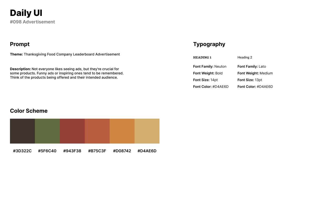
The ninety-eighth design challenge by Daily UI is an Advertisement. For the challenge, I created a leaderboard advertisement for a company called Feast which delivers home made meals to customers. The theme of the advertisement was designed in November, close to Thanksgiving Day and has an autumn appearance.
The style of the design has a fall or autumn color palette with an olive green, musky red, brownish orange, yellow-orange, and grayish yellow. The advertisement has AI generated illustrations by Adobe Illustrator of border décor and pumpkins. The design of the logo and CTA button’s font is Neuton which is a classic and elegant design with distinct, high-contrast strokes. The headline of the advertisement is Lato which is a well-stylized pair with Neuton.

#099 | Categories
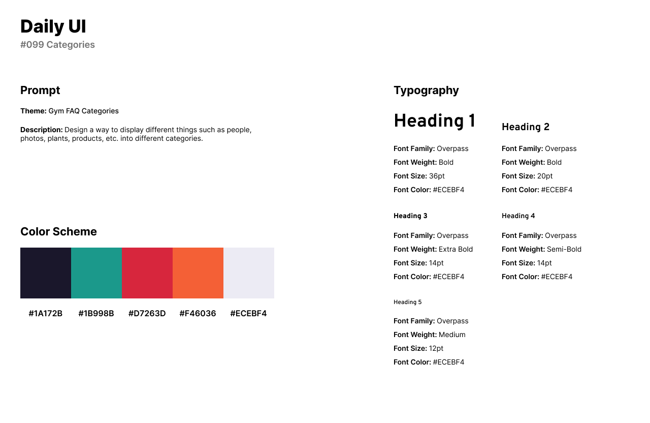
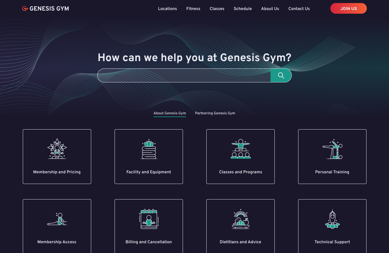
The ninety-ninth design challenge by Daily UI is Categories. I designed a categories page for Genesis Gym’s FAQ, reusing the same design style from the #092 FAQ challenge. The categories are featured as cards with titles and an icon.
The style of the design uses a dark theme as the background with a muted shade of deep navy, appearing almost as a rich, dark charcoal with subtle undertones. The primary color of the Categories page is a rich and deep shade of teal for its energetic qualities. I used the font Overpass because it features a clean and modern design with a neutral aesthetic for headlines.
The design features a wide search bar at the top of the screen with a wavy illustration and gradient as the background. The category cards are below the search bar with a brief menu for users to switch between learning about the gym and partnering with the gym. Each card contains a title and their relevant icon.
#100 | Redesign Daily UI
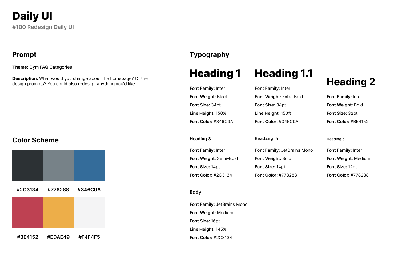
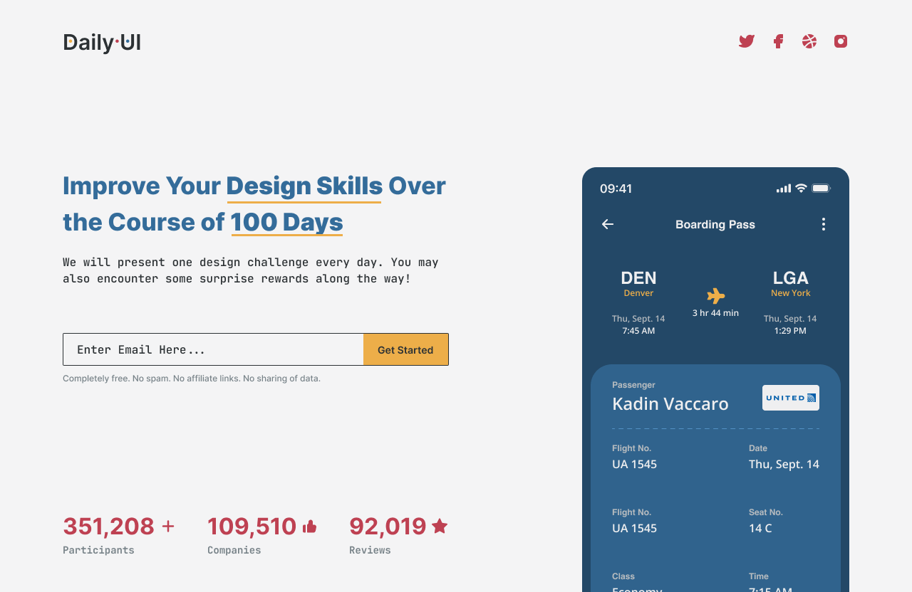
The final design challenge by Daily UI is a website redesign for Daily UI. Daily UI’s original website has two boarding pass designs featured to the left. Their headline is centered to the right of the page with a CTA button for users to sign up.
The style of the redesign has a vintage color palette of blue, red, and yellow with an inky or charcoal black text. The dark shade of blue resembles a deep and muted cobalt or steel blue with a cool and calm appearance. The red with a muted undertone carries a warm and intense visual presence. The yellow is a warm and vibrant shade of orange-yellow and has a lively and energetic appearance. I use Inter for the website redesign’s headlines as originally featured in Daily UI’s website. For personality and to pair well with the vintage theme, I use JetBrains Mono for body text.
The design features a rebranded Daily UI logo to the left of the page with social media icons on the opposite side. The headline and body text are to the left side of the screen with an input field for users to enter their email and subscribe. Below the input field, information about participants, companies, and reviews are featured in numbers.
