Daily UI: #081 - #090
#081 | Status Update
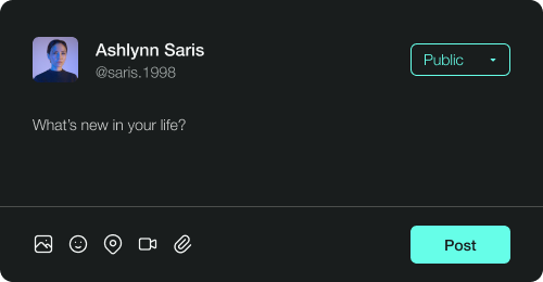
The eighty-first challenge by Daily UI is a Status Update. I designed a dark-themed status update input field for a social media platform. Users of the platform will type their status update in the input field and it will be posted on their page.
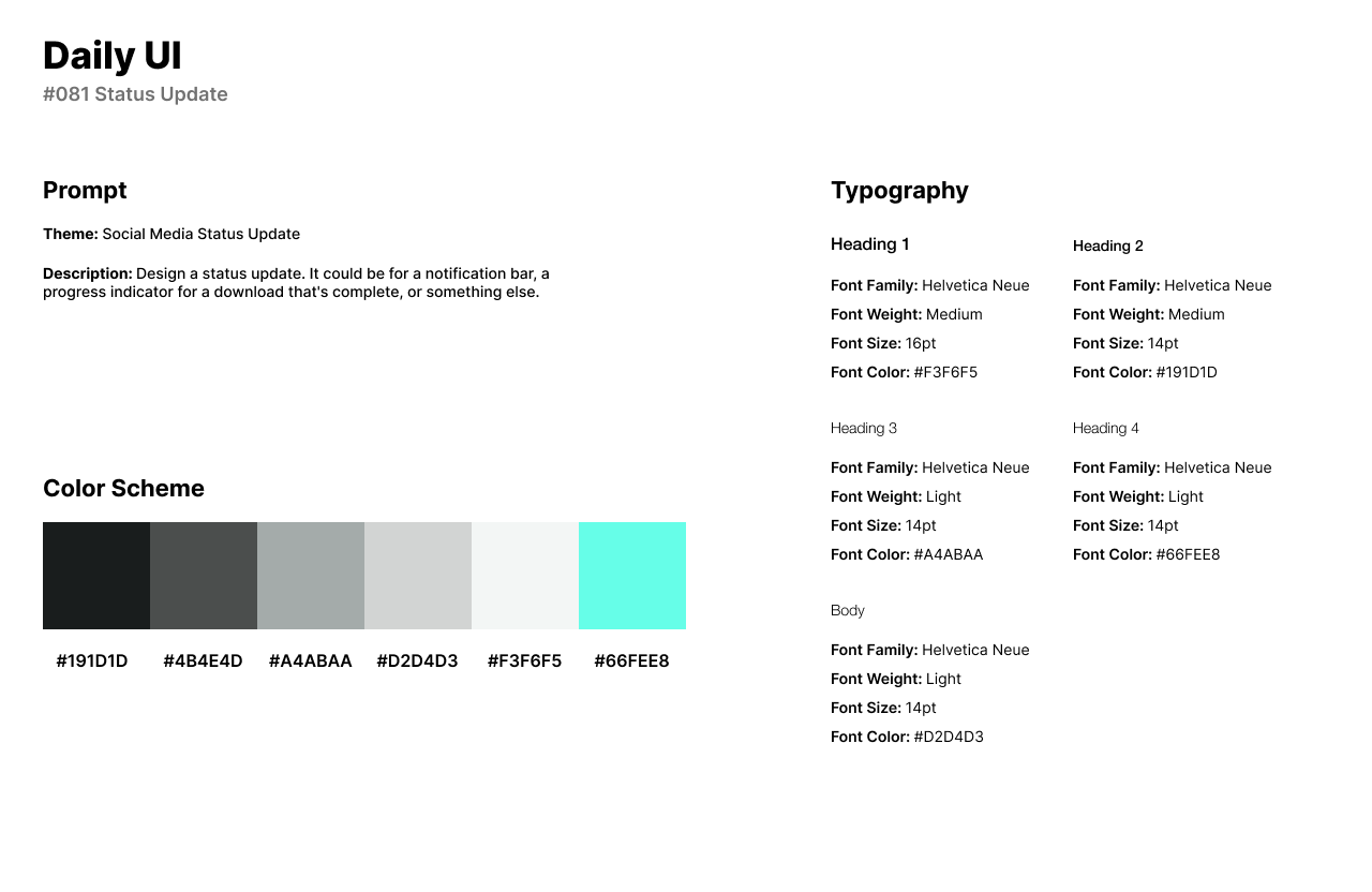
The style of the design has a primary color that is a bright and vibrant shade of cyan or turquoise. I use Helvetica Neue for the status update’s UI for its timeless and versatile design with clean lines and a neutral aesthetic.
The UI features the user’s profile image, name, and user name to the left part of the screen. Users can change the post’s publicity through the button to the right. Users can upload images or videos to their update or just write a short and simple text-based update.
#082 | Form
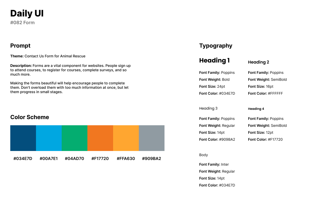
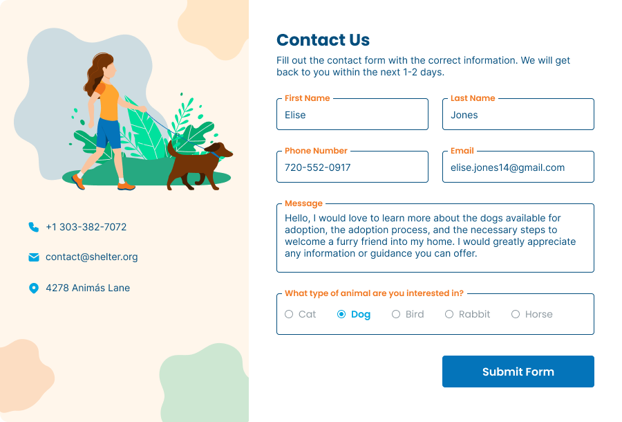
The eighty-second design by Daily UI is a Form challenge. For the theme of the design, I designed a form for an animal shelter. The application form is for users to fill out and submit with a message and the type of animal they are interested in adopting.
The style of the design is a friendly and colorful with a color scheme of orange and blue. I used Poppins for headlines for its eccentric and geometric style. For body text, I use Inter as a modern and clean style of font.
The design of form has an illustration with contact information to the left. Splotches of yellow, blue, and green over a tan background provide a colorful atmosphere. The form asks for the user’s personal information with their email and phone number. The user can select the type of animal they are interested in adopting being a cat, dog, bird, rabbit, or horse.
#083 | Buttons
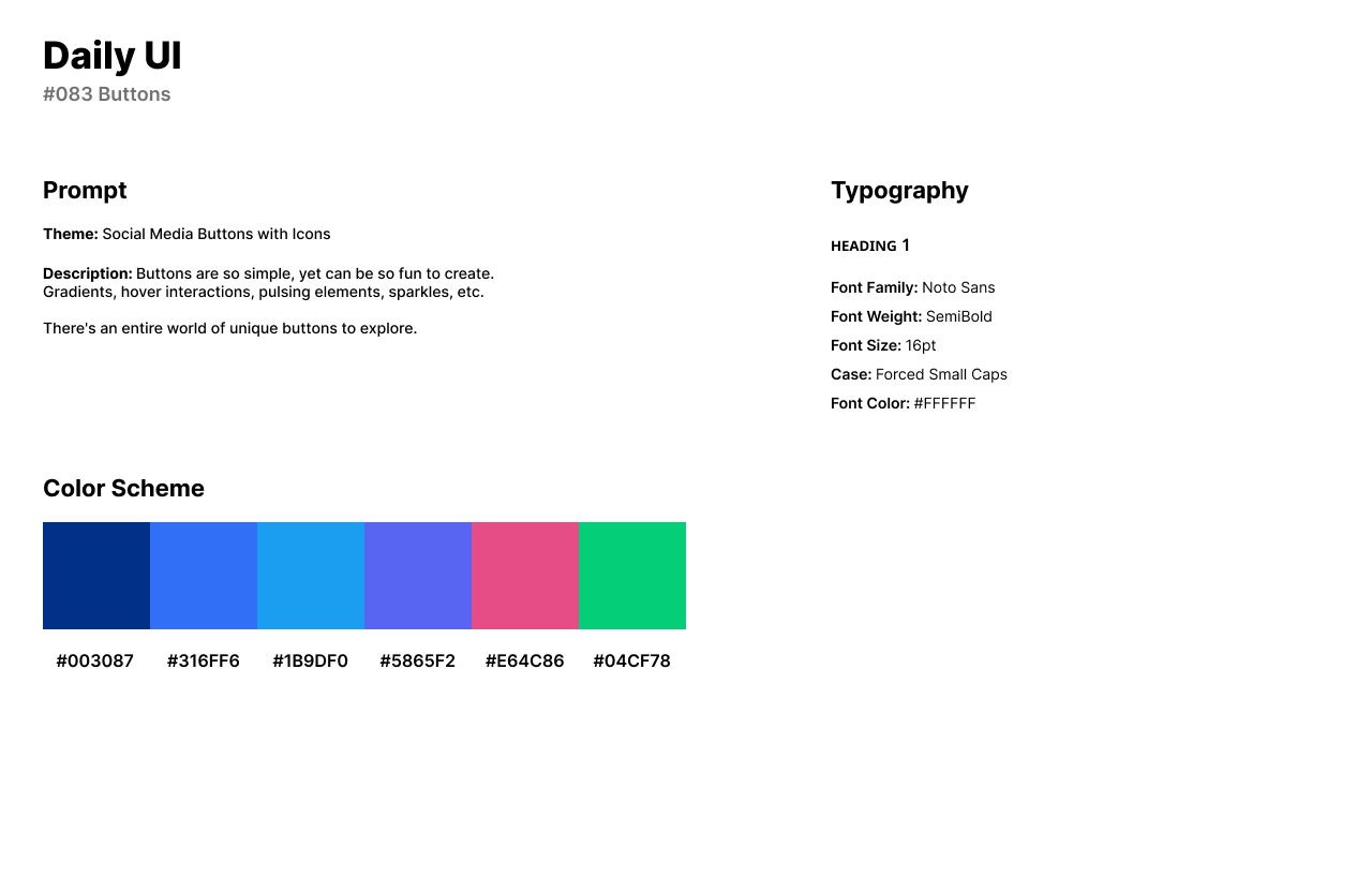
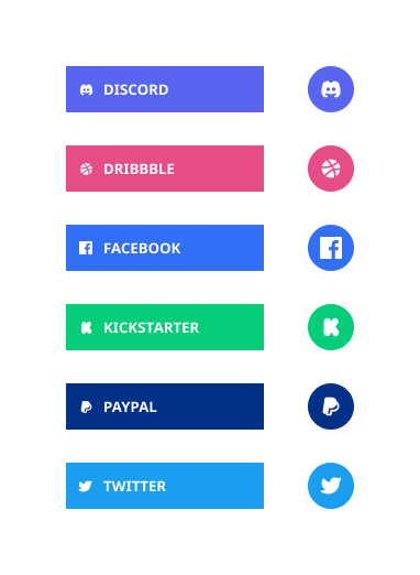
The eighty-third challenge by Daily UI is a Button UI. For the button design challenge, I designed buttons with icons for social media. Each button’s color scheme represents the theme of the social media platform.
The style of the buttons have a color scheme based on the main color of the social media platform. I use Noto Sans in all caps for its clean and neutral design. The font fits well within each social media button and its icon.
I designed six buttons: Discord, Dribbble, Facebook, Kickstarter, PayPal, and Twitter. Next to the text-based buttons, I created a mobile version of the buttons with the company’s icons. Each button has a hover effect which darkens as the cursor hovers the button.
#084 | Badge
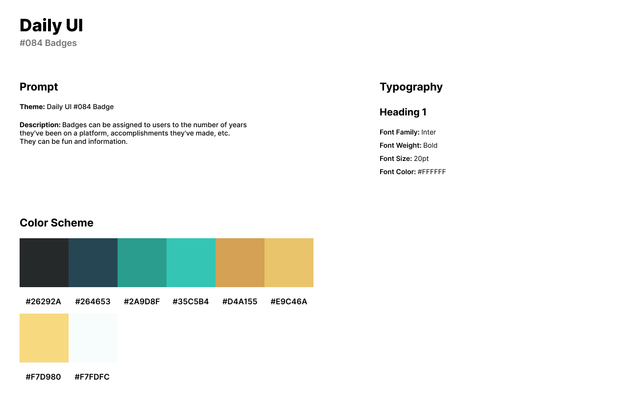
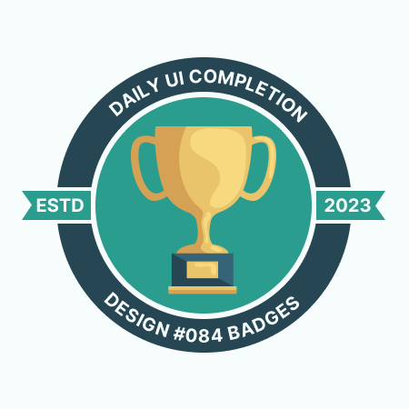
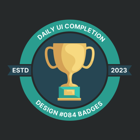
Daily UI’s eighty-fourth challenge is a Badge design. For the theme of the challenge, I designed a badge for reaching Daily UI’s #084 challenge. The badge represents a trophy or achievement for coming such a long way after months of designing a specific prompt every day.
The style of the design has a turquoise and yellow or gold color palette that. I use Inter for the text in the badge as a bold headline because Inter is the font Daily UI uses on their website design. Inter also pairs well with the modern design of the badge and its 2D design.
The badge features a trophy in the center over a bright turquoise background. The top and bottom text of the badge have the achievement of the Daily UI #084 challenge’s completion. The side of the badge has the ESTD year of 2023 as the badge was created in 2023.
#085 | Pagination
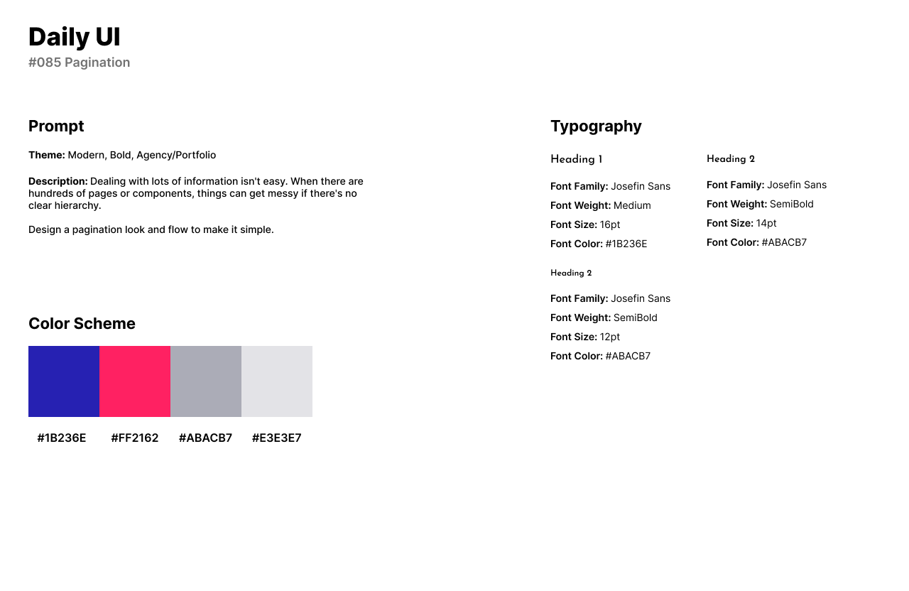
The eighty-fifth design challenge by Daily UI is a Pagination UI. Pagination is the process of dividing content into separate pages, often used in websites to organize and display information in portions. I designed a Pagination UI to be used in an agency or a portfolio.
The style of the design has a deep and dark blue for its sophistication, calmness, and formality. The pinkish-red color has a bold, eye-catching shade of pink with a strong reddish undertone for its passion, energy, and excitement. I use Josefin Sans for the text and numbers for its clean lines, simple shapes, and modern appearance.
The first design features text based links from page to page with arrows. The blue is used for numbers while the pinkish-red color is used as a highlight over the current page. The second design has icons instead of text and maintains the same style for numbers. Users can enter a number into the input field and be directed to that page instead of using the arrows.


#086 | Progress
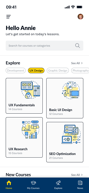
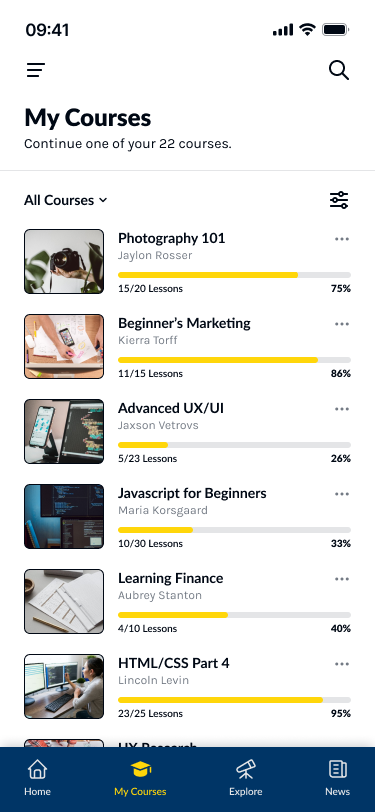
The eighty-sixth design challenge by Daily UI is a Progress UI. For this design, I represented a progress bar in an app for learning design with courses. Progress is used for the lessons of a course portrayed as a progress bar.
The style of the app has deep and nighttime blue as the primary color, evoking a sense of sophistication and stability. I use a bright and vibrant yellow as an accent and highlighter because it represents the color of an American school bus and provides a sense of warmth, energy, and positivity. I use Lato as a humanist Sans Serif font for headlines as it provides a versatility, readability, and friendly appearance. For body text and the navigation bar headline, I use Karla for its decorative style that has a clean and modern appearance.
The first design of the app is the Home screen where users can explore any type of course from Development, UX Design, Graphic Design, Photography, etc. The blue and yellow color palette is represented through tech-savvy illustrations from Adobe Photos.
The second design is the Courses screen where users can view and access all their current courses. Courses are listed in a list form as cards. Each card has the course cover image to the left. The title of the course and author are presented next to the image. Progress is featured as a yellow and gray bar with the number of completed lessons with a percentage of completion.

#087 | Avatar Design
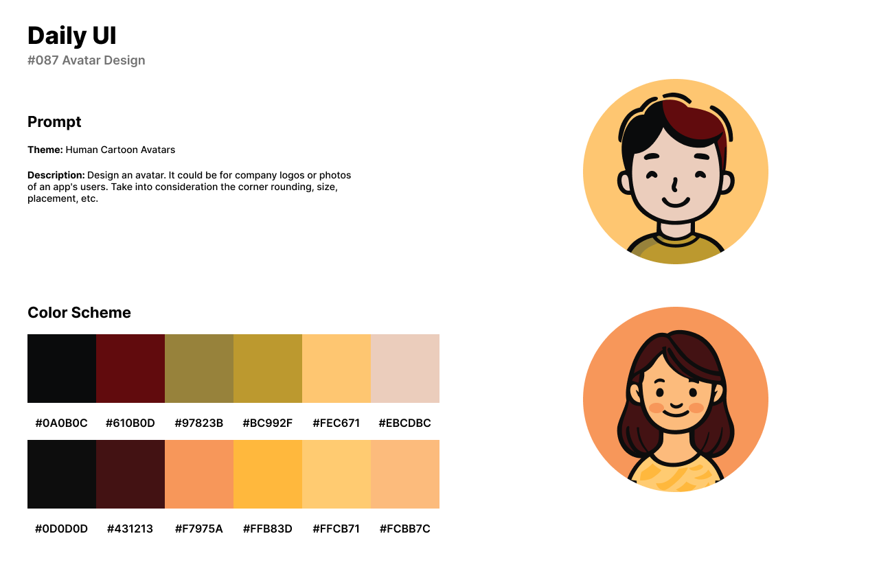
The eighty-seventh design challenge by Daily UI is an Avatar Design. I designed human avatars with a cartoon appearance. The 2D design of the avatars have an orange, brown, and yellow color palette. The male and female avatars have black outlines with a yellow and orange background to create an icon. The avatars can be used in place of gaming characters, profile pictures, and any style of design for a platform.
#088 | Tooltip
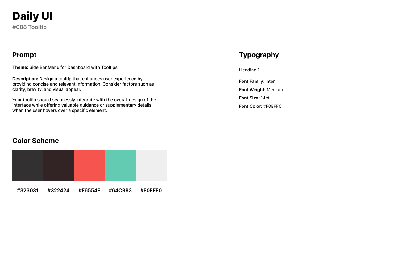
The eighty-eighth design challenge by Daily UI is a Tooltip UI. I designed tooltips for a sidebar navigation menu used in a software platform. The tooltips are presented as pop-ups when the user hovers over an icon in the menu.
The style of the design has a dark theme with an inky black color for a subdued and timeless look in the design. A bright and intense shade of red-orange is used as the primary color to be attention-grabbing and associated with passion, warmth, and vibrancy. I love using Inter when designing for dashboards or software programs because it is a clean and organized font which is used for the tooltip design.
The design features an assortment of icons: Overview, Analytics, Orders, Files, Clients, Inbox, Settings, Logout, and Profile. When the user hovers over one of the icons, the icon’s background becomes a darker version of the red-orange. The tooltip appears to the side with a title of the screen or icon being hovered. The animation is quick but dissolves once the user moves to another icon or the cursor exits the icon.

#089 | Agree to Terms
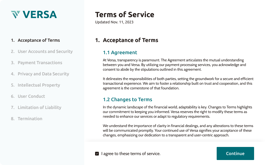
The eighty-ninth challenge by Daily UI is an Agree to Terms UI. For the theme of the challenge, I designed Versa, a payment processing platform’s agree to terms or terms of service. "Agreeing to terms" refers to accepting and consenting to the conditions, rules, or agreements in a document or a set of terms and conditions.
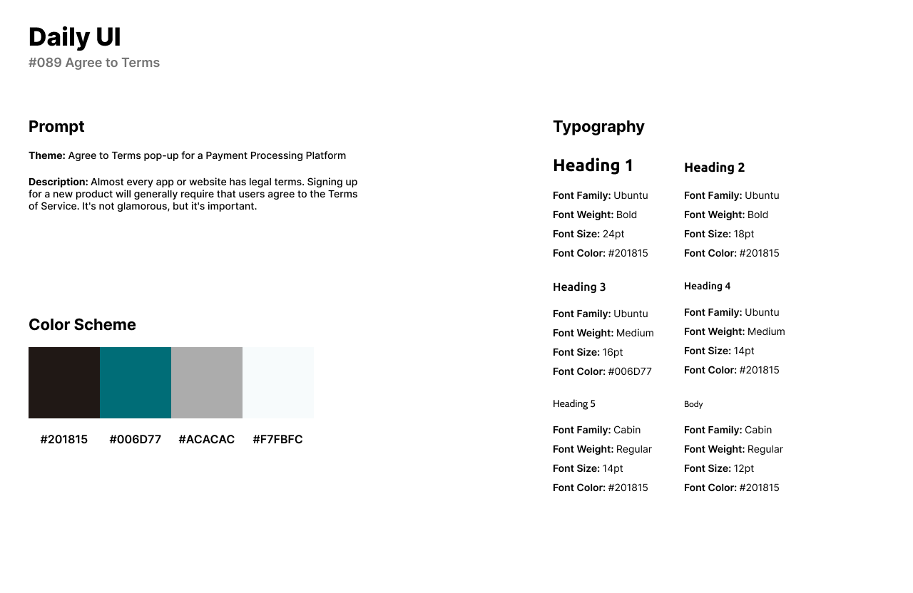
For the style of the design, the primary color is a deep shade of teal, characterized by a dark bluish-green hue. It has a rich and saturated appearance, reminiscent of deep ocean tones. I use the humanist sans-serif font Ubuntu for its clarity, readability, and modern, human-centric design characteristics. I paired Ubuntu with Cabin inspired by traditional serif fonts or its clean and modern appearance.
The design is featured as a pop-up screen with a menu to the left that includes the Versa logo the eight agree to terms services. To the right of the design, users can read and accept the terms of service. Users have to click the checkbox before they can click Continue.
#090 | Create New
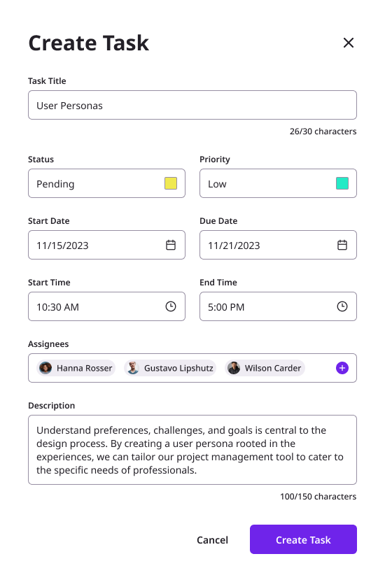
Daily UI’s ninetieth design challenge is to create something new. I designed a Create New UI for a Create New Task form with a CTA button. The form would be used in project management or a scheduling software.
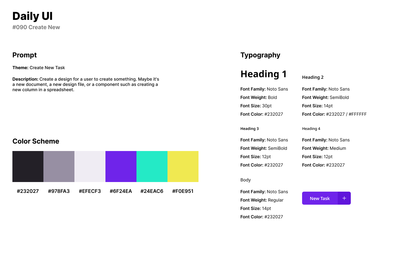
For the style of the design, I use a vibrant and deep shade of purple with a strong magenta undertone for its bold and saturated appearance. For headlines and input field text, I use Noto Sans for its a consistent and harmonious style which known for its versatility and readability across various writing systems. The input fields have a dark gray stroke with a hint of purple while the text is black with a hue of purple.
The design of the Create New Task form appears from the side of an interface. The form asks for the title of the task, status, priority, start/due date, start/end time, assignees, and description. Once the user fills out the form corresponding to their new task, they can select the CTA button Create Task to register into the system or software.
