Daily UI: #071 - #080
#071 | Schedule
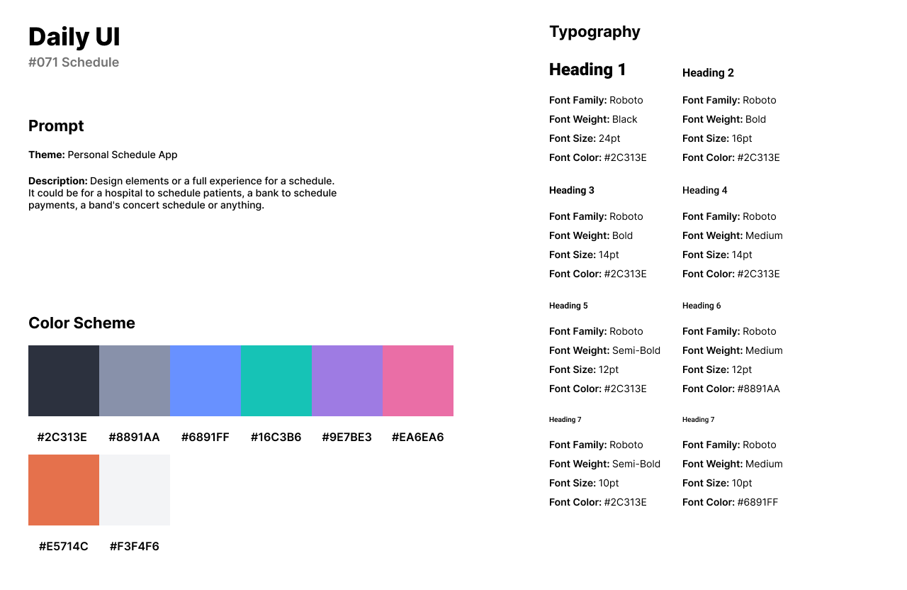
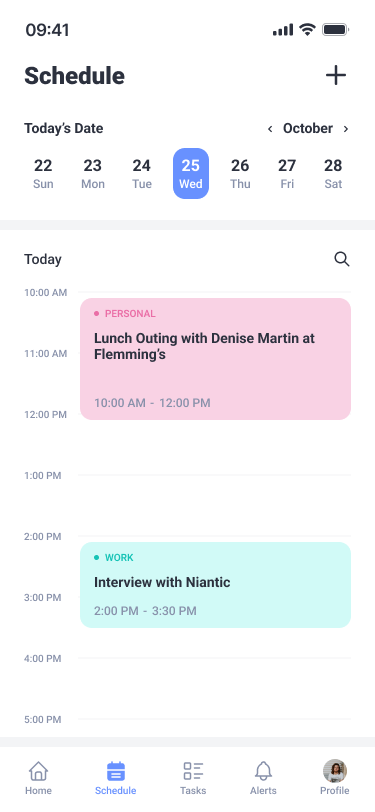
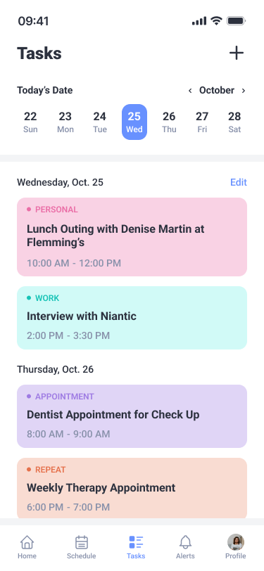
The seventy-first design by Daily UI is a Schedule. For the theme of the challenge, I designed a personal schedule app. Users can create events for their own personal benefits for personal events, work, appointments, and repeated events.
The style of the design uses a soft color scheme with a periwinkle blue as the main color theme and similar hues of green, blue, purple, pink, and orange. I use Roboto for headlines and body text. Roboto pairs well with the design for readability with titles and numbers.
The first screen is the Schedule screen of the app which has a weekly calendar at the top of the screen. Users can view their events for the current date. Each card includes the event’s category, title of the event, and time. The second screen is the Tasks screen which is similar to the Schedule but lists out all tasks or events and are categorized by the day.
#072 | Slider
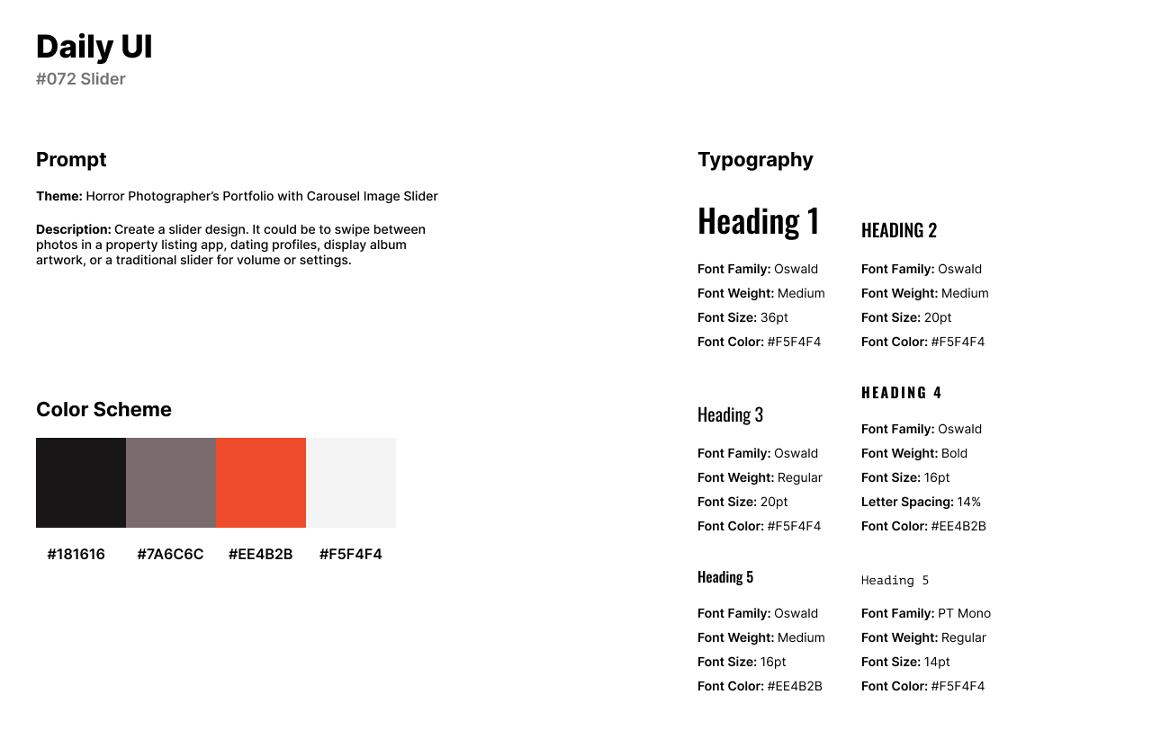
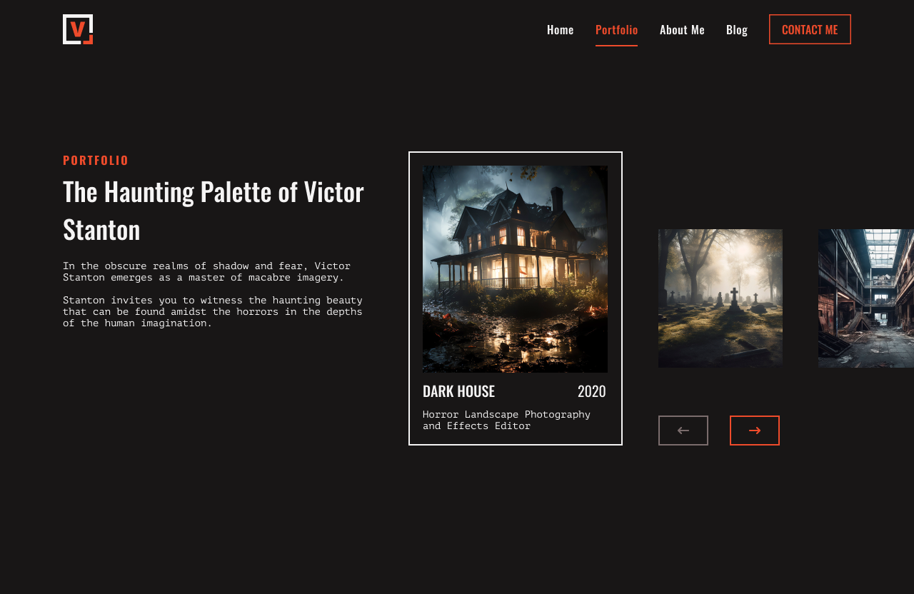
The seventy-second design challenge by Daily UI is a Slider. I designed a slider carousel animation for a photography portrait. Victor Stanton is a photographer who specializes in horror photography from haunted houses to graveyards. Victor Stanton is a made up person and the images are from the websites Vecteezy and Adobe Photos.
The style of the design has a dark theme with black as the background and an orange and red primary color. Oswald is used for headlines and secondary titles as a heavy and stand-alone font for the horror theme. I use PT Mono for body text as the typewriter style pairs well with the creepiness of the photographer’s theme.
The design consists of Stanton’s logo in the top left of the screen with his links and CTA button to the right. The center of the page has a short description about Victor Stanton and his horror photography. Each card features an image of the photo, title, year, and style of photography. As the user clicks the arrow icon to view the next photo, the photo quickly disappears while the next image slowly fades in.
#073 | Virtual Reality
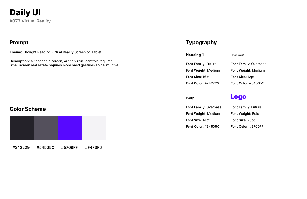
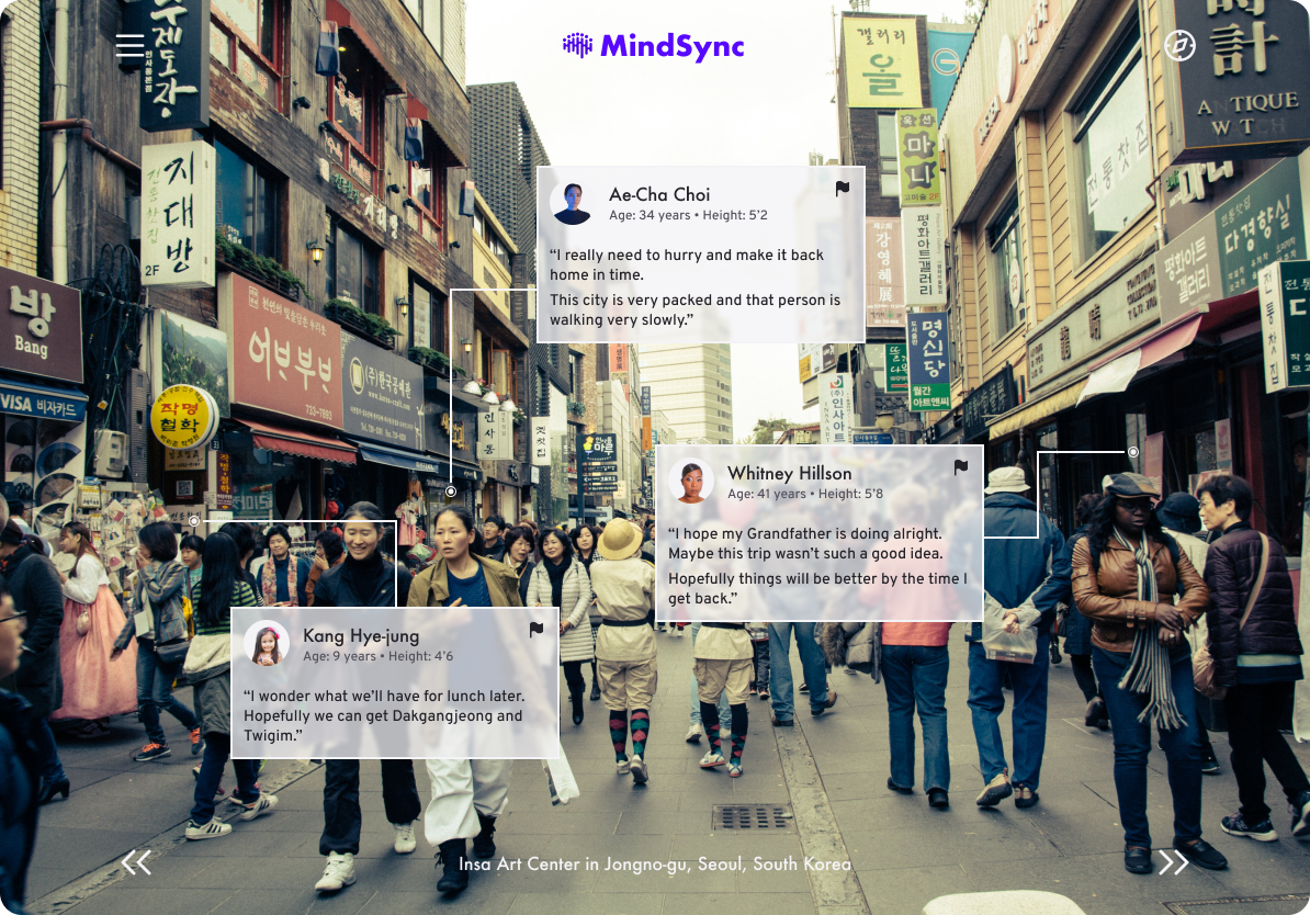
The seventy-third design challenge by Daily UI is a Virtual Reality design. For the theme of the challenge, I created a fictional and magical VR application for mobile and tablet called MindSync. Users face the device toward a person and the app can read their thoughts.
The style of the design has a black and white color palette with a vibrant purple-blue color for the company’s logo. For the futuristic style, I use Futura for headlines. As a similar yet lighting pairing, I use Overpass for secondary headlines and body text.
The design features an image of people in a city from the screen’s camera. Each card contains background information on the person’s name, age, and height. Below the information, the person’s thought or thoughts are listed. Users can report a person if their thought is dangerous.
#074 | App Download
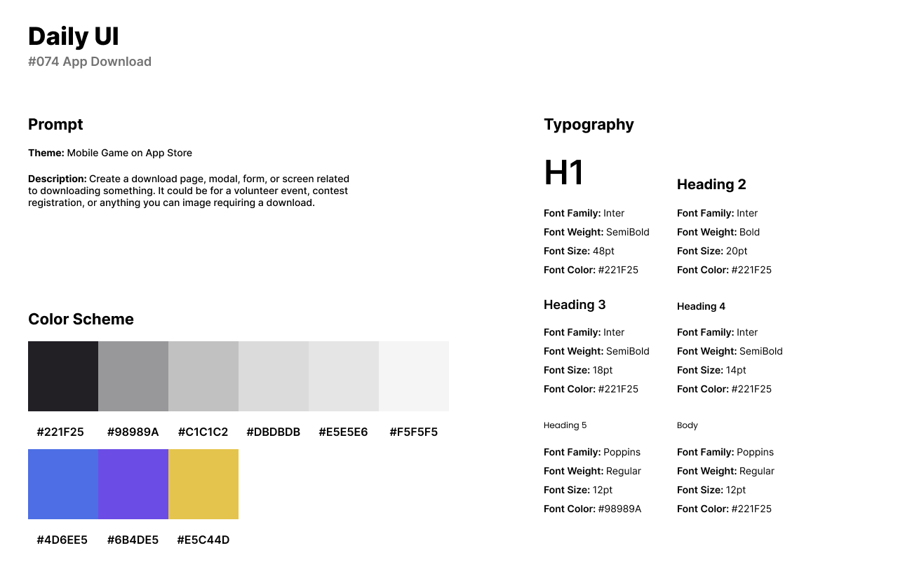
Daily UI’s seventy-fourth design challenge is an App Download. I designed an app download design for a mobile game on an app store platform. The platform is similar to that of the Google Play Store or Apple’s app store.
The style of the design has a purple color palette as the primary color. To match the primary color, I use similar hues of yellow and blue for reviews and links. I use Inter for headlines for the modern aesthetic and consistency for looking polished throughout the app’s design. To add character and a contemporary aesthetic, I use Poppins for body text and secondary text as a pairing with Inter.
The design consists of the mobile game’s cover image at the top of the screen. The app’s icon and title are featured underneath with an option to install or purchase the app. Users can preview the app through images or screenshots provided and read a description about the game. Users can also read reviews about the app and discover more games by the app’s developers.
#075 | Pre-Order
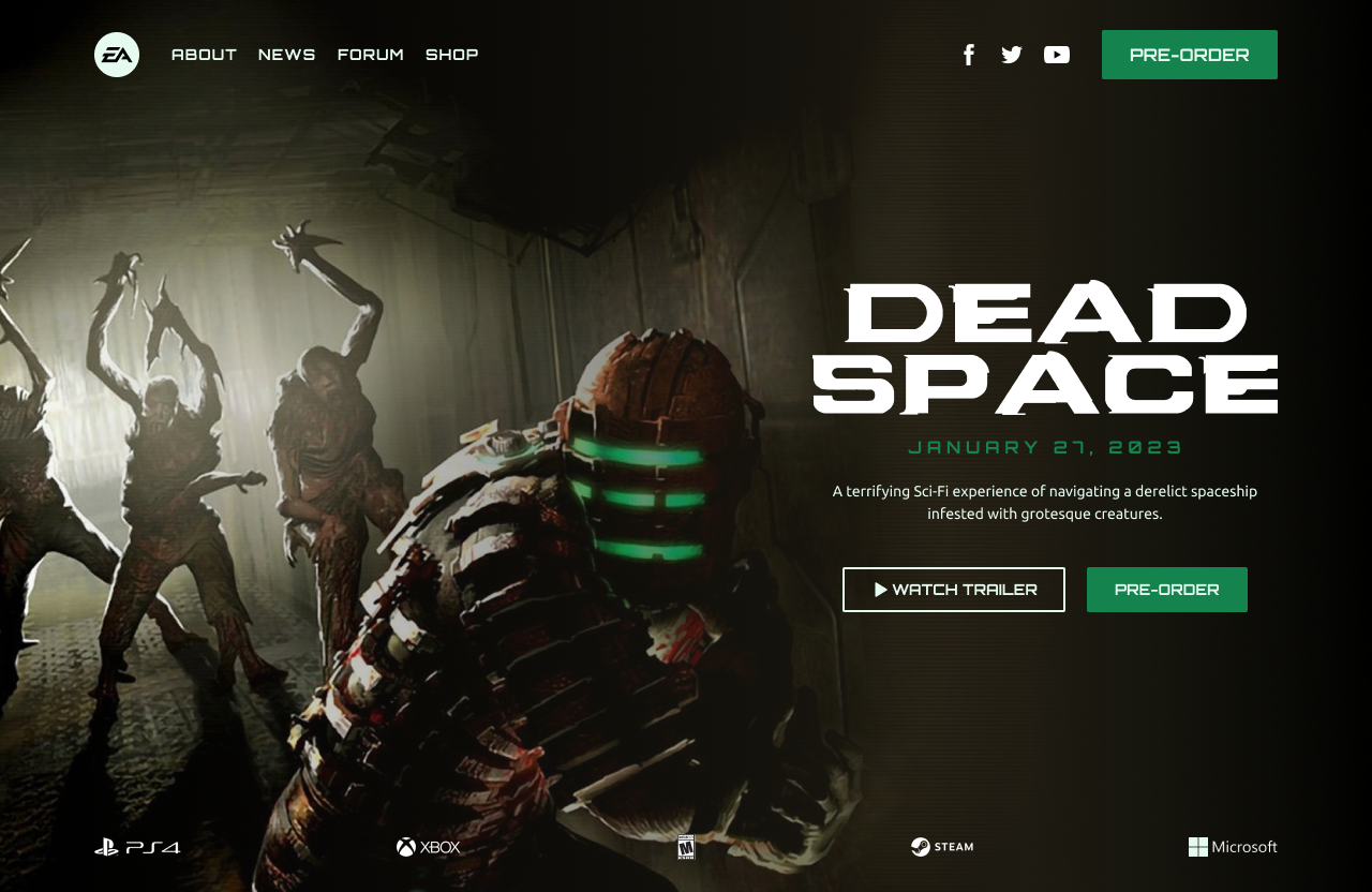
The seventy-fifth design challenge by Daily UI is a Pre-Order. For the theme of the challenge, I designed a pre-order for the horror game, Dead Space. Dead Space is a survival horror video game that follows Isaac Clarke as he navigates a space ship infested with alien creatures known as Necromorphs. The game is a psychological horror, strategic mechanic, and a dark, immersive sci-fi setting.
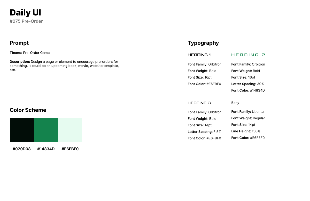
The style of the design has black and green color palette pulled from the interface’s background image. Because the game takes place in space and has a futuristic and sci-fi setting, I used Orbitron for headlines. As a well-rounded pairing for the display font, I used Ubuntu for body text.
The Pre-Order screen features a screenshot pulled from the game as the background. To the right of the design, users can watch the game’s trailer and view the release date. The Pre-Order part of the design is shown in the CTA buttons in the right center and top of the screen.
#076 | Loading
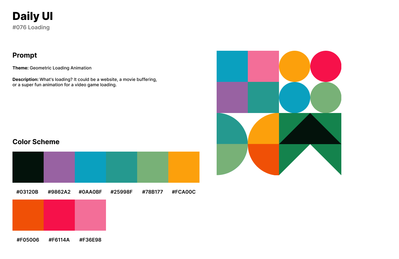
Daily UI’s seventy-sixth design challenge is a Loading animation. I designed a 4-part geometric loading animation icon. The loading animation’s design uses rectangles, triangles, and circles in a 4-part rectangular pattern. Each square has its own color scheme.
The first segment’s animation has squares that animate to their opposite corner. The second segment is related to the first segment’s animation but has circles instead of squares. The third segment below the squares animation consists of two circles divided in half. The halves move from one circle, and then flip to move back to their original place. The fourth segment has triangles in a simple 3-color palette which move up in a climbing pattern.
#077 | Thank You
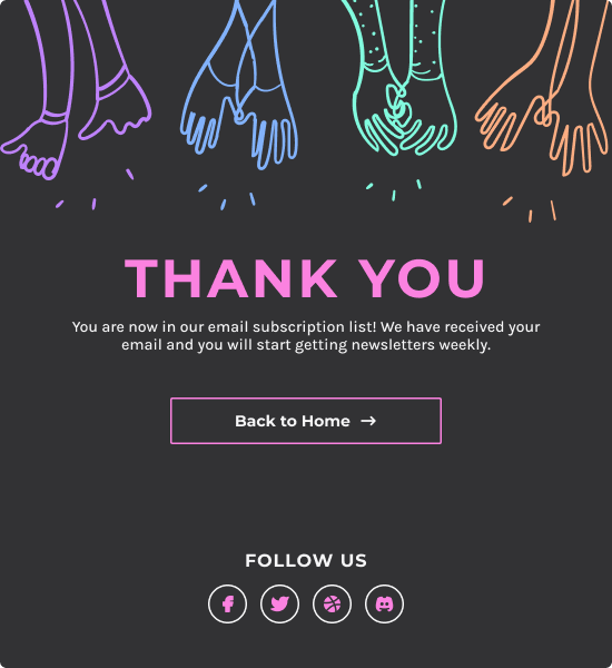
The seventy-seventh design challenge from Daily UI is a Thank You UI. For the theme of the Thank You UI, I designed a newsletter subscription pop-up screen. When a user subscribes to a newsletter, the Thank You message will pop-up on the screen and guide the user back to home.
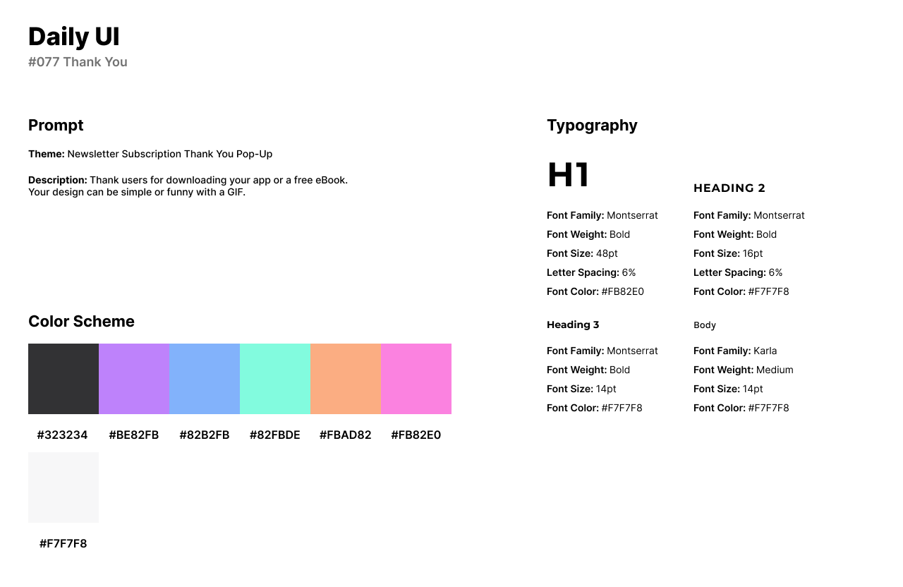
The style of the design has a neon color palette with a grayish black background and pink as the primary color. I used Montserrat for headlines as a bold font that is clean and eccentric in an all-caps style. For body text, I used Karla as a similar style and pairing for Montserrat.
The Thank You UI consists of an illustration of hands clapping from Adobe Photos. A bright pink headline in all caps thanks the user with body text detailing the user is in their subscription list. Users can access the company’s social media platforms or head back home through the CTA button.
#078 | Invitation
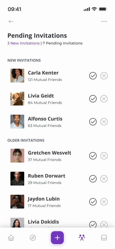
The seventy-eighth design challenge by Daily UI is an Invitation UI. For the Invitation design challenge, I designed a social media app for pending invitations. Users can accept or deny friend request invitations.
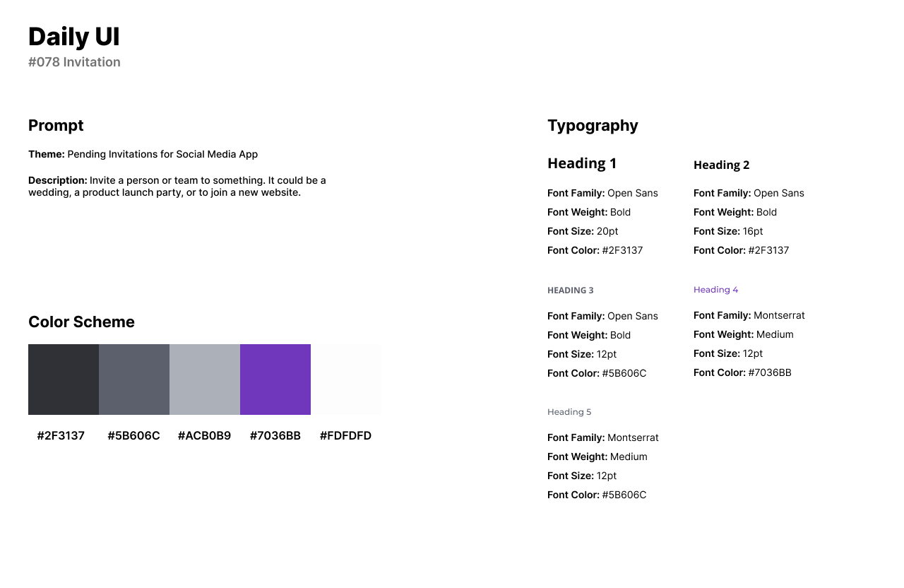
The style of the design has a purple color scheme as the primary color with black and gray for text and accents. I use Open Sans for headlines as a humanist style font that provides clarity and legibility. I use Montserrat for secondary titles because it provides a friendly pairing for Open Sans.
The Invitation UI features a list of new and older invitations for the user to accept or deny. Each card or invitation has the user’s profile image to the left. The user’s full name and number of mutual friends are next to the profile image. To the right of the card, users can select the checkmark or x-mark to accept or deny the invitation.
#079 | Itinerary
For the seventy-ninth design challenge, Itinerary, I designed a mobile trip planner app. The trip planner app is similar to a scheduling app but specifically for travel. Users can create itineraries for their trips and discover the community’s itineraries for any city.
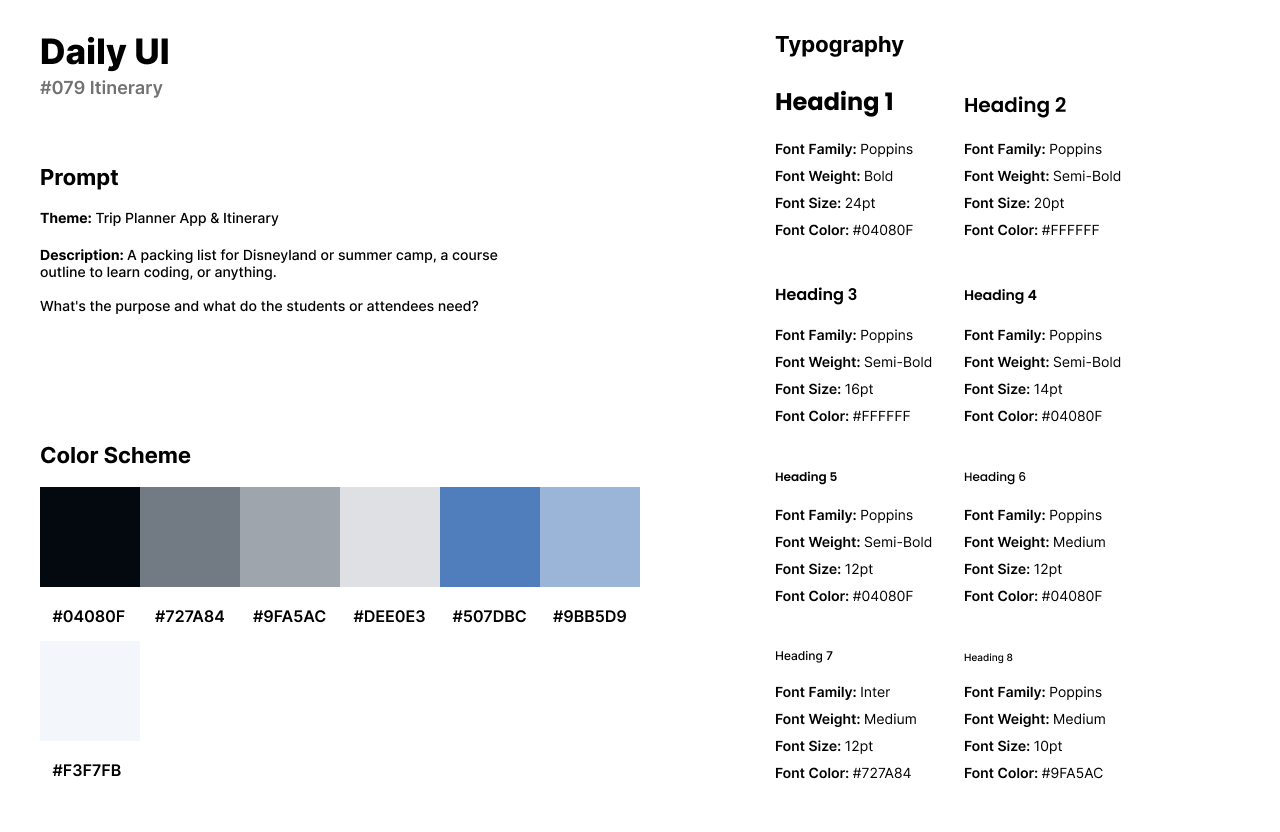
The design of the trip planner app has a cloudy blue color palette as the primary theme color with accents of gray and light blue. The app has Poppins as a font for headlines and body text because Poppins is a clean and modern Sans-Serif font perfect for mobile applications.
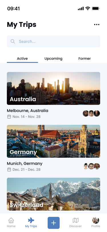
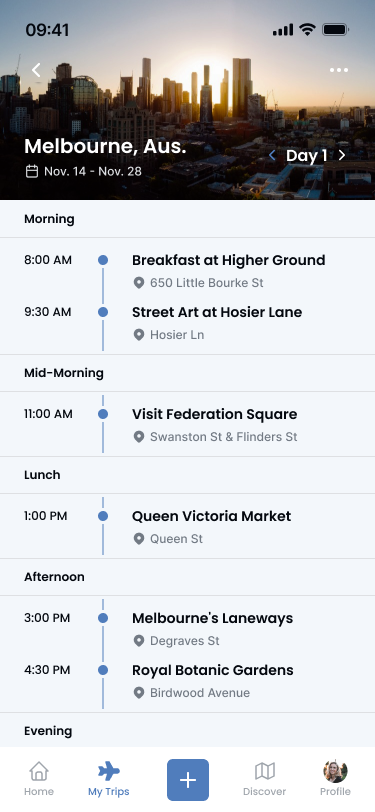
The first screen is the My Trips screen which has all the user’s active, upcoming, and former trip itineraries. Each card has an overlay image of the county or city, the dates for the whole trip, and any users going on the trip. The user taps on a trip and is directed to its itinerary. The itinerary’s layout has the whole day planned out for the user from morning, mid-morning, lunch, afternoon, and evening.
#080 | Date Picker
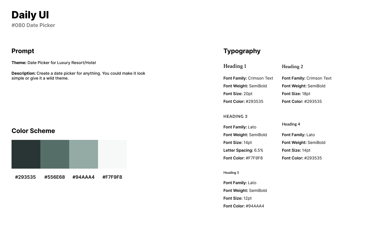
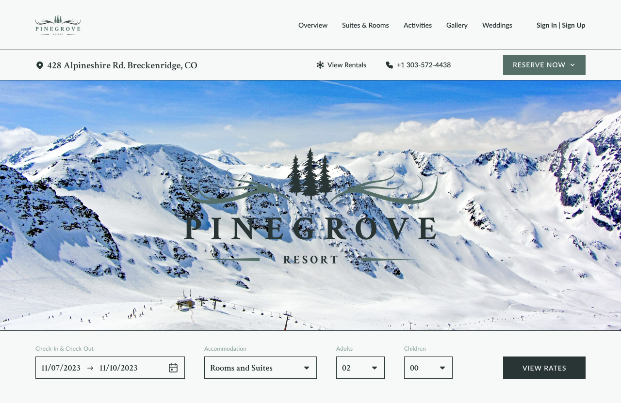
Daily UI’s eightieth design challenge is a Date Picker. For the theme of the challenge, I created a luxury resort called Pinegrove Resort. The resort resides in the mountains of Breckenridge, Colorado but the current design of the website takes place in the winter season.
The style of the design has a muted forest green color scheme. The logo’s illustrations are from Adobe Photos and the background image is from Pexels. For the logo and body text, I use Crimson Text for its sophisticated aesthetic and readability. I use Lato for menu links, headlines, and CTA buttons for its modern and polished design.
The design consists of the resort’s navigational links and information at the top of the screen with a background image of snowy mountains below. The Date Picker design is hidden by the Check-In/Check-Out input field. Once the user taps the calendar icon, the date picker screen will pop up. Once the user fills out the information, they can click View Rates to be directed to Suites and Rooms.
