Daily UI: #061 - #070
#061 | Redeem Coupon
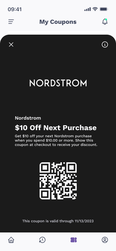
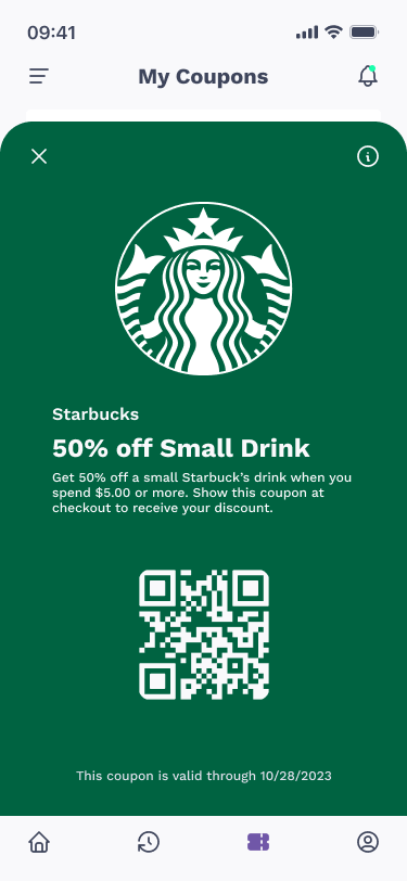
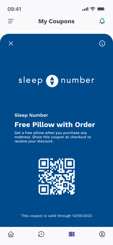
The sixty-first design challenge by Daily UI is a Redeem Coupon UI. For the theme of the challenge, I designed a coupon app. The coupon app gives their users coupons for a variety of stores where they can redeem the coupon in the store and through the app.
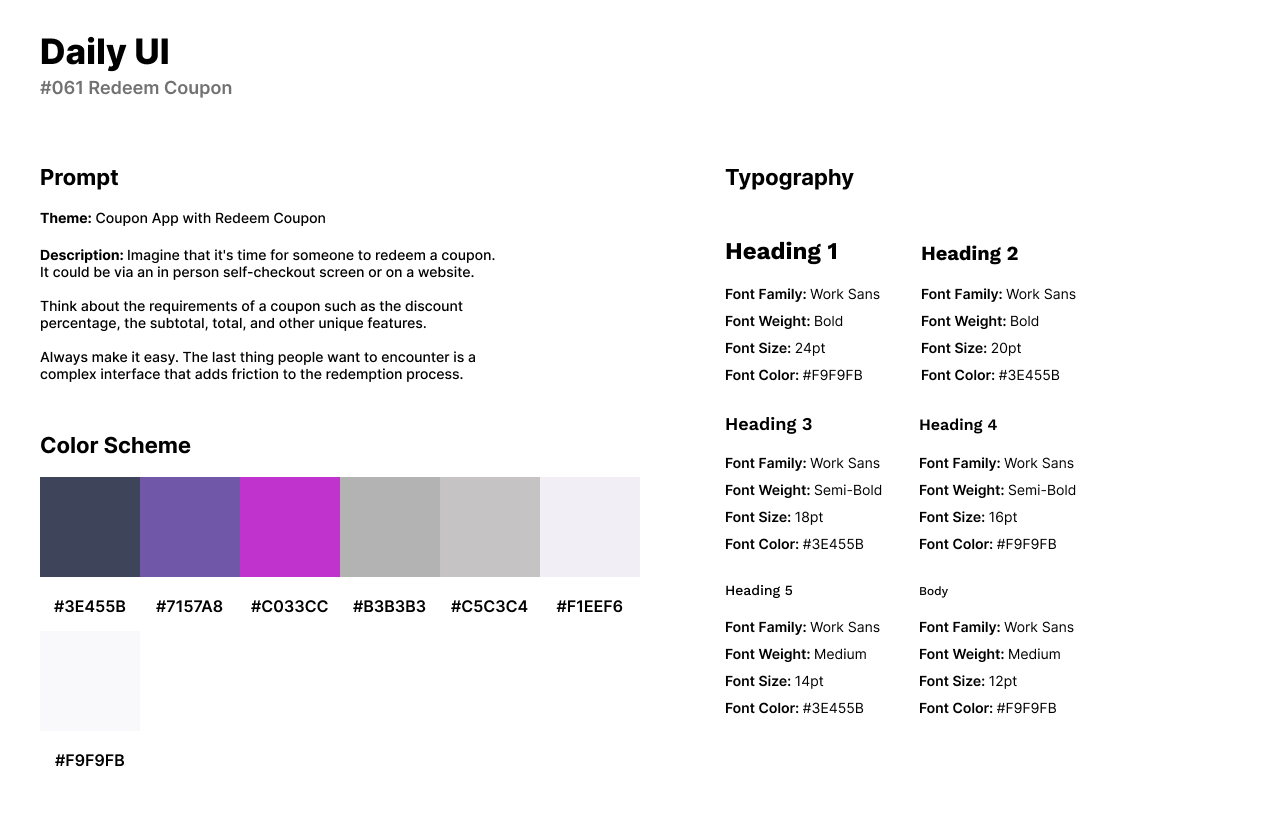
The style of the design has a purple and magenta color palette with light grays. I use Work Sans for headlines of the app’s interface. Work Sans is also used in the coupon’s cards as a bold font with personality.
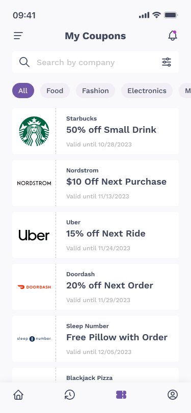
The design challenge consists of four screens. The first screen is the coupon screen where users can browse for coupons under any category: Food, Entertainment, Electronics, etc. Each card features the company’s logo to the left. To the right of the coupon card, the percent of the item is offered with the coupon’s expiration date. The three “Redeem Coupon” designs are pop-up screens where the business can scan the QR code. The design of the coupons change based on the company’s logo color.
#062 | Sign Up Form
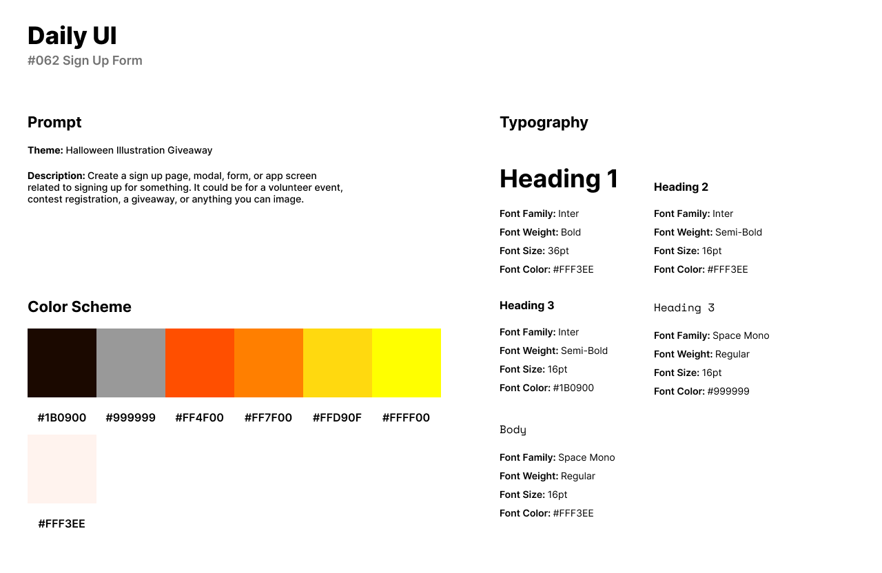
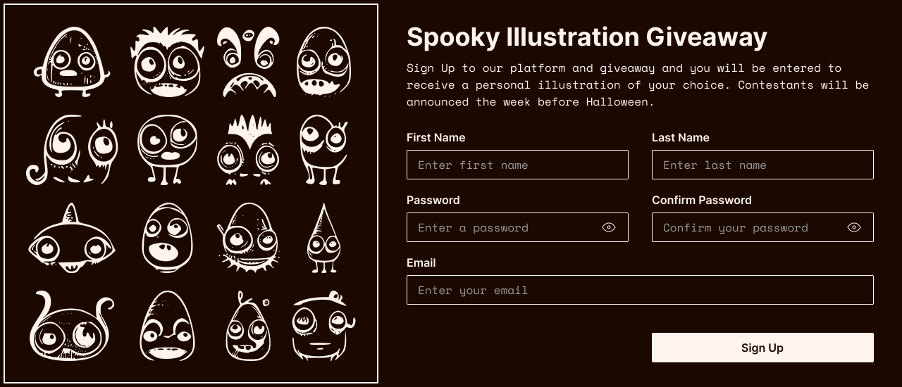
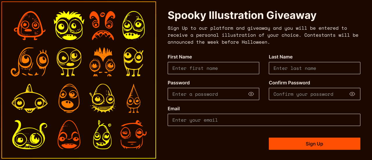
The sixty-second design challenge by Daily UI is a Workout of the Day UI. However, Daily UI emailed me a Sign Up Form as the next challenge. For this challenge, I designed a sign up form for a Halloween Illustration Giveaway.
The style of the design has a Halloween theme so I used a color palette of orange and black. For headlines, I use Inter as a clean and readable Sans-Serif font. For body text, I use Space Mono as an eerie typewriter style for the Halloween theme of the form.
The form contains illustrations from Adobe Photos to the left of the design. The form asks for the user’s first and last name, password, and email before the user can sign up for the giveaway.
#063 | Best of 2022
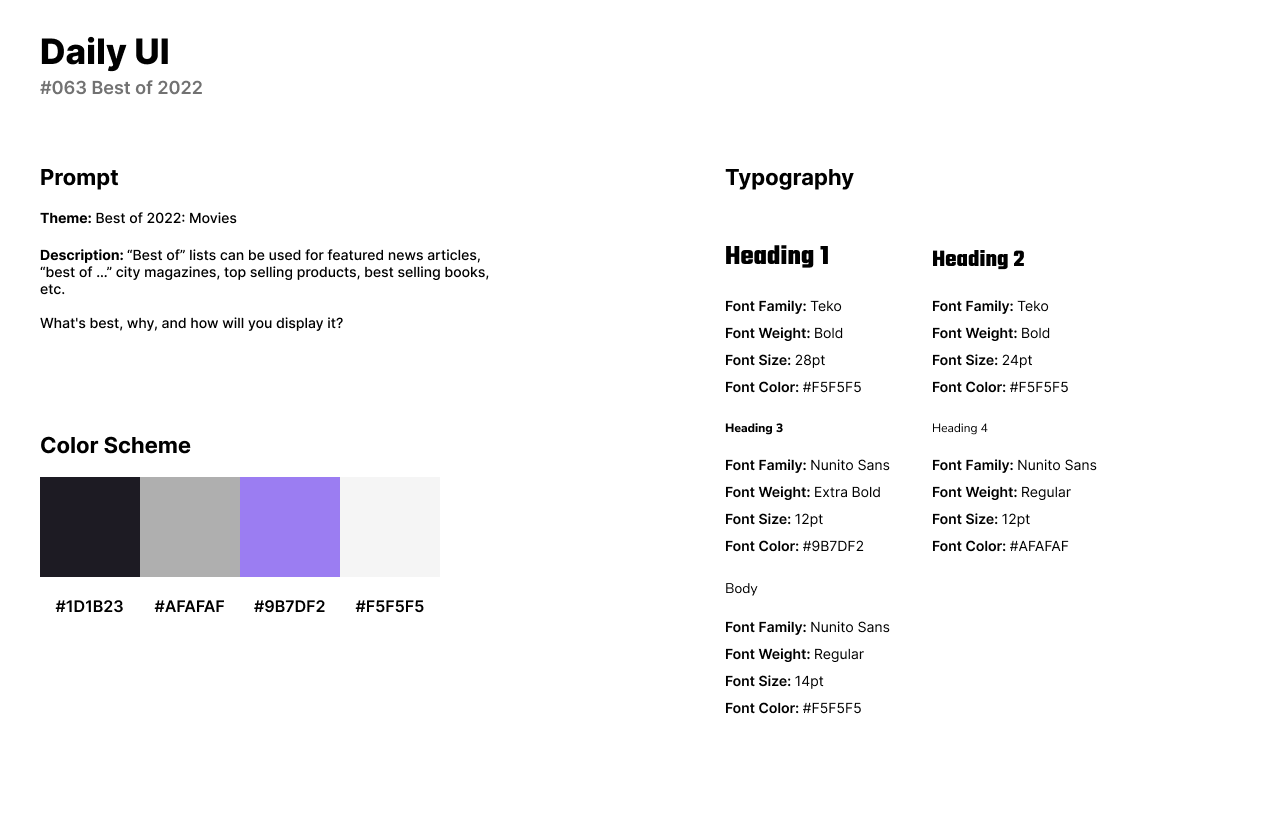
The sixty-third challenge by Daily UI is a Best of 2022 UI. For the theme of the challenge, I designed a Best of 2022 list for movies. I created a company called Space Tek which is a technology and entertainment platform.
The style of the design is a dark themed UI with a neon purple accent and white for text. I use Teko for headlines as a thick and bold font that stands out for article titles. For body text and secondary titles, I use Nunito Sans as a lighter Sans-Serif font.
The design consists of a list of the top horror movies of 2022. The article features a wide placeholder image of one of the movies in the list with a description of the article’s content below. The list is entirely my own personal preference with images from Google.
#064 | User Selection
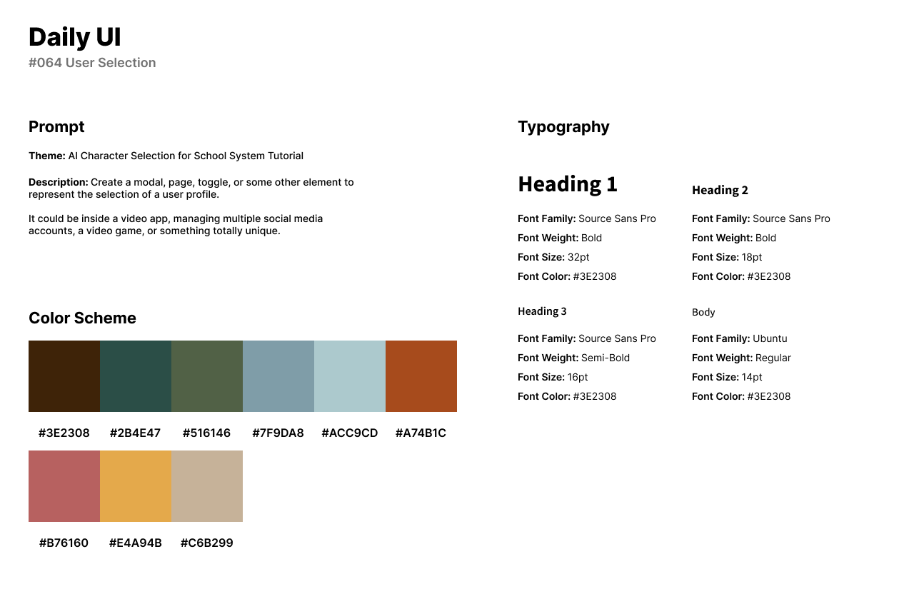
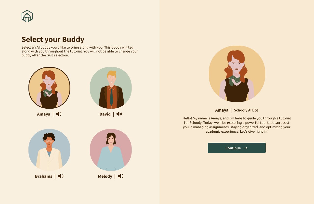
Daily UI’s sixty-fourth design challenge is a User Selection screen. For the design, I created an AI character selection for Schooly, a schooling software’s tutorial. The system asks users or children to choose a character who will guide them on how to use the software for their digital homeschooling.
The style of the design has a 70’s or vintage themed color palette with a variety rusty and dark colors. Source Sans Pro has a fun yet readable style of font for headlines for the character’s names. Ubuntu has a playful quality while also being readable for a younger audience.
The screen features four AI characters for users to choose from. The user can click on the sound icon to hear the character’s voice. Once the user selects the character, they can read the character’s description and begin the tutorial.
#065 | Notes Widget
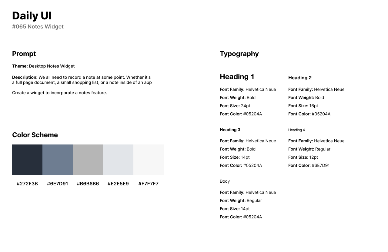
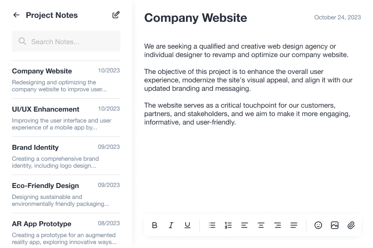
The sixty-fifth design challenge by Daily UI is a Notes Widget. For the design, I created a desktop notes widget app. The app is installed on a desktop’s system as a widget either in a window or in a corner for a pop-up.
The style of the design has a dark blue and grayish blue color scheme with a white background. I use Helvetica Neue for the font in the notes widget for headlines and body text. Helvetica Neue is a Sans-Serif font that is modern and easy to read for users.
The Notes Widget features the menu or list of previous notes to the left under the category, Project Notes. To the right of the widget, users can type out their new note and stylize the text through the text editor bar at the bottom of the widget.
#066 | Statistics
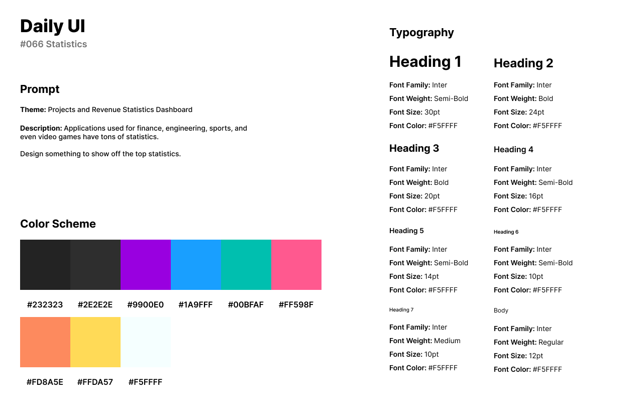
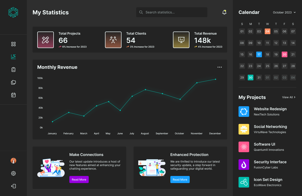
Daily UI’s sixty-sixth design challenge is for Statistics. For the design challenge, I designed a project and revenue statistics dashboard. The software manages a company’s projects, clients, and revenue.
For the style of the design, I used a dark theme for the background with a variety of bright colors to stand out from the black background. I used Inter for headlines and body text as Inter has a technology style of design that fits in well for software design interfaces.
The design features a vertical side navigation bar to the left where users can access their profile and settings. The top of the statistics dashboard has an overview of the total projects completed, total clients of the year, and total revenue of the year. The chart below features the company’s monthly revenue for the year. To the right of the dashboard, users have quick access to their calendar and current projects.
#067 | Hotel or Vacation Rental Booking
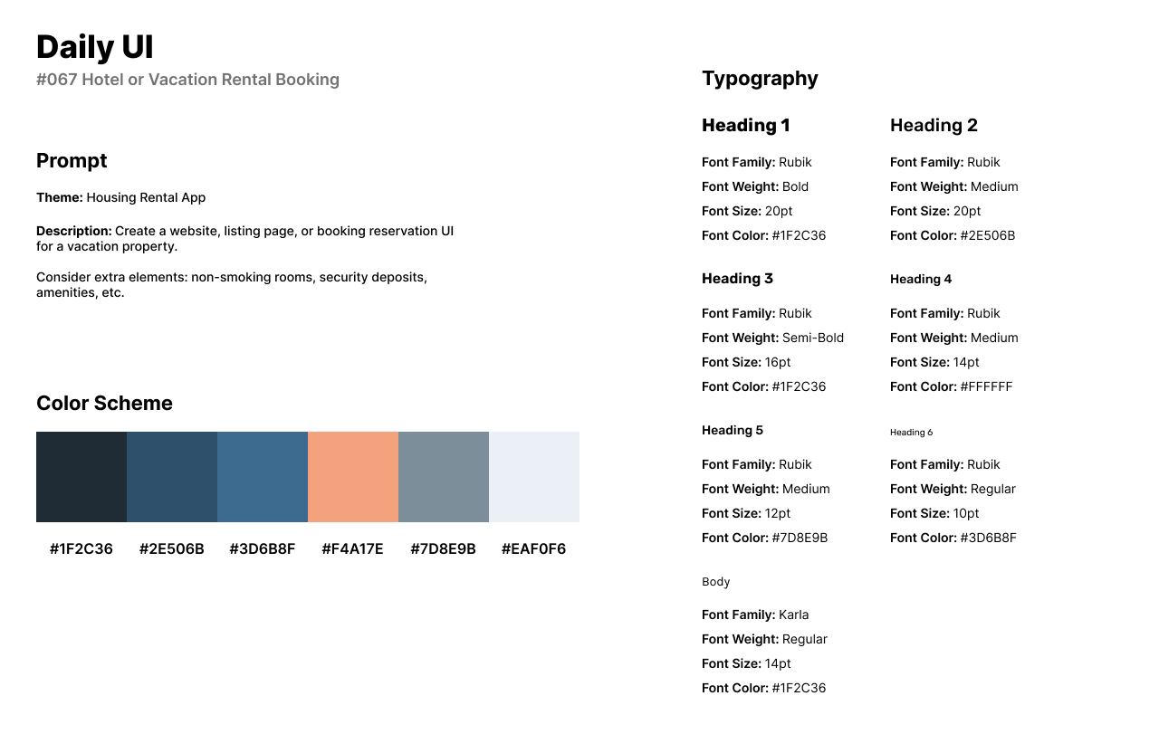
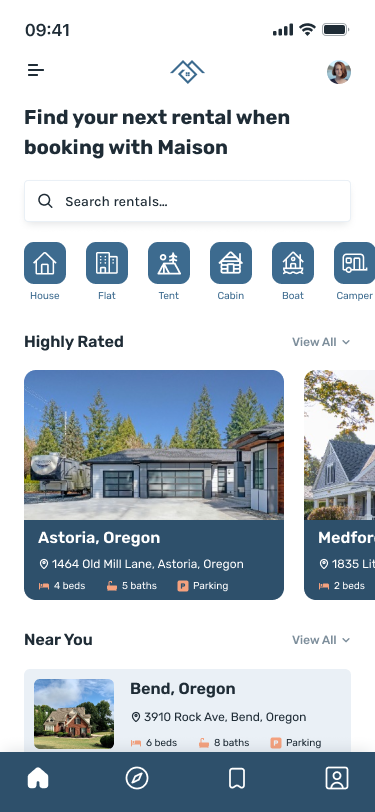
The sixty-seventh design challenge by Daily UI is a Hotel or Vacation Rental Booking. For the theme of the challenge, I designed a housing rental app. The app, Maison is for users to rent a vacation rental from house to tent.
The style of the design has a navy blue color scheme with a light orange accent. I use Rubik for headlines and secondary text as a friendly and flat style of Sans-Serif font. I use Karla for body text as a light sans-serif font.
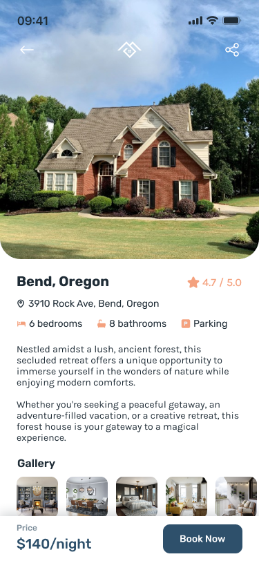
The first screen is the home screen and features a search bar at the top of the app. Users can select the type of housing they’d like to rent or view the highly rated and new options. Once the user selects their housing rental option, they will be directed to the second design. The second design features an image of the property. Below the image, users can read more about the property such as the number of bedrooms, number of bathrooms, and verification for accessible parking.
#068 | Flight Search
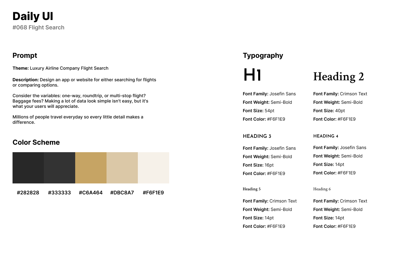
The sixty-eighth design challenge by Daily UI is a Flight Search UI. Because I designed an airline logo for the logo design challenge, I reused the luxurious airline, Avant Air for the theme of the challenge.
The style of the design uses the same color scheme as the logo design challenge of a gold and black theme. I reused Josefin Sans for secondary headlines and text while implementing the Serif font, Crimson Text for primary headlines.
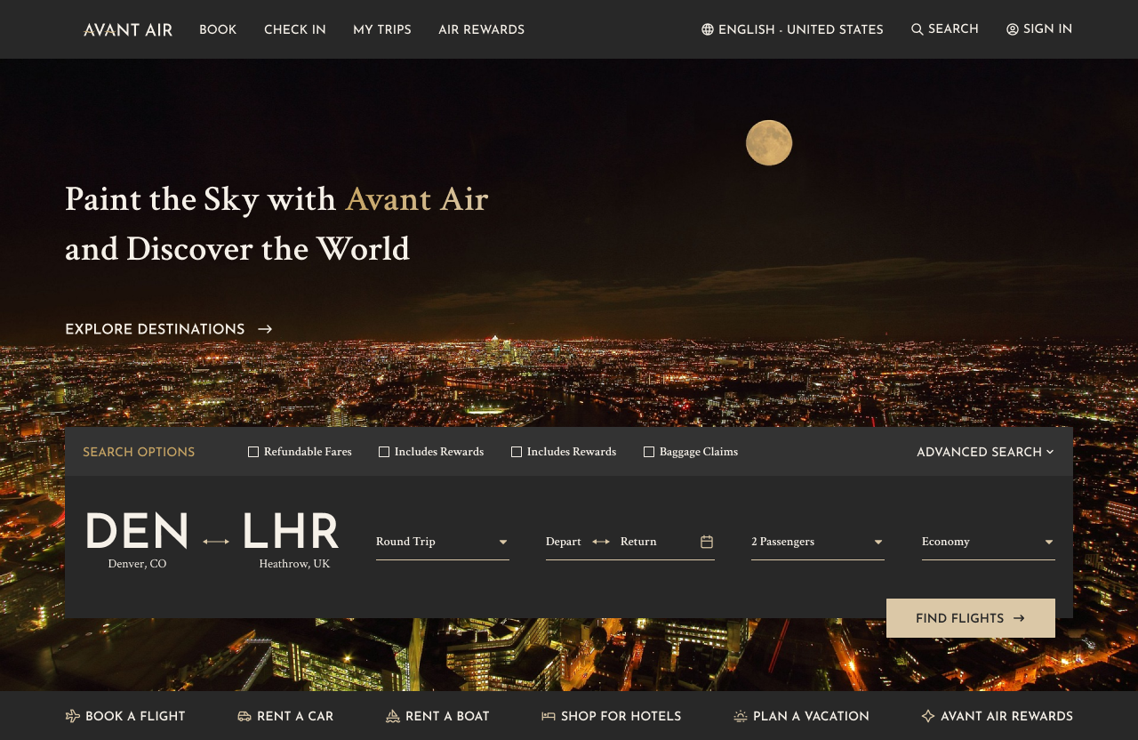
The Flight Search design is featured on the airline’s home page. A nighttime city view image expands across the screen with a catchy title above the flight search. The form asks for the user to choose their two locations, round trip, departure/return, number of passengers, and seat before directing the user to another page with flights according to the form’s responses.
#069 | Trending
Daily UI’s sixty-ninth challenge is a Trending UI. For the theme of the challenge, I designed trending articles on a gaming news websites. News websites typically feature tags for most recent, popular, and trending in a list format.
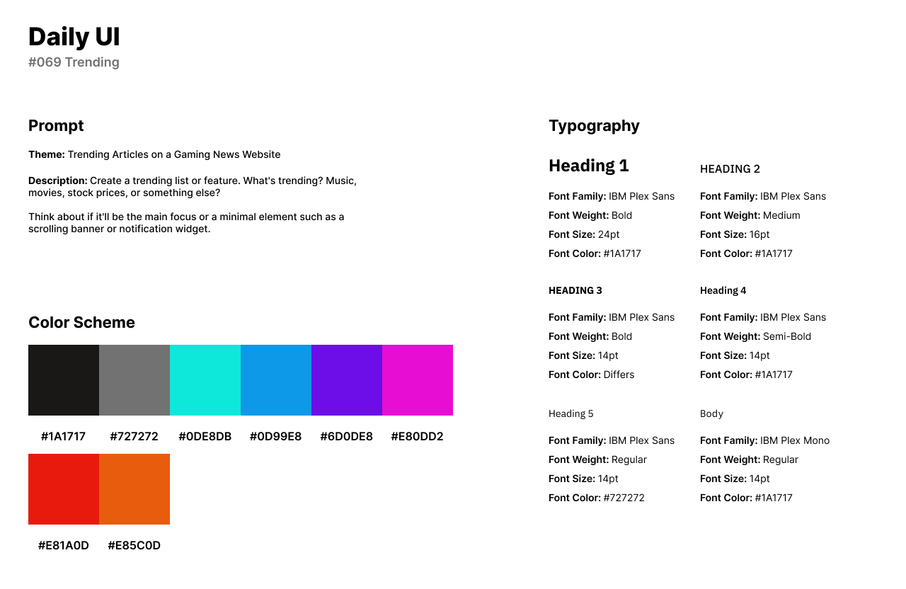
For the style of the design, I used a bright and neon color palette with a primary red and black palette for the website’s main theme. I use the IBM Plex family’s Sans and Mono fonts for a modern and olden style of design.
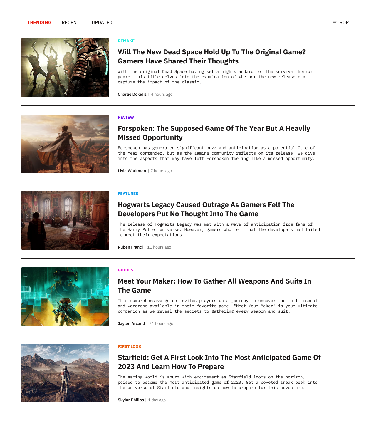
The design features a navigation for articles trending, recent, and updated. Each article card features an image to the left with different colored categories. The cards contain the article’s title, description, and author’s name.
#070 | Event Listing
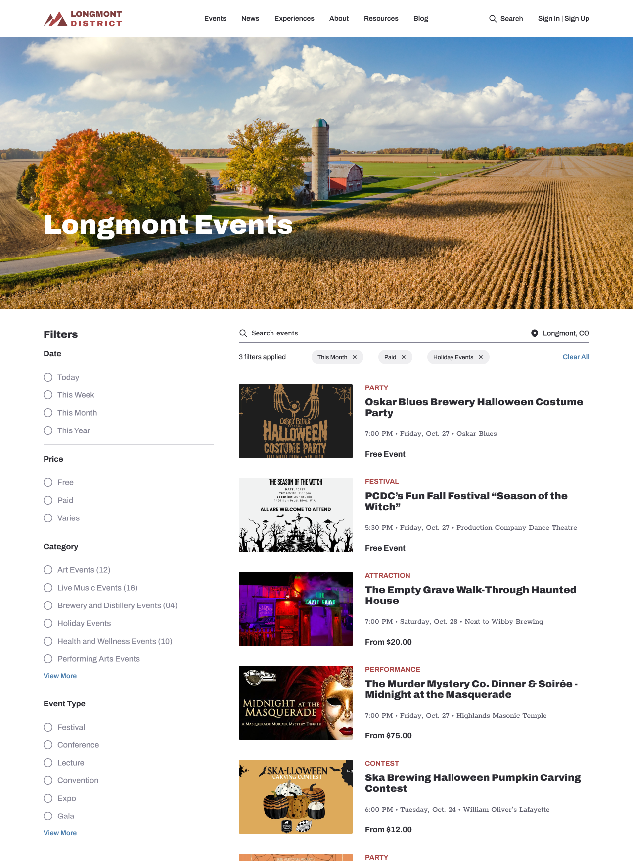
The seventieth design challenge by Daily UI is an Event Listing. At the time of the design it was October so I designed an event listing page for Halloween events for cities in my state. I created a website for news and events about Longmont, Colorado called Longmont District.
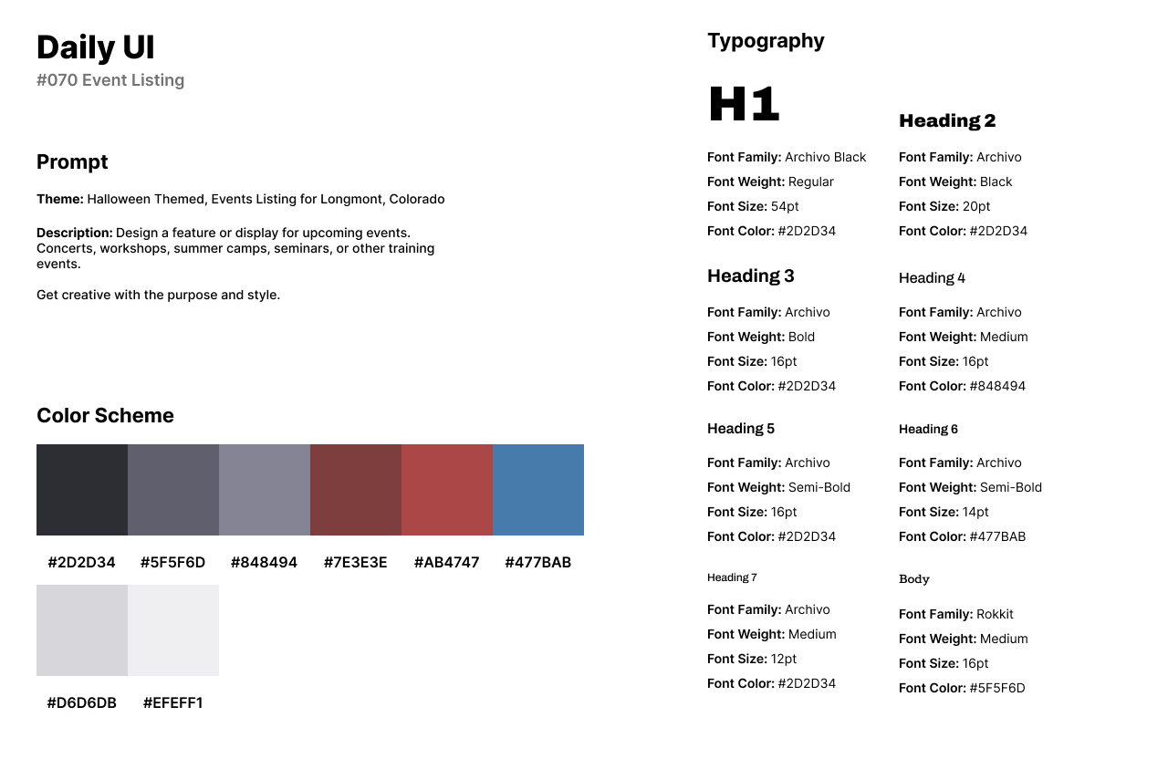
The style of the design is a dark red color palette with blacks and grays. A muted blue is used for links. The events listing design has Archivo Black as a bold and heavy font. I used Rokkit for body text as a well-rounded Serif font pairing with Archivo Black and Archivo.
The events listing page features an expanded image from Adobe Photos. To the left of the design, users can sort through the filters to adjust the events to their preference. Users can also search for events through the search bar. Each card contains the event’s cover image to the left, the category, title of event, date and time, and price of the event.
