Daily UI: #051 - #060
#051 | Press Page
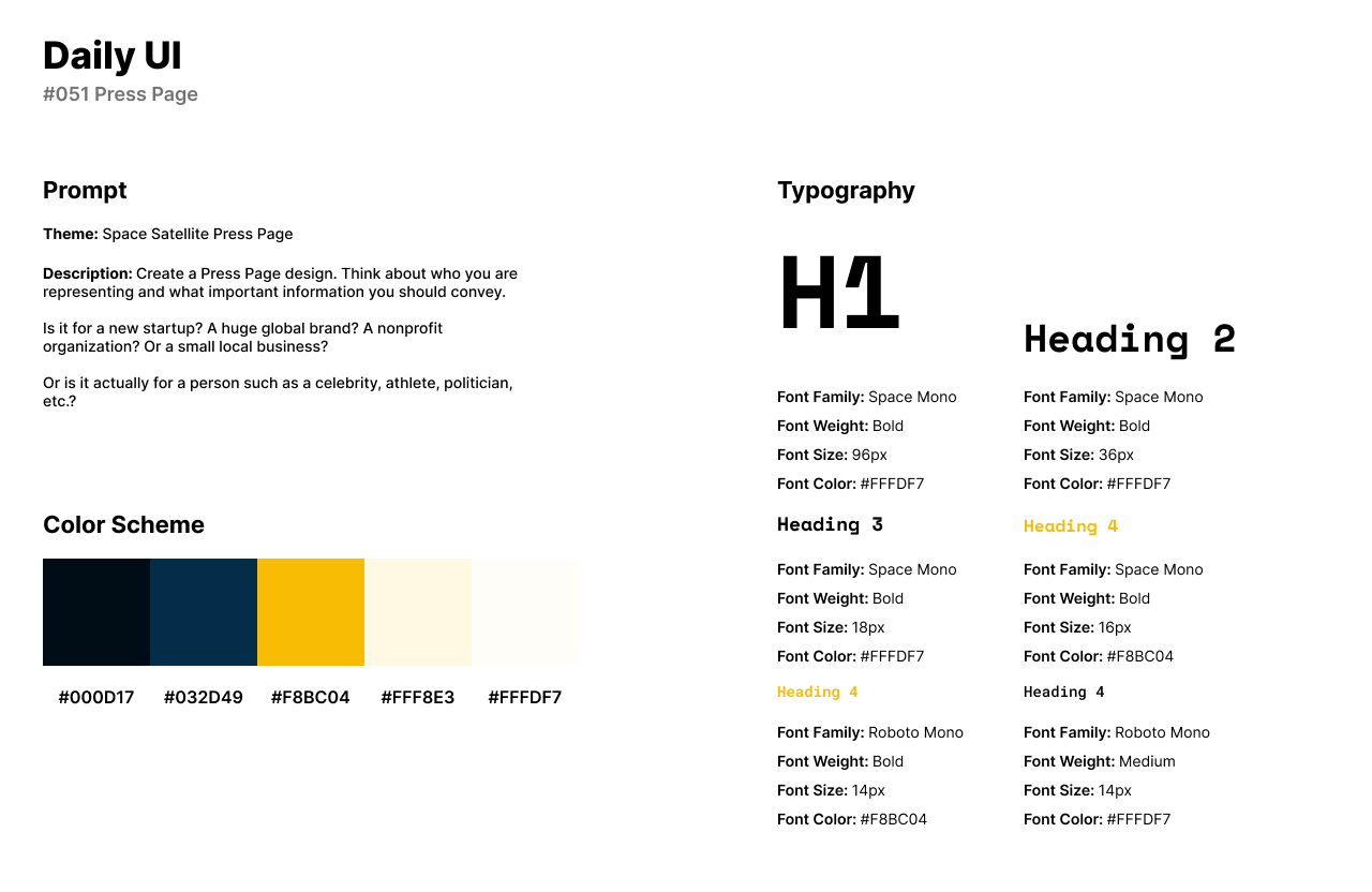
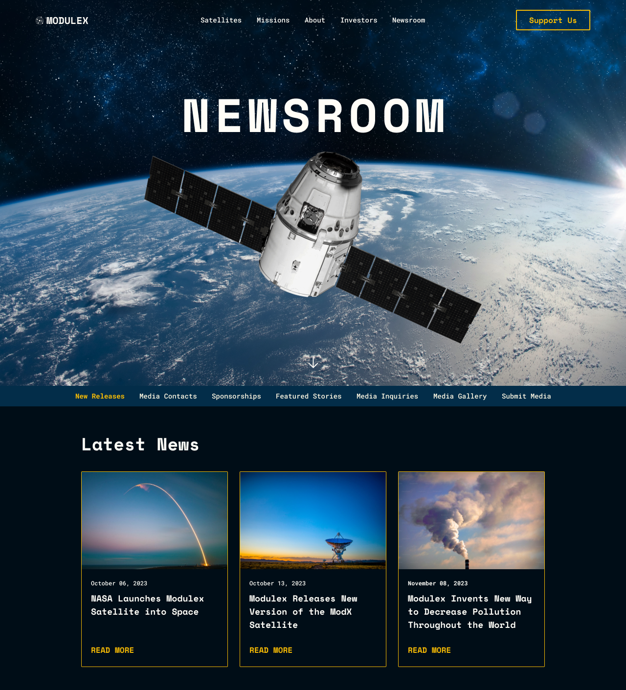
Daily’s UI’s fifty-first design challenge is a Press Page. For the theme of the press page UI, I designed a space satellite company’s press page. Modulex is a company that sells space satellites and goes on missions to launch their satellites into space.
The style of the Press Page has a dark navy blue and vibrant yellow color palette. For fonts, I use Space Mono for headlines as a bold and display font for the space theme of the design. For body text and secondary titles, I use Roboto Mono because it adds personality to the titles of articles below the main screen.
The Press page features a cover image that expands throughout the main page. Below the image and Newsroom title, users can browse the page’s navigation titles. The articles featured on the press page are about the latest news involved for the company.
Images are by Adobe Photos and Unsplash.
#052 | Logo Design
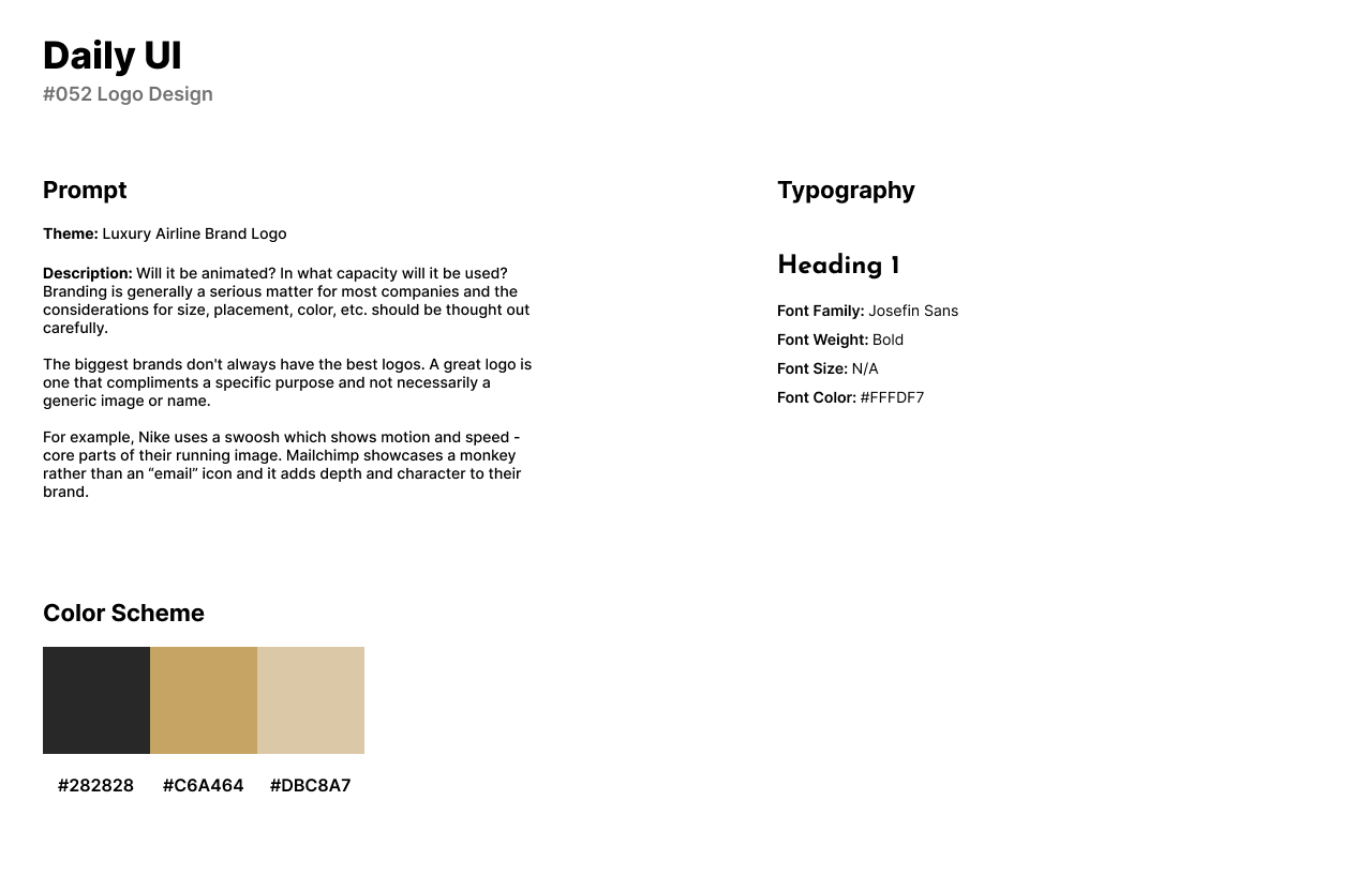
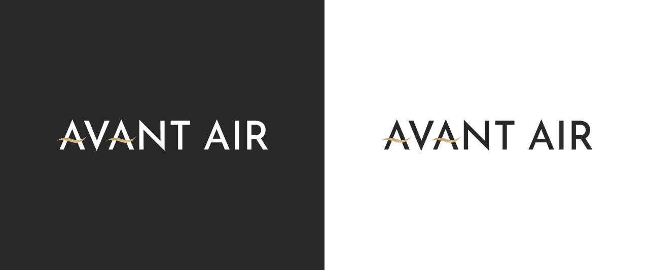
Daily UI’s fifty-second challenge is a Logo Design. For the theme of this challenge, I created a luxury airline company called Avant Air. The name of the company is about painting in the sky through the streaks airplanes can leave behind, thus including the word Avant.
The style of the logo is a word-based logo design which has a color scheme of gold and black to pair with the luxurious airline’s theme. I use the font Josefin Sans with slight letter spacing to maintain a modern theme. The golden swirls or arches on the letter A’s represent wind and movement in the airline’s logo.
#053 | Website Navigation
The fifty-third design challenge by Daily UI is a Website Navigation UI. For the theme of this challenge, I designed a navigation bar for desktop and mobile for a design agency that provides design services to their clients.
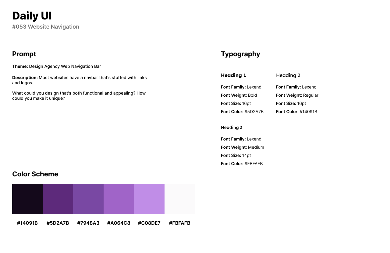
The style of the navigation bar has a friendly theme of purples for their color scheme and the Sans-Serif font, Lexend. Lexend has a friendly style with curves and geometry while the purple color scheme is calming and trustworthy.
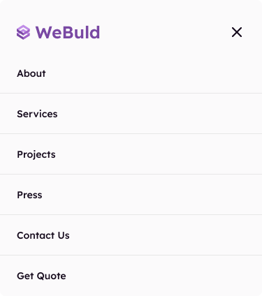
The website navigation bar has the company’s logo, WeBuld to the left with the navigation links to the right: About, Services, Projects, Press, and Contacts. The Call to Action button asks the user to Get a Quote for their design. The mobile navigation includes the same elements from the website navigation but the links and logo are stacked on one another.

#054 | Confirmation
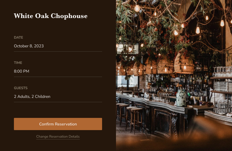
Daily UI’s fifty-fourth challenge is a Confirmation UI. For the theme of the challenge, I designed a restaurant reservation confirmation. White Oak Chophouse is an upscale restaurant specifically known for their steak and wine.
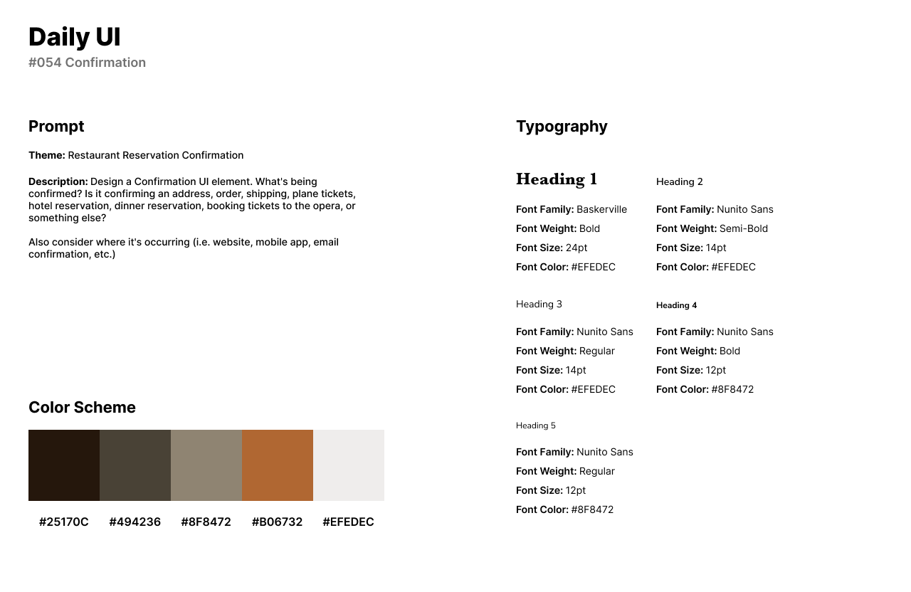
The style of the design has a dark theme of black, gray, and orange accents. The card features an image of the restaurant from Adobe Photos. For fonts, I use the Serif font Baskerville for White Oak Chophouse’s logo or headline. Nunito Sans is used for secondary titles in the input fields, CTA buttons, and input field body text as an all-caps and lower caps font.
The design features the restaurant’s image of the interior to the right from Adobe Photos with the form to the left. The form asks for the date, time, and number of guests before the user confirms their reservation.
#055 | Icon Set
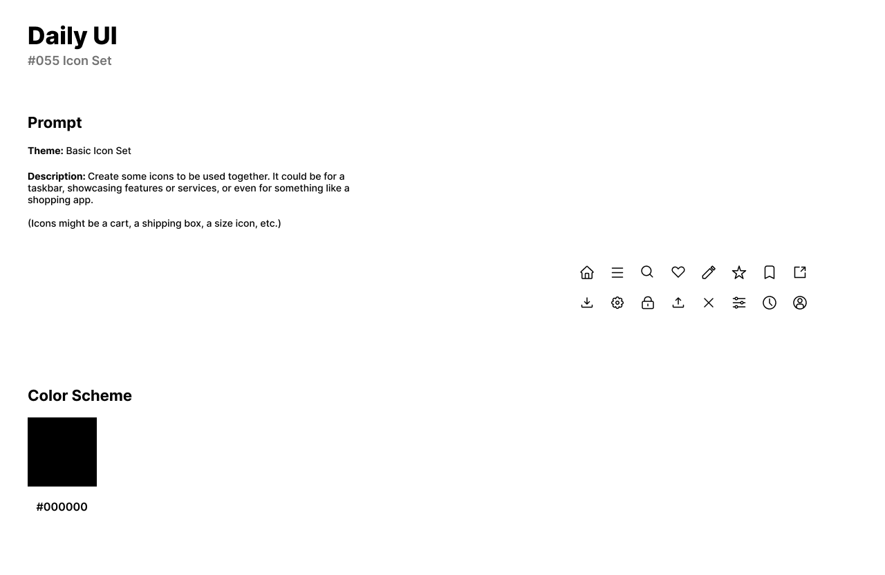
The fifty-fifth design challenge by Daily UI is an icon set. For the theme of the challenge, I designed a basic icon set. The icon set can be used for any application as the icons are typically featured in an interface.
For the icon set, I designed sixteen icons: Home, Menu, Search, Heart, Pen, Star, Bookmark, New Window, Download, Settings, Lock, Upload, Cancel/Close, Sort, Clock, and User.
Each icon has a size of 24px by 24px with a 2pt stroke and #000000 color scheme. The icons stroke size and color can easily be changed by the user to fit their needs.
#056 | Breadcrumbs
The fifty-sixth design challenge by Daily UI is a Breadcrumbs UI. For the theme of this challenge, I designed breadcrumbs for a retail store. Breadcrumbs are featured on an interface as a navigational aid that helps users understand their location within a website or mobile app. They typically appear horizontally at the top of a page and display the horizontal trail from the home page to the current page.
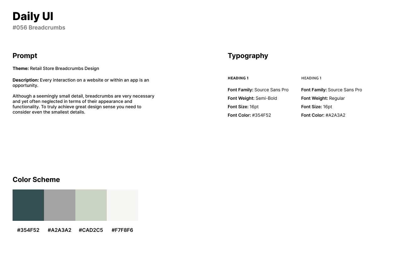
The style of the design has a forest green color choice for the selected text or page while the previous pages or non-selected text is a light gray color. The dividers in the two designs are a mint green or lightened version of the forest green color and the background is an off-white or cream color. For the font’s titles, I use Source Sans Pro as a clean and accessible Sans-Serif font in all caps.
The two breadcrumb UI’s feature links from Women’s (Clothing), Clothing, Sweaters, and Cashmere. The two designs differ from the dividers. The first design has filled-in arrows as the divider while the second design has a forward slash in place of the arrows.


#057 | Videoplayer
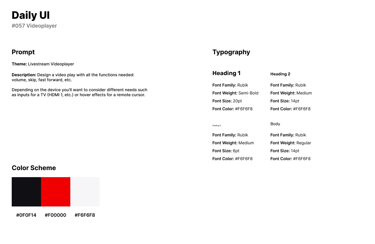
Daily UI’s fifty-seventh design challenge is a Video Player. For the theme of the UI, I designed a video player for a livestreaming platform. Users can livestream content of their choice on the livestreaming platform.
The style of the design has a brief color scheme of black, red, and white as the primary color for the video player’s icons. Rubik is used in the design for headlines and body text, as well as the number of viewers watching the stream.
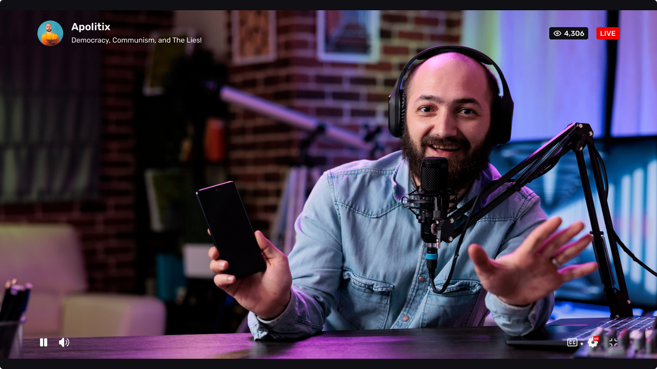
The Video Player UI has the streamer’s username and title of the stream in the top left corner. Viewers can see the number of people watching the live stream to the right and will know the stream is live through the red label. The main focus of a video player is the icons or components seen in the bottom of the screen, Pause/Play, Sound, CC, Settings, and Full/Minimize Screen.
#058 | Shopping Cart
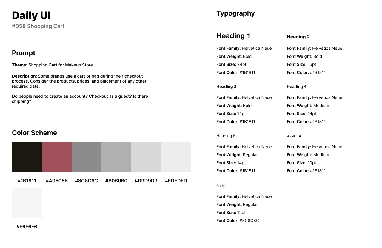
Daily UI’s fifty-eighth challenge is a Shopping Cart UI. I designed a Shopping Cart UI for a makeup store. Users can purchase any brand of makeup through the store’s website or app, similar to any retail store that sells makeup items like Sephora or Ulta.
The style of the UI has a dark red color scheme with gray and black for icons and text. Helvetica Neue is a Sans-Serif font that has a modern and sharp style of font which is used in the headlines and body text.
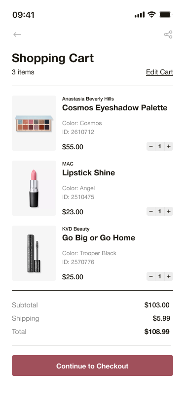
The Shopping Cart screen has a list of the items added into the cart with their image, brand, title of product, color, ID number, and price. Users can adjust the quantity with the minus and plus icons to the right of the item. The subtotal and shipping information can be viewed below the list of items, and then the user can purchase the items through the CTA button.
#059 | Background Pattern
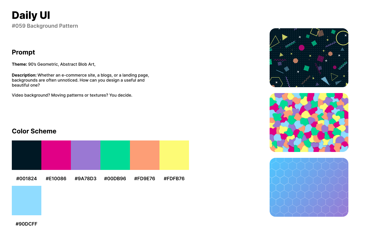
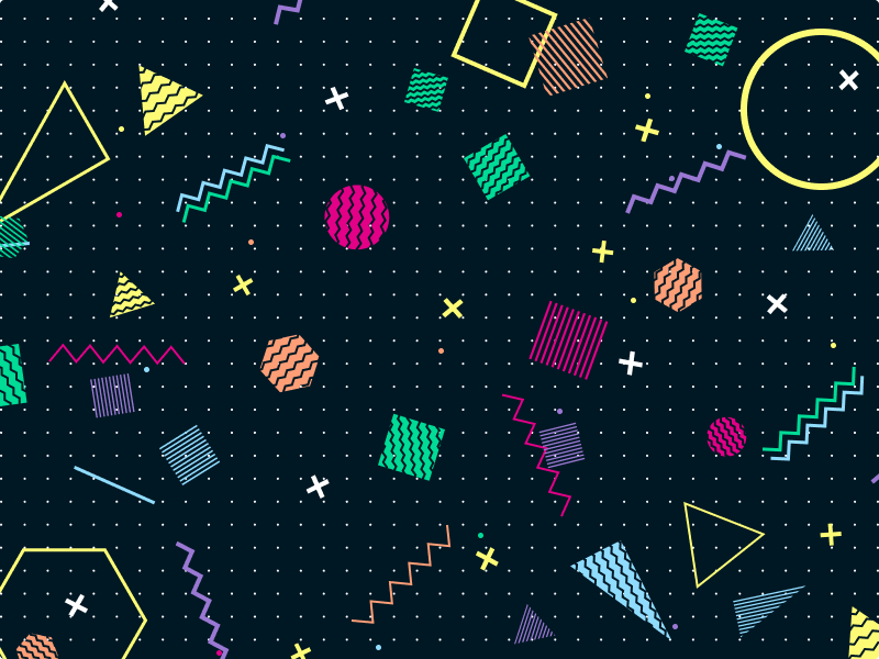
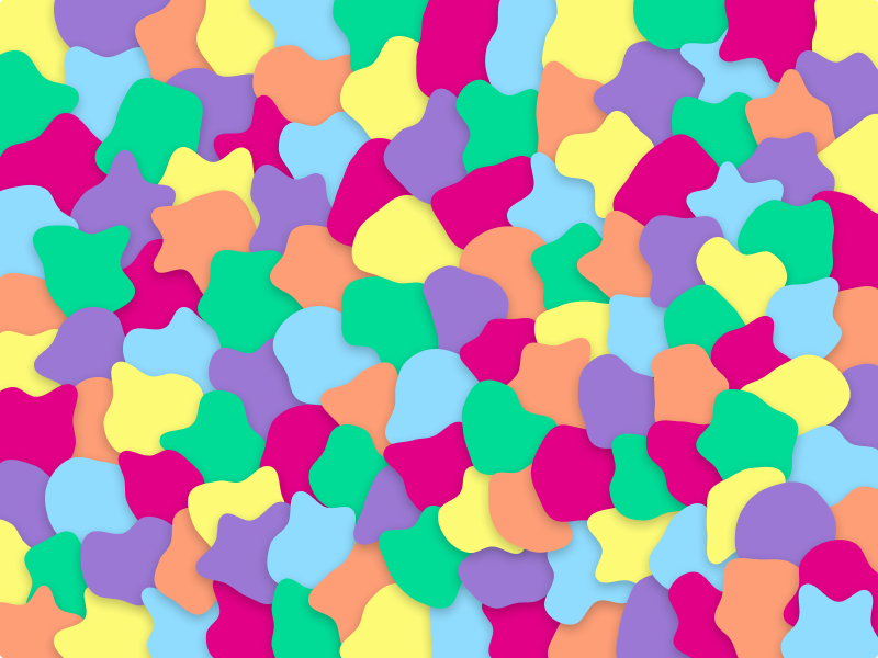
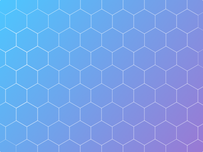
The fifty-ninth challenge from Daily UI is a Background Pattern. For the theme of the design challenge, I designed three patterns. The firsts pattern is a 90’s and geometric themed pattern. The second pattern is an abstract blob art themed pattern with drop shadows for a 3D effect. The third pattern is a geometric or honeycomb shaped pattern with a blue and purple gradient.
The style of the patterns uses a bright, vibrant, and colorful color palette. I created multiple shapes with different properties. The shapes have fills, fills with strokes, and stroke with no fill. The background of the first pattern is a white dotted and black background and has shapes of different properties. The second pattern has blobs or organic shapes with drop shadows giving the shapes a 3D effect. The third pattern uses a non-filled hexagon with a white stroke over a blue and purple gradient background.
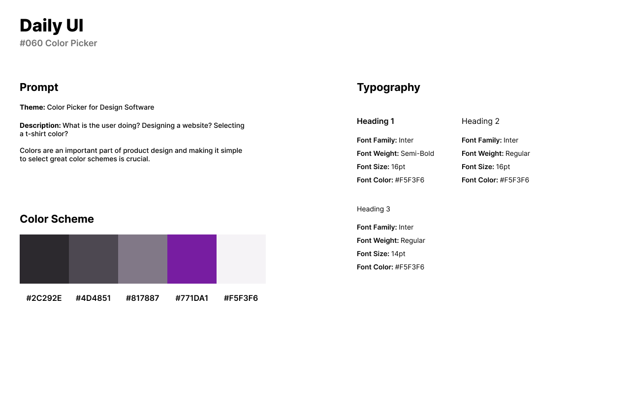
#060 | Color Picker
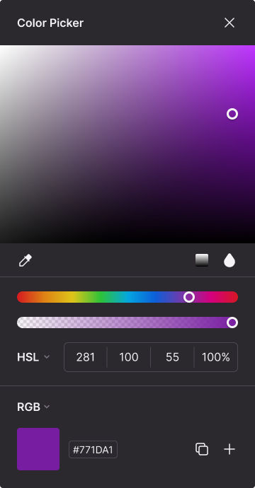
Daily UI’s sixtieth design challenge is a Color Picker. I designed a Color Picker interface for a design software where users can choose and save colors to a color palette. Users can use the color picker and adjust the specific color’s Hue, Saturation, Lightness, and Percent.
The style of the design is a dark theme of black and gray. For the color picker’s font, I use Inter as Inter is easily accessible and readable in design software for text and numbers over a white or black background.
The UI has the gradient or color and shade of the selected color with an opacity bar. The user can select, the type of color while adjusting the color’s properties. The user can create color palettes within the color picker or copy the number code and paste within the design software.
