Daily UI: #041 - #050
#041 | Workout or Exercise
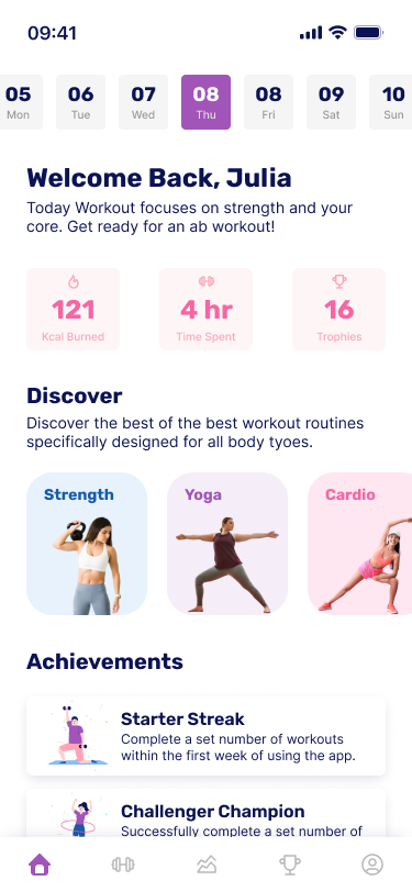
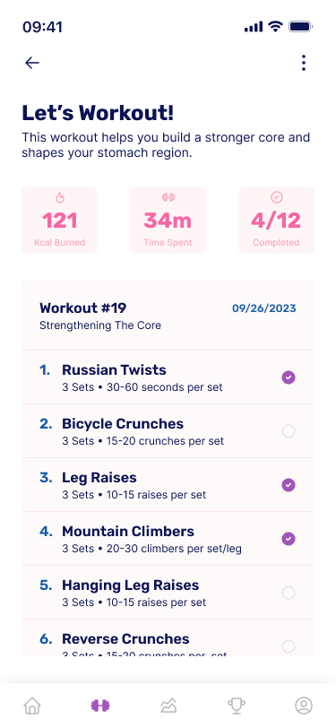
The forty-first design by Daily UI is a Workout/Exercise UI. For this challenge, I designed a friendly and bubbly themed exercise tracker where users can track daily exercises and receive exercise templates from the app.
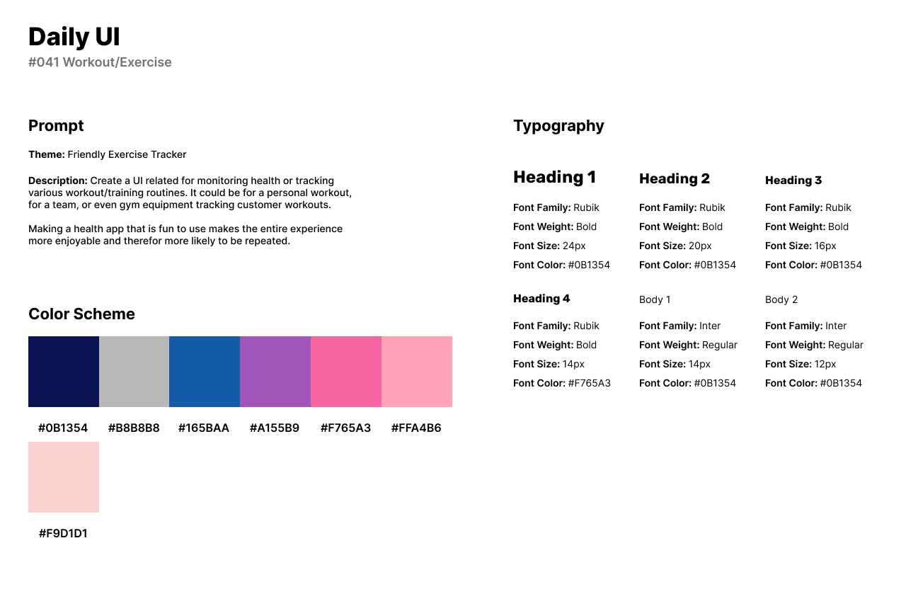
The style of the design has a bright color scheme of blue, purple, and pink with a dark blue color for text. For fonts, I used Rubik for headlines and titles as it is a funky-styled Sans-Serif font. Because I wanted Rubik to be the font that stood out, I used Inter for body text.
The exercise tracker’s first screen is the home screen that has the user’s daily calories burned, time spent exercising, and trophies earned. The user can discover new types of workouts while also viewing their achievements earned.
The second screen of the app is the workout tracker and has an exercise template for the user to follow. The app provides the user with a list of exercises to complete every day. When the user finishes the exercise, they will earn an achievement.
#042 | To-Do List or Manager
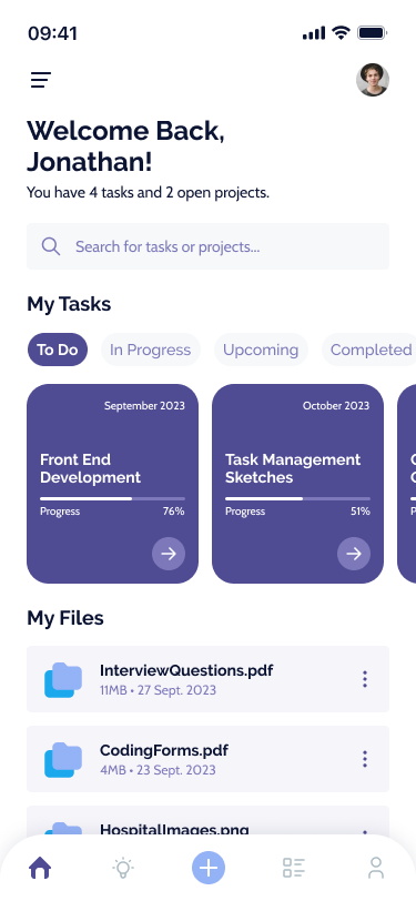
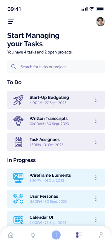
For the forty-second design by Daily UI, I was challenged to design a To-Do List or Manager UI. I designed a Task & Project Management mobile app for users to manage their tasks or projects, secure their files, and organize their tasks by: To Do, In Progress, and Completed.
The style of the UI uses a purple and blue color scheme as the colors provide a calming combination when working with complex or stressful tasks or projects. I use Raleway as a friendly and stylized font for headlines and titles with Cabin being used for secondary titles and body text as a flatter Sans-Serif font.
The first screen is the home screen which consists of a search bar for browsing tasks or projects. Users can easily access their current tasks by the categories provided as well as any files they’ve uploaded to the platform.
The second screen is the Task Overview screen which features all current tasks by the three categories: To Do, In Progress, and Completed. Each task has the due date and due time with individual icons and colors.

#043 | Food Menu Items
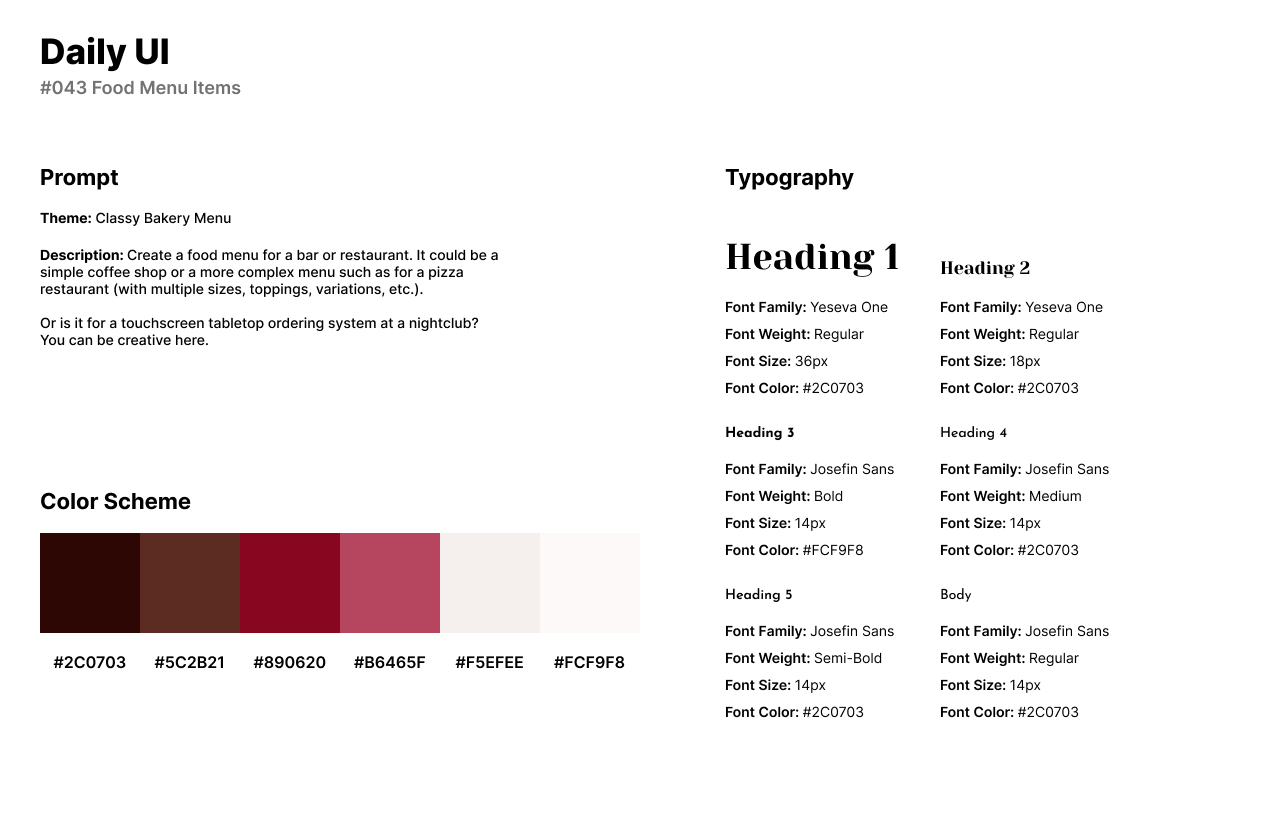
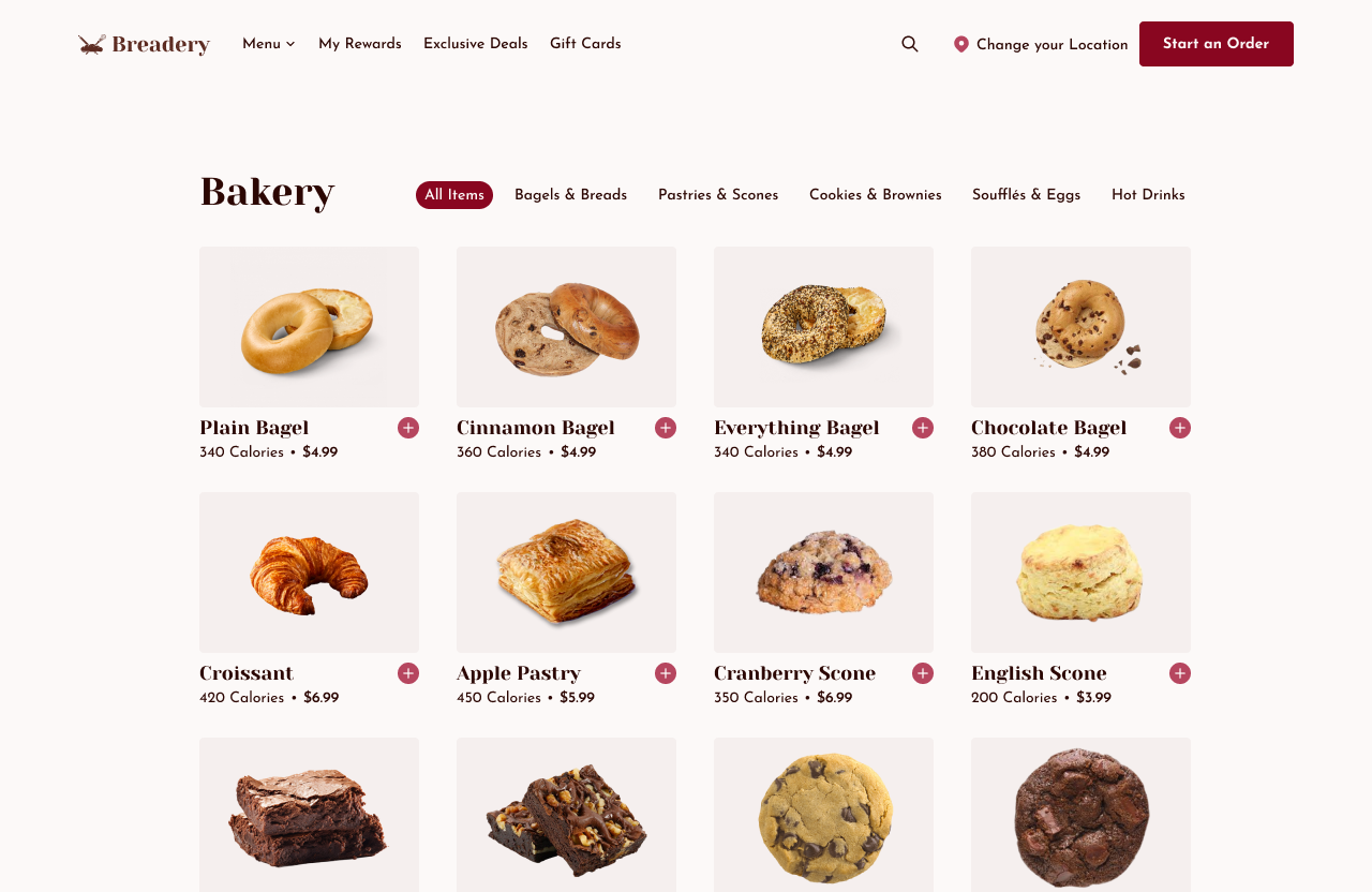
Daily UI’s forty-third challenge is a Food Menu Items UI. For this challenge, I created a bakery company called Breadery that sells a variety of baked goods from bagels to brownies. Breadery’s website allows users to start an order online and add items to a shopping cart to order online.
The UI’s style has a dark red color scheme with a dark pink for accents and brown for body text. To be in line with a classy and comforting theme for a bakery, I used the Serif font Yeseva One for headlines. I used Josefin Sans for secondary titles and body text as a circular and sociable Sans-Serif font.
The Food Menu UI features images of the baked goods under their selected category. Under each card, users can view the title of the baked good, caloric information, and price. Users can start an order with the top right CTA button where they can add the baked goods to their cart.
#044 | Favorites
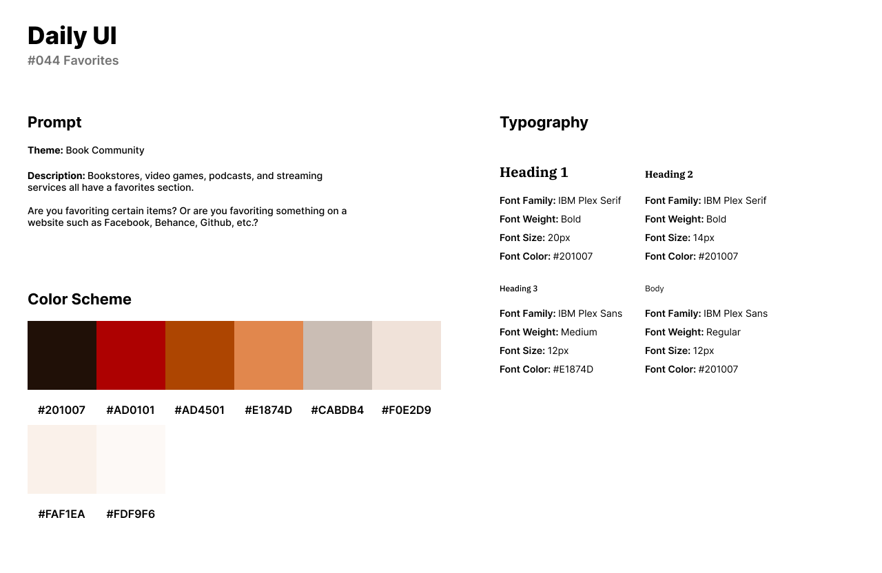
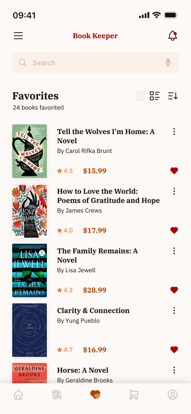
The forty-fourth challenge by Daily UI is a Favorites UI. For the theme of this challenge, I created a Favorites screen for a book community app called Book Keeper. The app helps users to find and purchase books.
The style of the app has an autumn color palette of reds and oranges with a beige background. I used IBM Plex Serif for headlines as a classy and comforting font style. For body text and secondary titles, I used IBM Plex Sans as the IBM font series pair well with one another.
The Favorites UI features a list of the books users have favorited on the platform. The cards provide the user with the book’s overall reviews and pricing. Users can browse for more books through the search bar and change the order of the list with the icons to the right.
#045 | Info Card
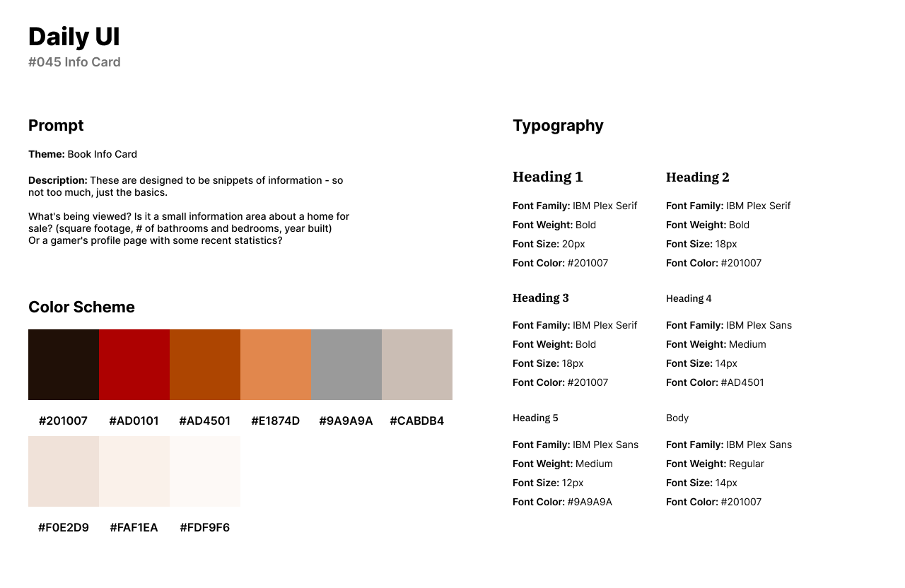
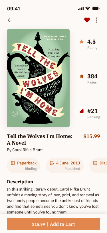
For Daily UI’s forty-fifth challenge, Info Card, I reused the previous book app design from the forty-fourth challenge to design an info card for a book’s product page. The app, Book Keeper helps users find books through their online community and purchase books through their app.
I reused the design’s style of an autumn theme with red and orange colors, as well as the IBM Plex font family. The design of the interface features the book’s cover with ratings, page numbers, and rankings to the right of the cover image. Users can view the physical book’s properties such as the binding, publishing date, and publishing company.
#046 | Invoice
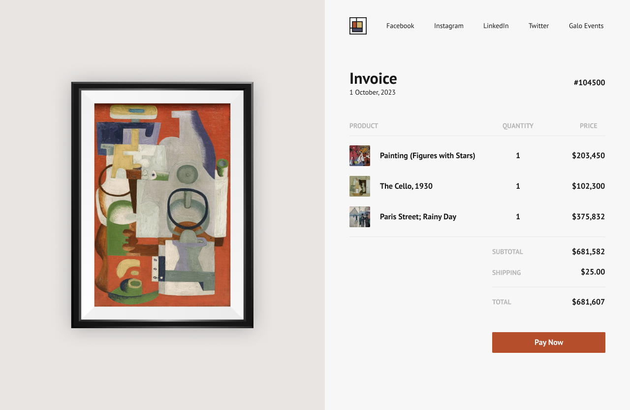
Daily UI’s forty-sixth design challenge is an Invoice UI. I created an art gallery called Galo and designed an artist invoice for a client. The invoice is for art pieces that have been sold from the art gallery.
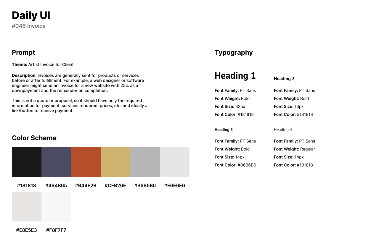
The style of the design uses a dark and beige theme of red, yellow, and blue. For headlines and secondary titles, I used PT Sans. PT Sans is a Sans-Serif font that has sharp curves and stands out in weight from Bold to Regular. I use PT Sans for body text as it is much lighter while maintaining character.
The invoice consists of a placeholder image from the gallery to the left of the form. The form includes the gallery’s logo and social media links. The invoice provides the user or client with the products purchased, quantity, and price. The user can pay for total online through the CTA button, Pay Now.
#047 | Activity Feed
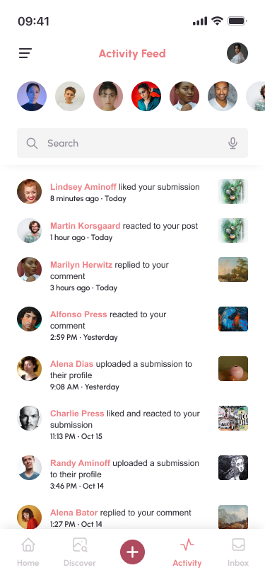
The forty-seventh challenge by Daily UI is an Activity Feed. For this design, I designed an activity feed screen for an art inspiration app. The app features an online community of artists who upload their art to the platform and they can react to each other’s’ work.
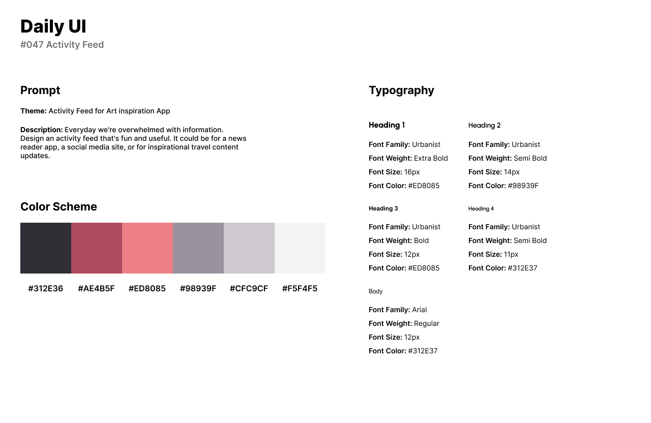
The design style of the app has a pink and red color scheme with a white background. For fonts, I use Urbanist for headlines and secondary titles as a circular Sans-Serif font that doesn’t take away from the app’s content. For body text, I use Arial as a well-rounded pairing for Urbanist.
The Activity Feed feature’s a category of users who have reacted to the user’s content. The feed has the name of the user or artist, their reaction or submission, and the image of the art to the right of the screen.
#048 | Coming Soon
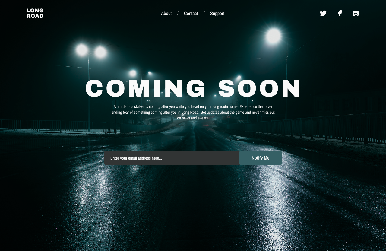
The forty-eighth challenge from Daily UI is a Coming Soon UI. For this challenge, I designed a Coming Soon UI for a horror game called Long Road. The game follows a player on their route home but something is following the player and they have to try to survive.
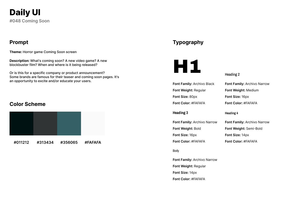
The style of the design uses a dark and stormy image as the background with a color scheme of black and teal pulled from the image. For fonts, I used the Archivo font family as Archivo has a variety of font weights that fit in well with the horror theme of the game.
The UI features the game’s logo in the top left corner with social media links to the very right. In the middle of the top navigation, users can read more about the game, contact the team for questions, and support the start-up company. Users can also enter in their email to be reminded of the game’s release and any updates along the way.
#049 | Notifications
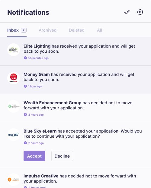
The forty-ninth design challenge by Daily UI is a Notifications UI. For this challenge, I designed a job application website. Users apply to jobs on the website and can check the notifications to see who has viewed their application or accepted their application.
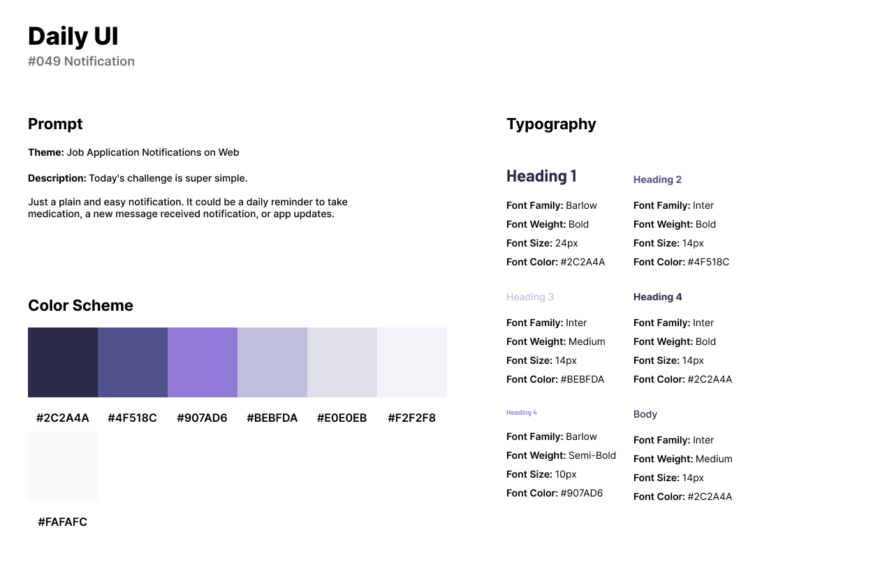
The style of the design has a dark blue and purple color scheme with accents of gray. For fonts, I used Barlow for headlines and titles as a bold Sans-Serif font. For body text and secondary titles, I use Inter as aa clean and readable Sans-Serif font.
The Notifications UI features a menu for an Inbox, Archived, Deleted, and All. The notifications list includes the company the user applied to, the message or action, and the date the notification was received. Companies can also accept an application for the user to move forward.
#050 | Job Listing or Hiring Page
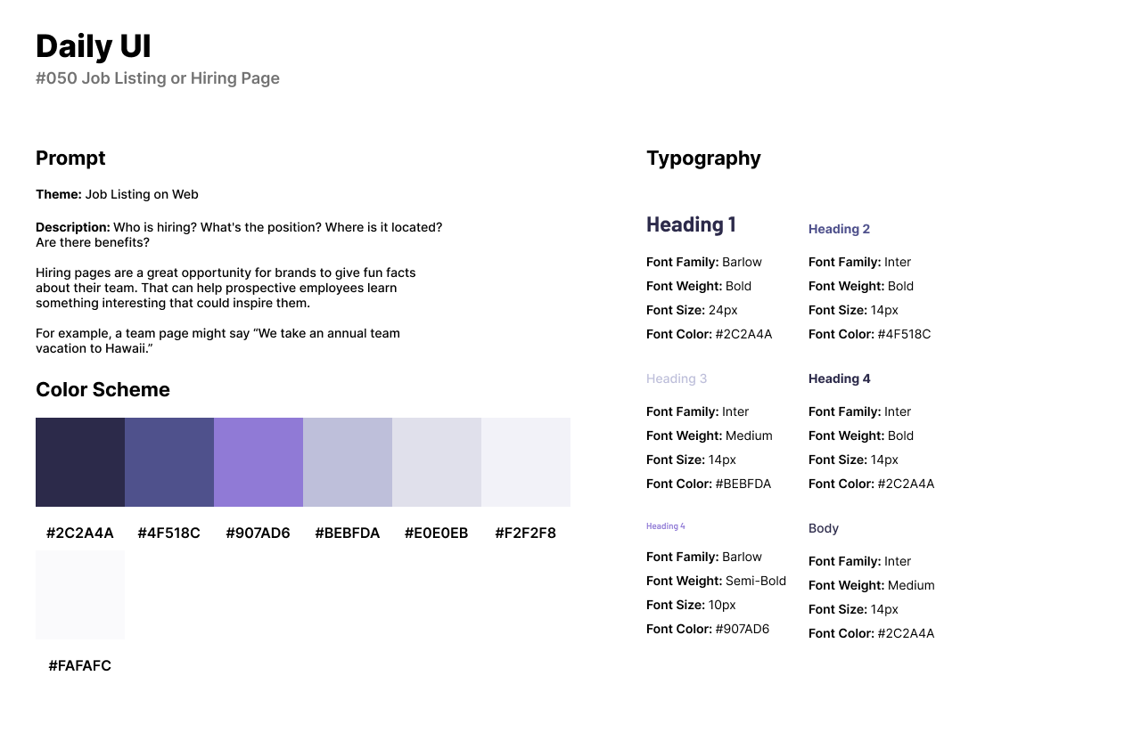
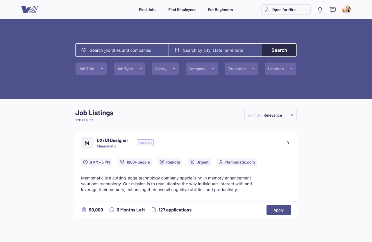
The fiftieth design challenge by Daily UI is a Job Listing or Hiring Page. For this challenge, I reused the style guide from the previous challenge as it is for a Job Application website. The job listing website allows users to search for any job and apply if they meet the requirements.
The Job Listing features a wide search bar where users can search for a job title or company and sort by city or remote. The job listing card has the job title, company name, description and information about the company’s hours, employees, and urgency hiring. In the section where users can click apply, the listing provides the salary, time left until the job will be filled, and the number of applications submitted.
