Daily UI: #031 - #040
#031 | File Upload
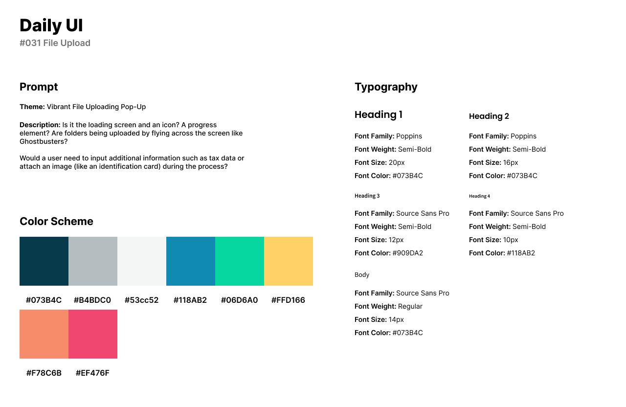
The thirty-first design challenge by Daily UI is a File Upload. For this challenge, I designed a File Upload pop-up for desktop where users can upload files to a specific platform. I did not have any specific platform in mind for the File Upload Design as most systems are relatively similar.
The style of the design has aa variety of colors which are vibrant and energetic. The illustration from Undraw was slightly changed to align with the color palette of the icons in the UI. I used Poppins as a friendly and bubbly font for headlines. Source Sans Pro fit in naturally with Poppins for body text as I wanted a body text that doesn’t take too much away from the style of the Poppins font.
The design includes a wide area for users to drag or drop images, videos, and files into the rectangular box. Underneath the upload box, users can view their files being uploaded to the platform with a loading bar and number of KB.

#032 | Crowdfunding
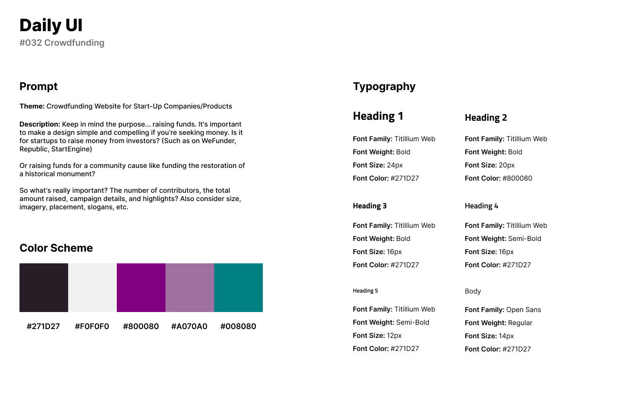
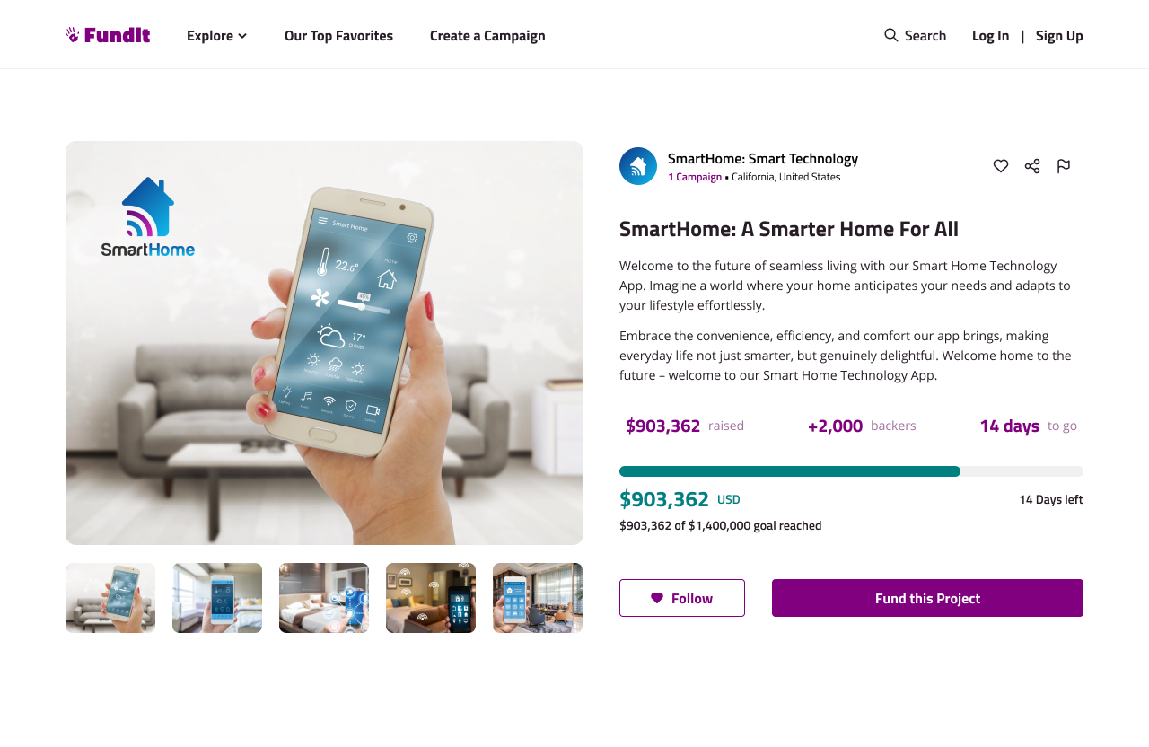
The thirty-second design challenge by Daily UI is a Crowdfunding UI. I designed a Crowdfunding UI for a website called FundIt where users can showcase their company or product and as other users to donate money to build or support their cause.
In the design’s style, I use purple as a calm and friendly primary color with a dark and grey-ish green as an accent. Titillium Web is a curvy Sans-Serif font that I used for headlines. Open Sans pairs well with Titillium Web for being much lighter while still having its own personality.
The Crowdfunding UI for this challenge has placeholder images showcasing the product and a library of images below the main image. Viewers can see the name of the company and how many campaigns they have they started. Viewers can also see the amount of money the campaign has made, the number of backers, and how many days left to contribute to the campaign. Users can also follow the campaign for notifications to see if the campaign reaches their goal.
#033 | Customize Product
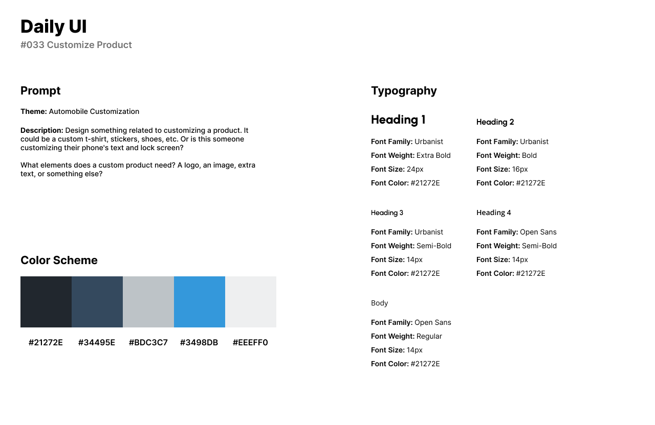
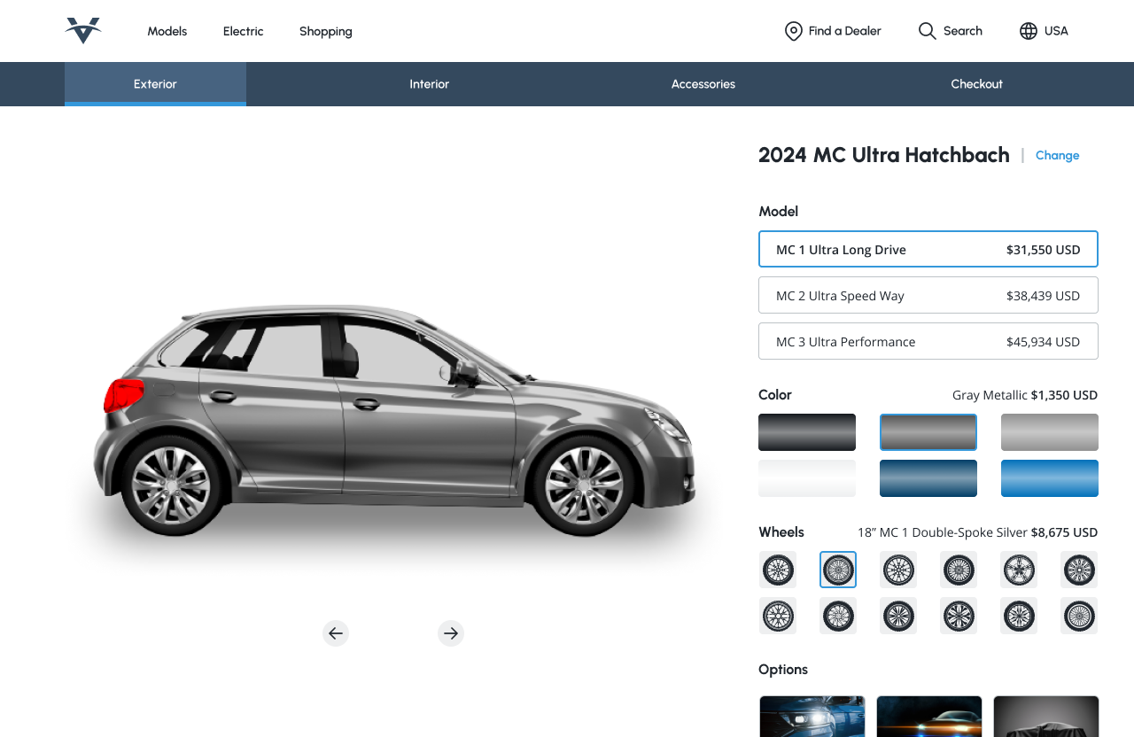
Daily UI’s thirty-third challenge is a Customize Product UI. I designed a product customization UI for an automobile website where users can shop for cars and accessories, and customize the car they wish to purchase.
The style of the product customization UI includes a blue color palette. Navy blue is used as the primary color of the UI while electric blue is used for card selections or as an accent color. I used Urbanist for headlines as it is a sleek and circular Sans-Serif font for trendy designs. I used Open Sans for body text or card titles as it is a readable font when browsing for information.
The design features a horizontal menu for users to customize their car. For the exterior of the car, users can choose the car’s model, customize the color and wheels, and choose different options for lighting. The car’s image takes up most of the page so users can easily view the customization. After customizing the exterior, users can customize the interior, add accessories, and then checkout.
#034 | Automotive Interface
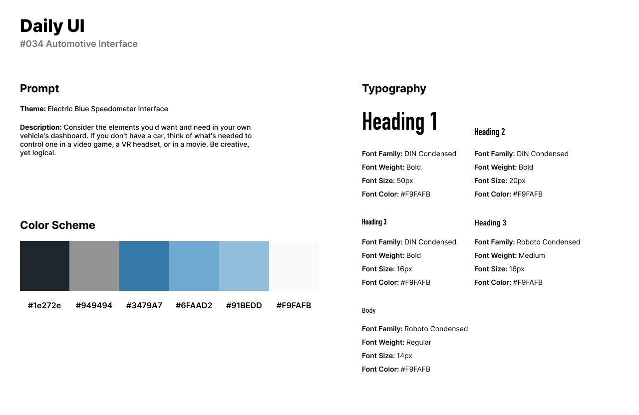
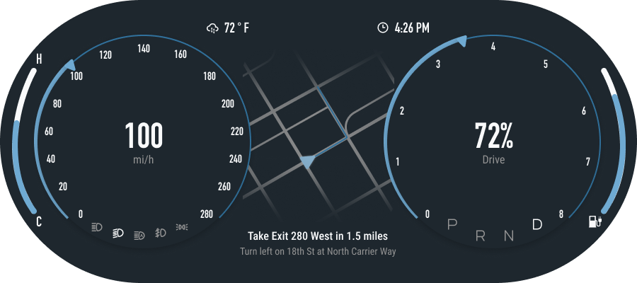
The thirty-fourth challenge by Daily UI is an Automotive Interface. For this design challenge, I created an electric blue speedometer interface. The interface is a digital speedometer for users to view their speed and a GPS location tracker all in one interface.
The style of the design is a dark theme with three shades of a bright blue. I used Din Condensed for headings as it is a bold Sans-Serif font that is readable for numbers. I used Roboto Condensed for body text or the map directions.
The UI consists of the miles per hour with the exterior car lights underneath. In the middle of the interface, users can track their location or directions through a built-in GPS map. The right of the design tracks the user’s fuel tank and features icons for parking and drive.
#035 | Blog Post
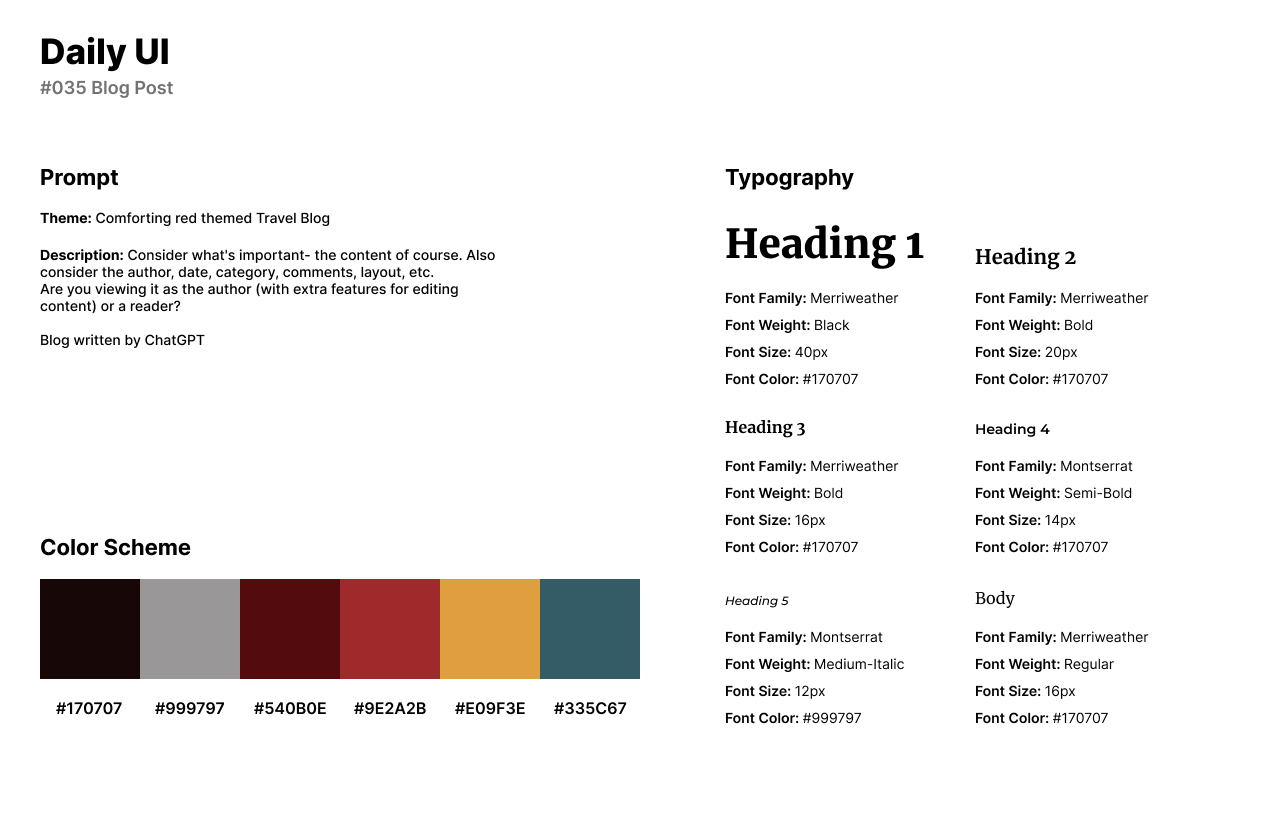
The thirty-fifth design challenge by Daily UI is a Blog Post. For this design, I created a travel blog for a travel company called Intransit. Intransit is a travel agency that helps users find their next travel destinations. The company writes about travelling through their blog and hosts podcasts.
For the design, I used a comforting red color scheme with yellow and blue accents. I use Merriweather for headings and body text as a classy and bold Serif font. Montserrat pairs nicely with Merriweather for secondary titles.
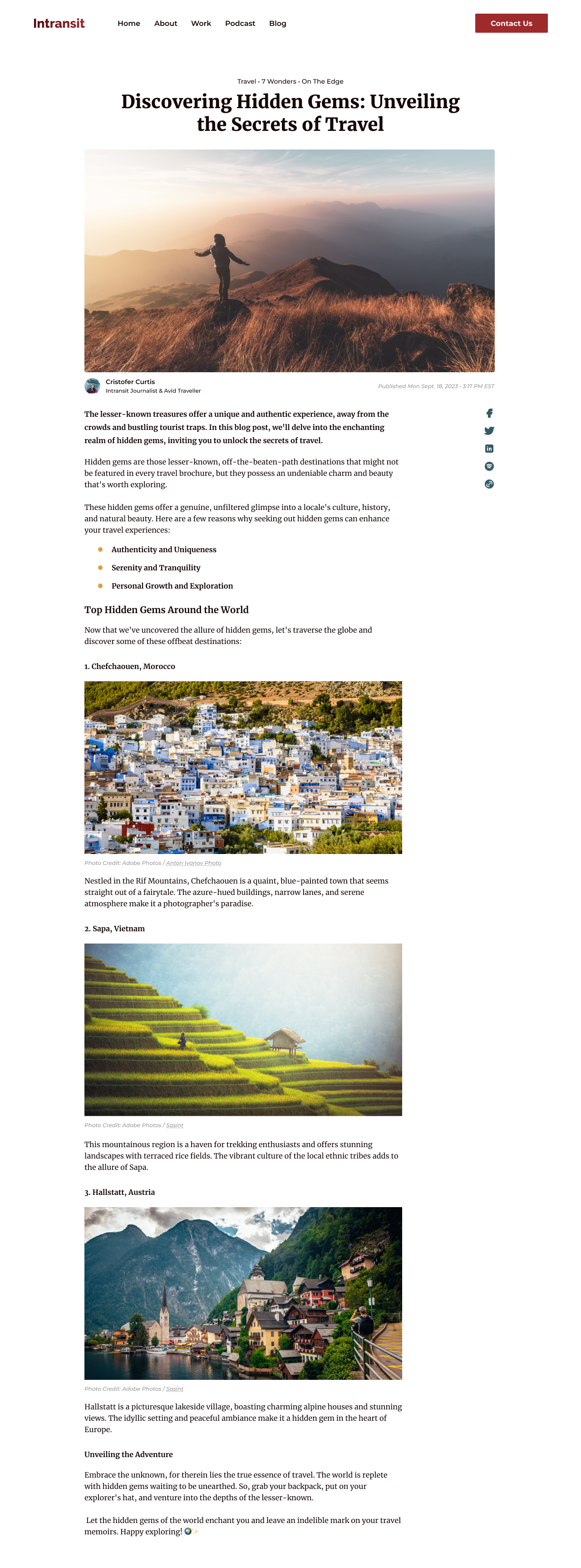
The Blog Post in a desktop format features the title of the post in the middle of the screen with a wide image and the author and publishing date underneath the image. The blog post, written by ChatGPT is about the top hidden gems of the world and is in a list format with images from Adobe Photos. To the right of the post, users can click on the company’s social media icons.
#036 | Special Offer
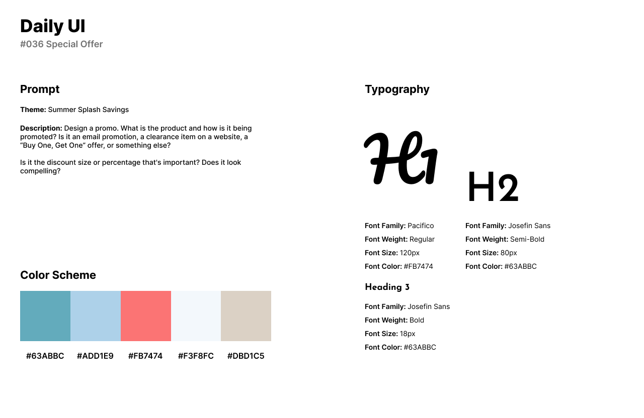
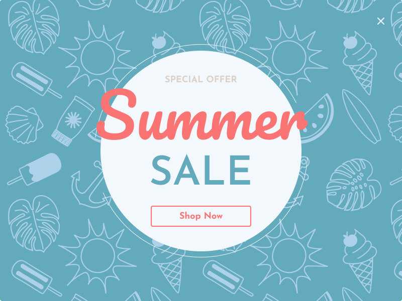
Daily UI’s thirty-sixth design challenge is a Special Offer UI. For this design, I designed a special offer advertisement for the theme of Summer Splash Savings. The design is a nautical summer theme for a retail company.
The style of the design uses the cursive Serif font, Pacifico for the title Summer. Josefin Sans is used for smaller text and secondary headlines. A nautical and beachy color palette is used in the design with a coral color for text and blues and beige to represent the beach.
The Special Offer design uses an illustration from Adobe Photos as the background. The main focus of the design is the word, Summer in a bright coral color. The CTA action button in the bright coral color asks users to Shop Now for the company’s special offer or summer sale.
#037 | Weather Design
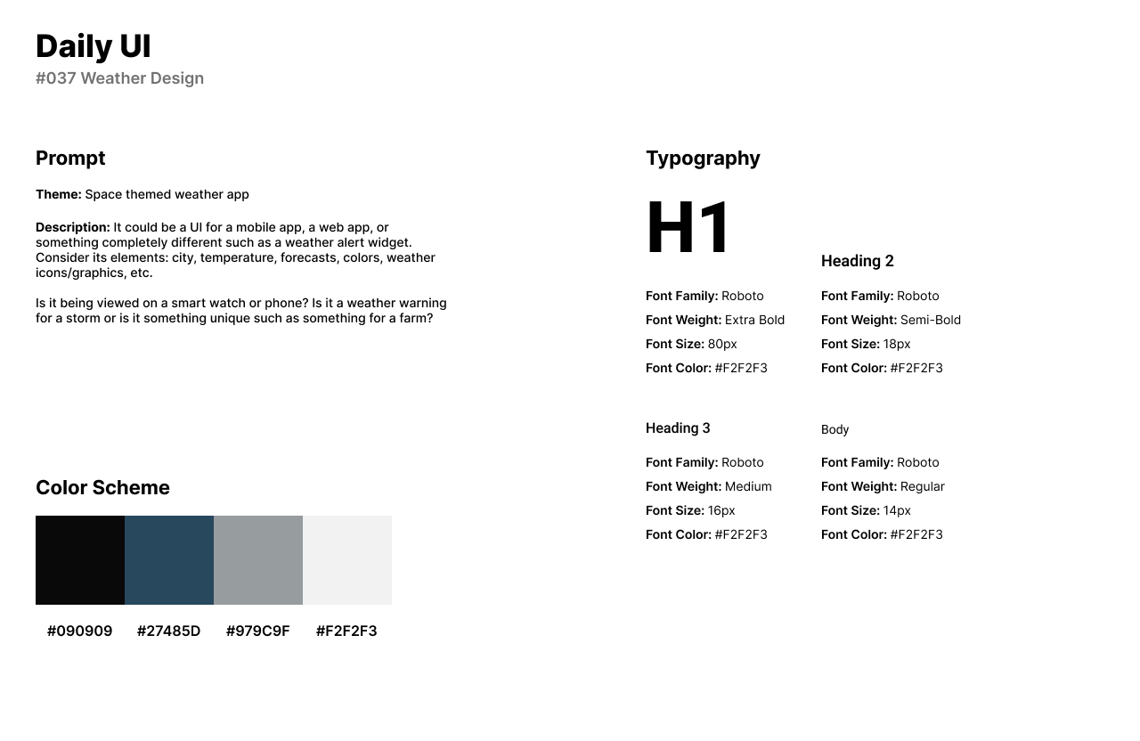
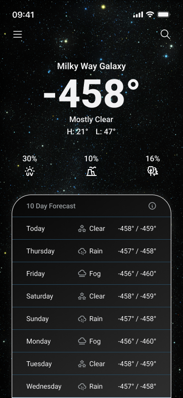
The thirty-seventh challenge from Daily UI is a Weather Design UI. For the theme of this challenge, I designed a weather app for weather in space. Users or astronauts can use to weather app to view the weather forecast from space or earth.
The design’s style uses a dark theme of black and blue with white and gray for text. The background of the UI uses an image or the user’s location in space. I used Roboto for headlines and body text as Roboto pairs well with the astronomical landscape and is readable for numbers.
The UI features an extensive 10 day forecast that provides the user with the temperature in Fahrenheit with the low and high temperatures for the day. The main focus of the UI is the current temperature with statistics for UV, Pollution, and Pollen provided underneath the current temperature.
#038 | Calendar
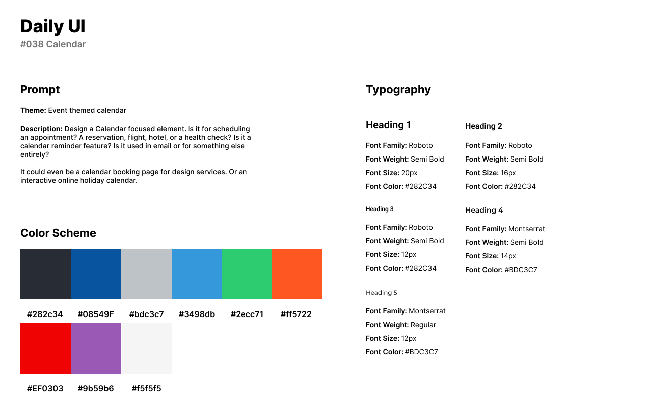
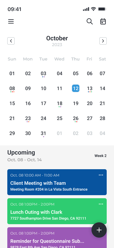
The thirty-eighth challenge by Daily UI is a Calendar UI. For the theme of this challenge, I designed an event themed calendar UI that focuses on work and personal events. The app tracks upcoming events and color-codes categories for different events.
The style of the design uses a variety of color with blue as the primary color. Users can change the color of categories with green, orange, red, and purple. For headlines, I used Roboto specifically in the calendar UI for the numbers. I used Montserrat for secondary titles in the event cards for the date and time.
The UI features the calendar in the top half of the app’s layout. Users can view their upcoming events below the calendar and view the time of the event, date, and location. In the bottom right corner of the UI, users can tap the plus icon to create a new event or category.
#039 | Testimonial
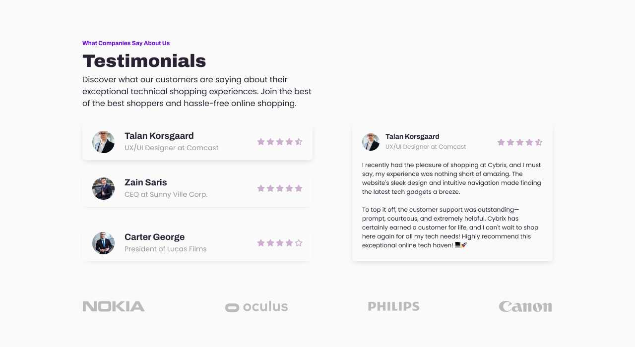
Daily UI’s thirty-ninth challenge is a Testimonial design. For the theme of this challenge, I created an online technology retail website called Cybrix. The Testimonial design is about the review’s customers have left on the website and features their testimonial.
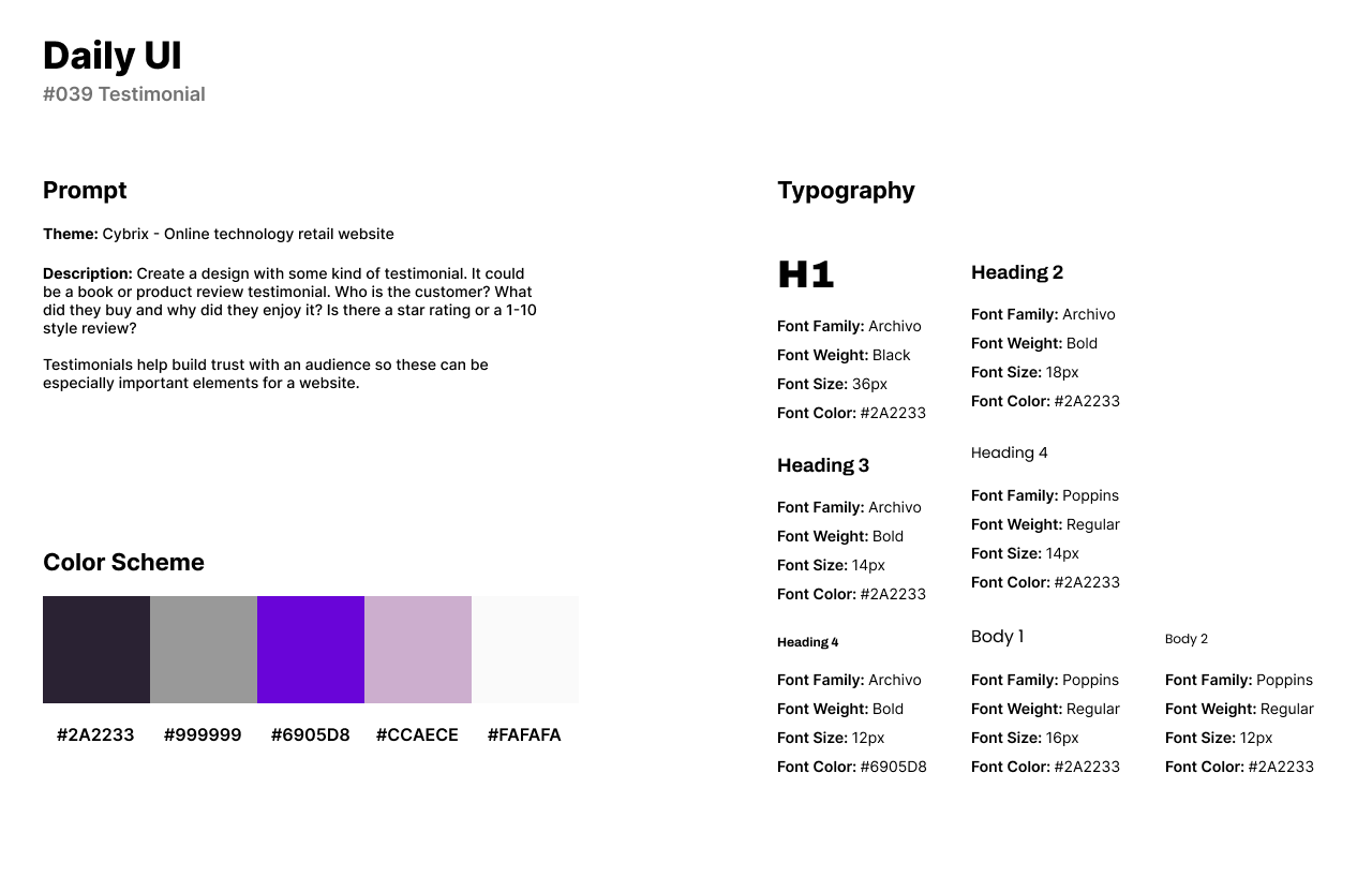
The style of the design consists of a purple color palette with a neon purple and lighter lavender purple. For headlines, I used Archivo as a bold and wide Sans-Serif font. For body text and secondary titles, I used Poppins as a friendlier font for readability that pairs well with Archivo.
The design features three testimonials which can be viewed by clicking on each card. The featured testimonial is an expanded version of each card where the viewer can read about their experience.
#040 | Recipe or Food Order
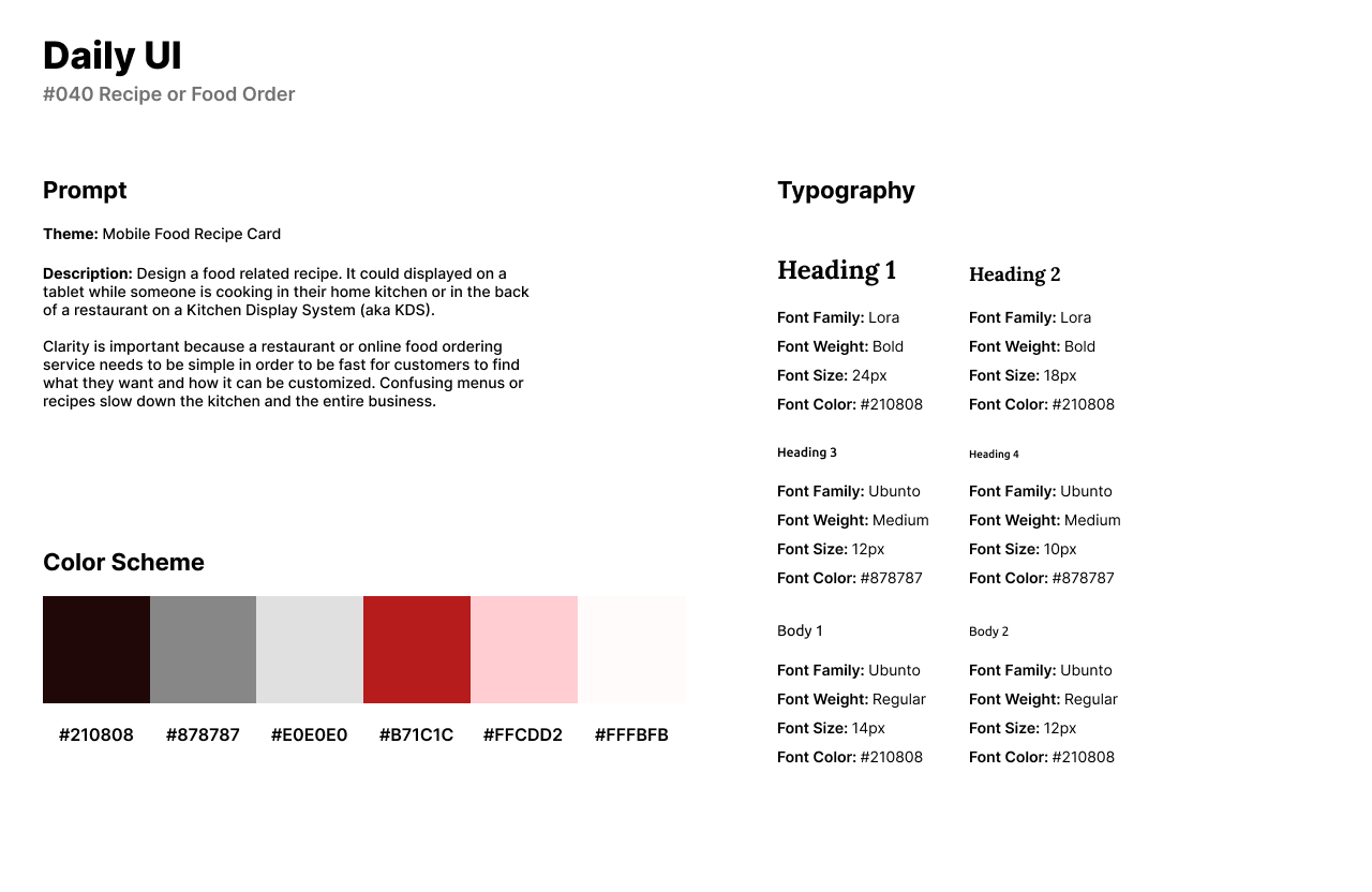
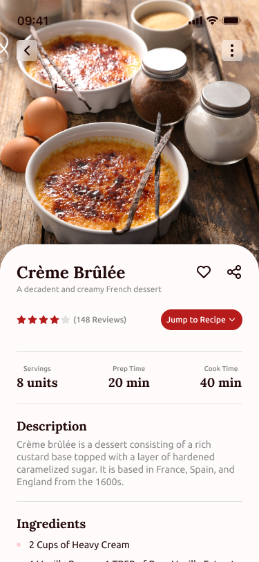
The fortieth design challenge by Daily UI is a Recipe or Food Order UI. The theme of this challenge is a Mobile Food Recipe Card or a food app. Users can use this app to find recipes with ingredients and instructions to make the dish.
The style of the UI uses a red color scheme as red is highly portrayed in food or restaurants and it pairs well with the classiness of the app. For fonts, I use Lora for a Serif font that is used in headlines or titles. I use Ubuntu for body text as an accessible Sans-Serif font.
The recipe card features an image of the recipe in the top third of the app screen. The bottom two-thirds of the screen features an option to share or heart the recipe. The card provides the number of servings, prep time, and cook time. A description is provided for background information or history into the dish or recipe. Finally, users can browse the ingredients and directions to make the recipe themselves.
