Daily UI: #011 - #020
#011 | Flash Message
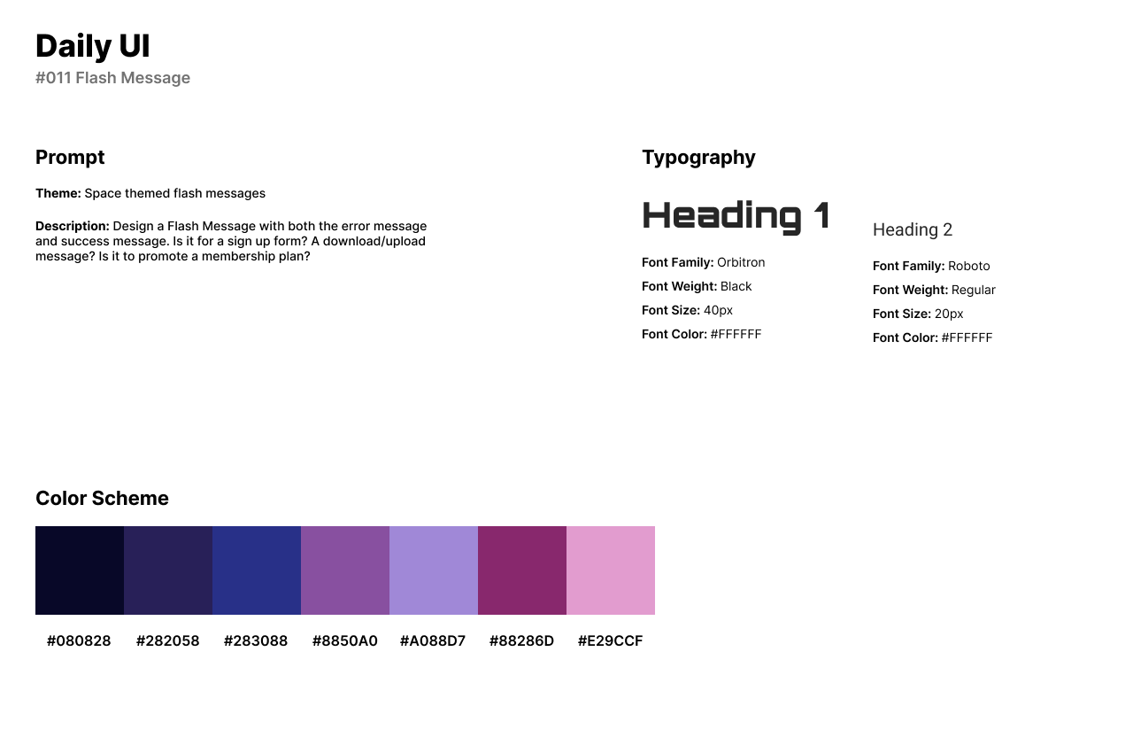
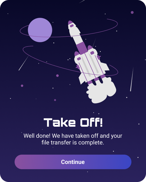
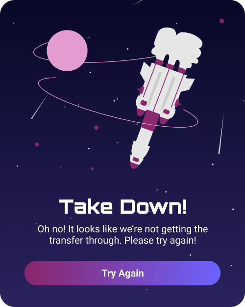
The eleventh challenge from Daily UI is to design a Flash Message. A flash message is a pop-up that appears when the user has successfully or incorrectly completed something. For this design, I created a space themed flash message.
The flash message’s theme of space consists of a rocket taking off or taking down, if failing. The style of the designs uses dark blues and purples, gradients, and rocket illustrations from Undraw. For fonts, I used Orbitron as a futuristic styled space font and Roboto for body text.
The Success flash message’s scene is a rocket taking off into space. The CTA button asks the user to continue forward. The Error flash message’s scene is a rocket travelling down, for failure. The CTA button asks the user to try again. The color scheme of the Error message changes to a purple-red color scheme to represent an error.
#012 | E-Commerce
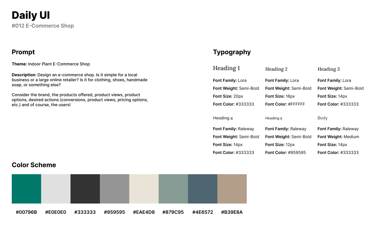
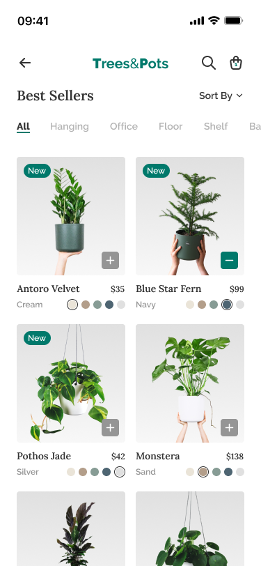
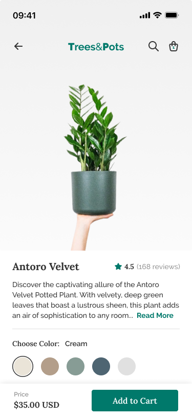
Daily UI’s twelfth challenge is to design an E-Commerce Shop UI. For the theme of this design, I designed an E-Commerce shop for an indoor plant store, Trees&Pots. The shop sells indoor potted plants for any type of room indoors.
The style of the design consists of a muted color scheme with greens and grays with browns and a muted blue for the color of the pots. Serif and Sans-Serif fonts were used in the design’s UI for elegance and modernism. The serif font, Lora is used for headlines and titles, while Raleway is used for smaller titles and body text.
The first screen of the design features the website’s best sellers of potted plants. Each card features an option to add the plant to their cart, title and price of the item, and an option to change the color of the potted plant.
When a user taps on an item from the first screen, they will be directed to the second screen. The second screen is a more detailed view of a specific item. Users can read a description about the potted plant and view reviews given by previous purchasers.
#013 | Direct Messaging
For Daily UI’s thirteenth challenge, Direct Messaging, I chose to design a Direct-Messaging App for text messaging and voice calling. The theme of this design is a modern approach on a basic messaging platform.
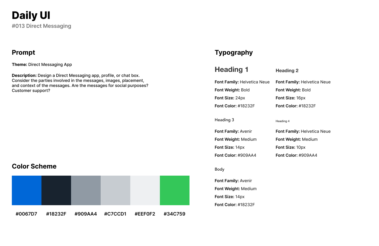
For the style of the UI, I used a vibrant blue as the main color of choice, blue-grays for backgrounds and input fields, and a vibrant green for users statuses. Because messaging apps need to be accessible and minimal for a modern approach, Sans-Serif fonts were the right choice to use for the design. Helvetica Neue is a perfect font for accessibility and headlines, while Avenir is clean and easy to read as body text.
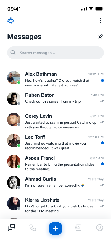
The first screen of the design, or home screen shows the conversations between two users. The blue dot indicates a new or unread message, while the gray double-checks indicate the message has been opened by the user.
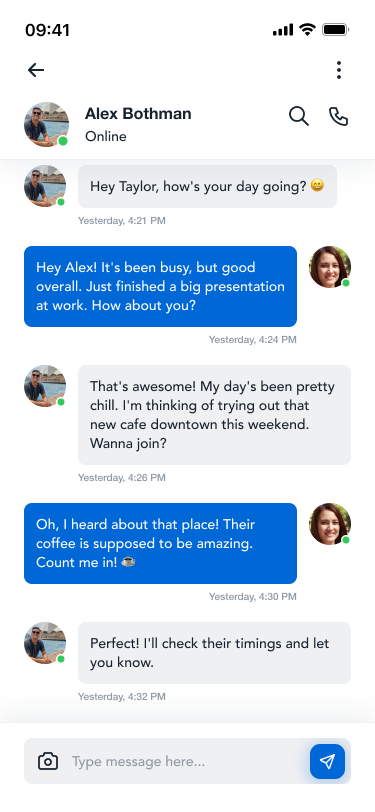
When the user taps on a conversation, they are taken to the second screen to view the full conversation and can message the user from this screen. Users can choose to message the other user or call them. The navigation bar features screens for: Conversations, Phone Calls, New Message, Contact List, and User Profile.
#014 | Countdown
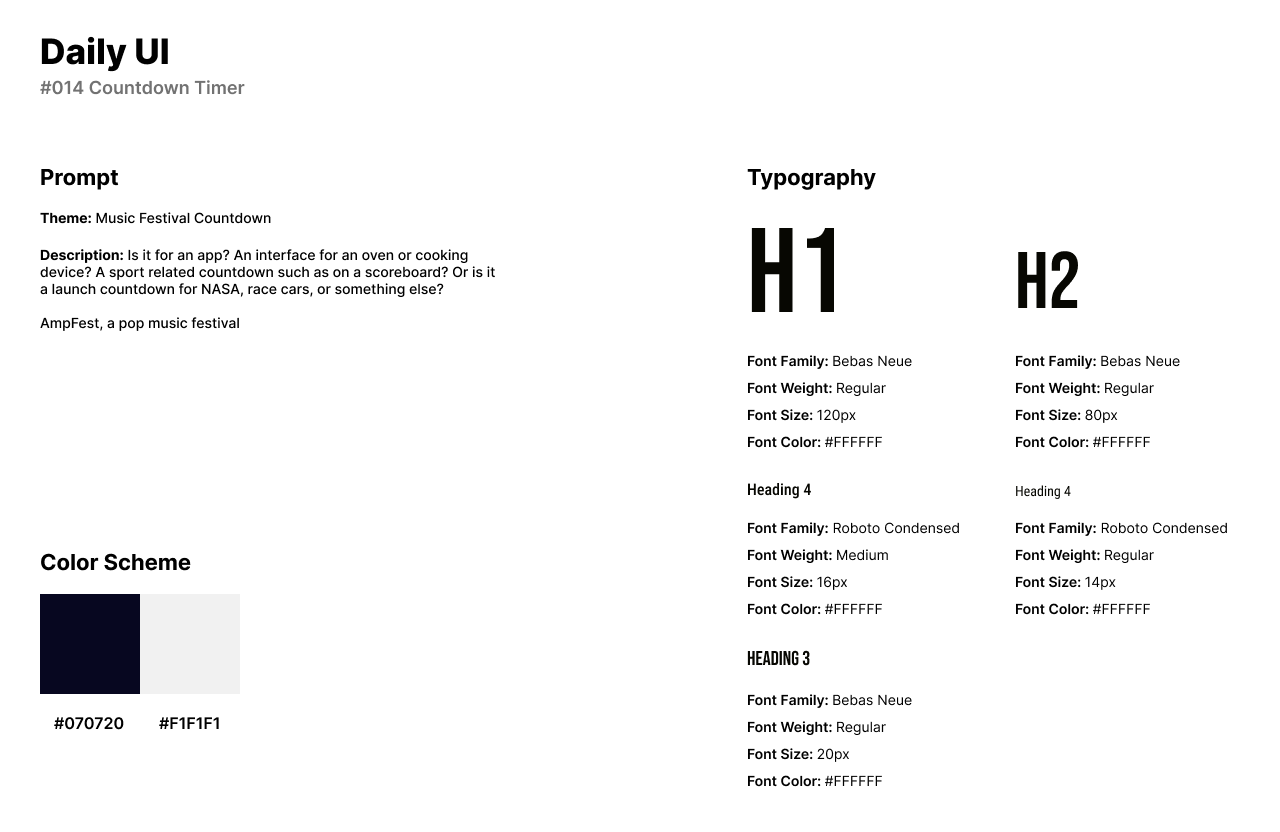
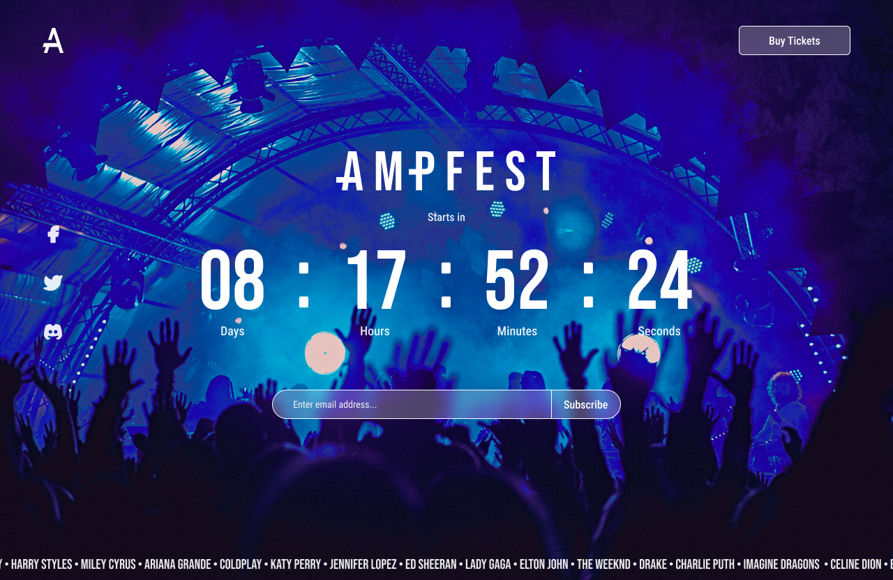
The fourteenth challenge by Daily UI is to design a Countdown Timer. For the theme of this design, I chose to design a countdown timer for a music festival called AmpFest. AmpFest is a music festival for pop music lovers and headlines popular main stream music artists.
The style of the design uses white and black for a color scheme because the background image is the main source of color. Bebas Neue made for a perfect Sans-Serif font in all caps for headlines, while Roboto Condensed is used for body text, or the input field for users to enter an email address.
The Countdown timer can be seen in the UI as a countdown for the festival’s start date. The icon of the festival is in the top left of the website with social media icons underneath. The top right of the website allows users to purchase tickets to the festival. The input field allows users to enter in their email and receive information about the festival.
View Link Here. Images are from Adobe Photos.
#015 | On/Off Switch
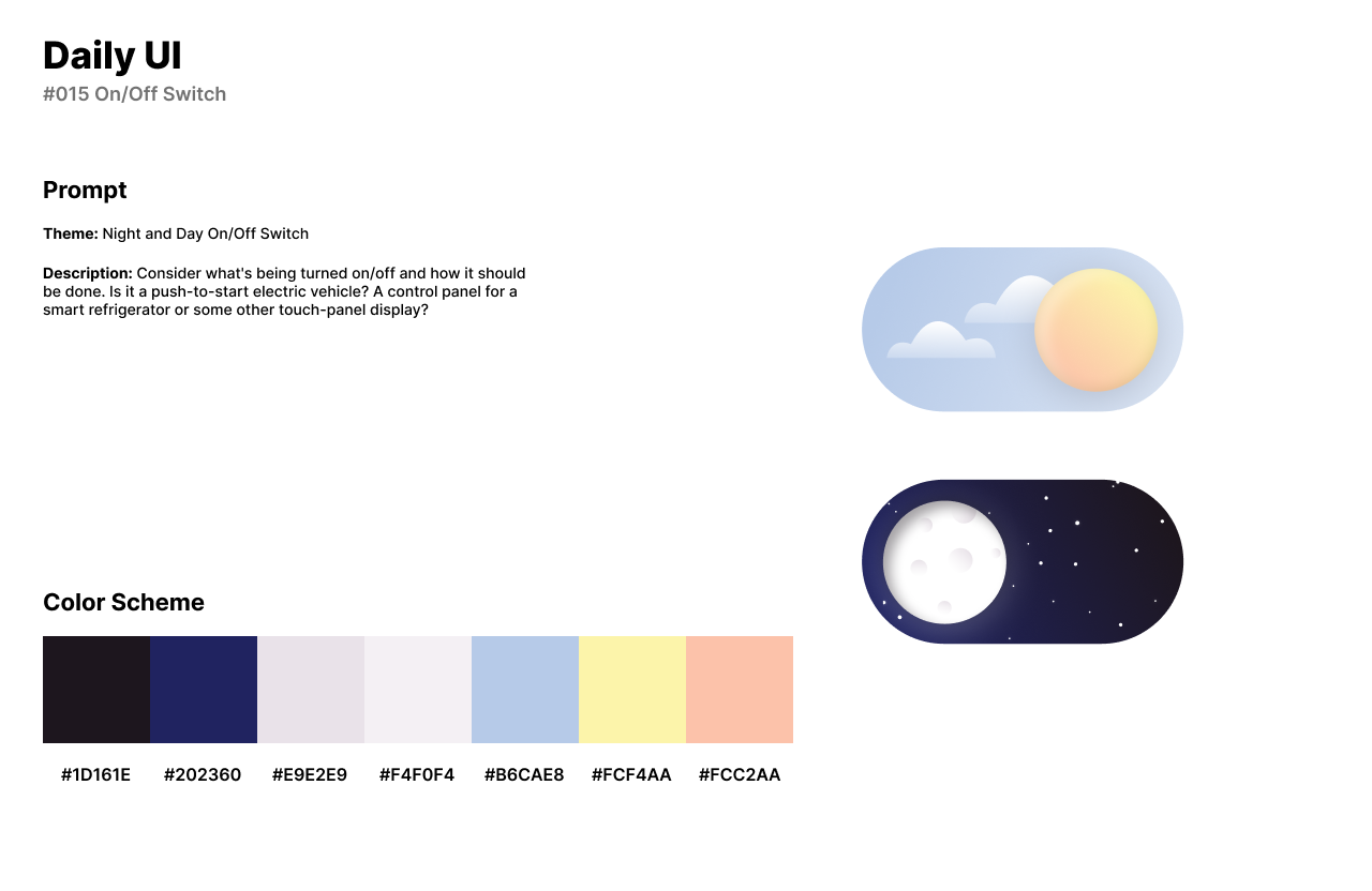
Daily UI’s fifteenth challenge is to design an On/Off Switch. For the theme of this design, I designed a switch for a Night and Day On/Off Switch.
The design style of the switch uses a dark blue and black for nighttime and bright pastels of blue, orange, and yellow for daytime. Fonts were not used or needed in this design.
When the user plays the prototype for the design, the user starts on the Off switch which is a starry night and a moon as the button. As the user taps on the moon, the sun rises up and clouds appear in place of the stars. The sky goes from a blue and black gradient to a light blue and white gradient.
#016 | Pop-Up
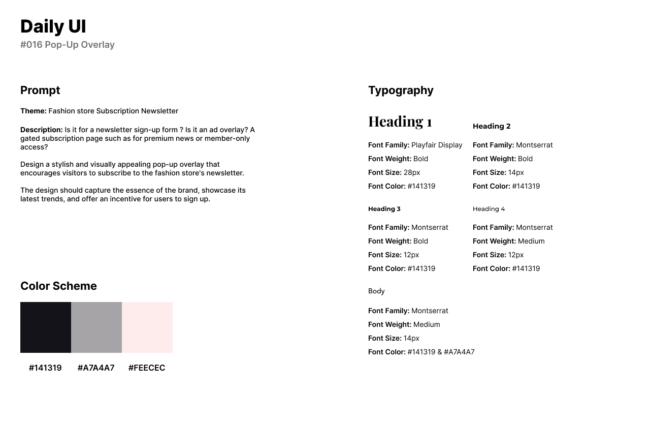
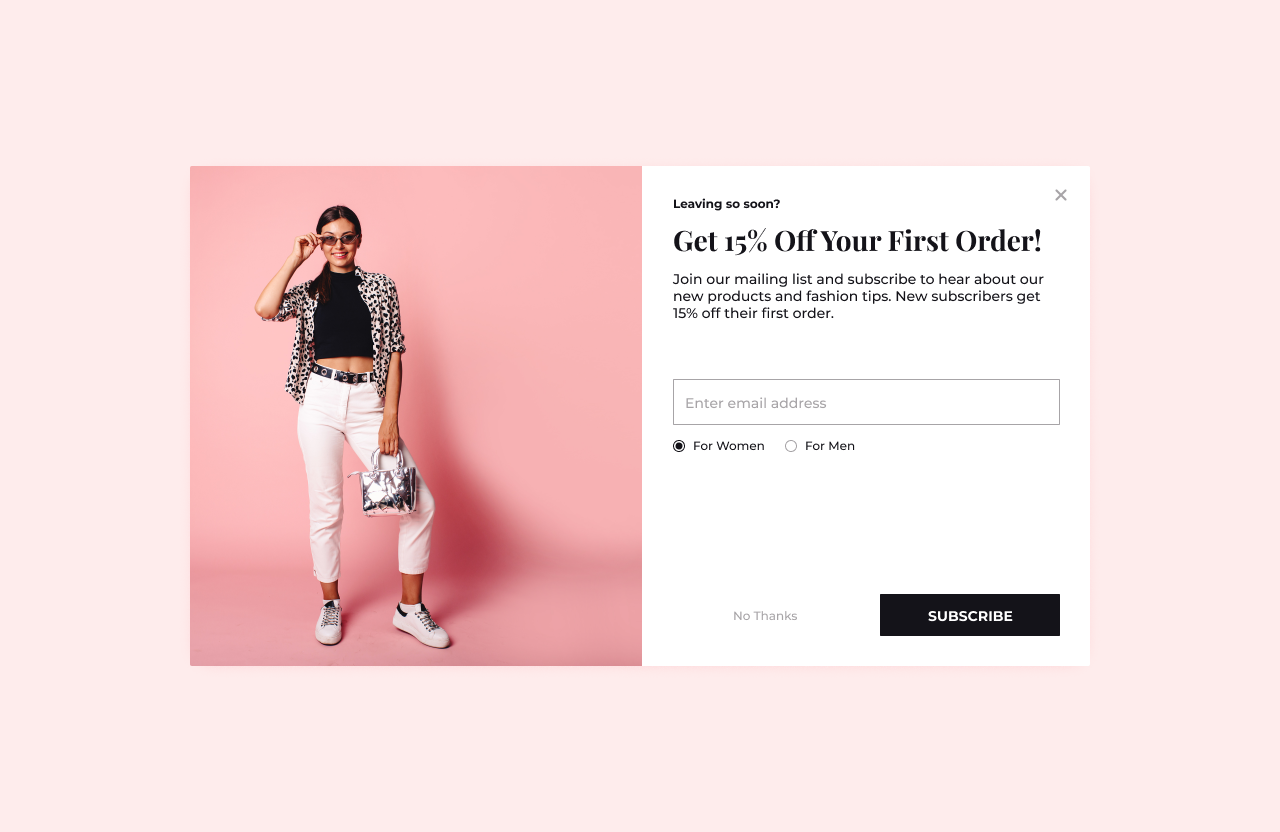
The sixteenth challenge by daily UI is to design a Pop-Up Overlay. For the theme of this design, I chose to design a pop-up overlay for a fashion store’s newsletter. The theme of the design is trendy and vibrant with a pink and black color scheme.
The style of the design uses an off-black for text and CTA’s and a light pink used in the background, although not officially part of the actual design. For fonts, I used Playfair Display as it is an elegant font for fashion and designer brands. Montserrat is used for smaller headlines or titles, body text, and input fields.
The design features a catchy headline to get the user to sign up for the newsletter by offering them 15% off their first order. The user can then add their email to the input field, and then click Subscribe. To the left of the form is a bright and pink background with a model posing in fashion clothing and accessories.
View Link Here. Images are from Adobe Photos.
#017 | Purchase Receipt
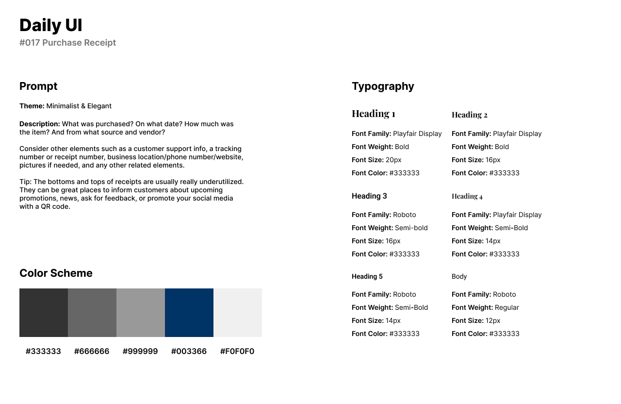
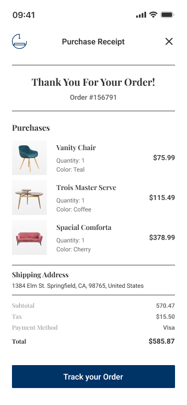
For Daily UI’s seventeenth challenge, Purchase Receipt, I chose to design a receipt for a furniture store order. The theme of the receipt and furniture store template is a modern yet elegant style.
For the design, I designed a digital purchase receipt that includes muted blacks and grays with a navy blue and off white. To match the theme of elegancy and modernism, I reused the Serif font Playfair Display for headlines and titles. I used Roboto for secondary titles and body text.
The design consists of the furniture store’s logo in the top left corner of the mobile screen from Adobe Photos. The user can view their order number with the items they’ve purchased, as well as the price, quantity, and color. The shipping address of the user can also be seen near the bottom underneath the purchases. Above the CTA button, Track your Order, the subtotal, tax, and final total can be seen in the receipt design.
#018 | Analytics
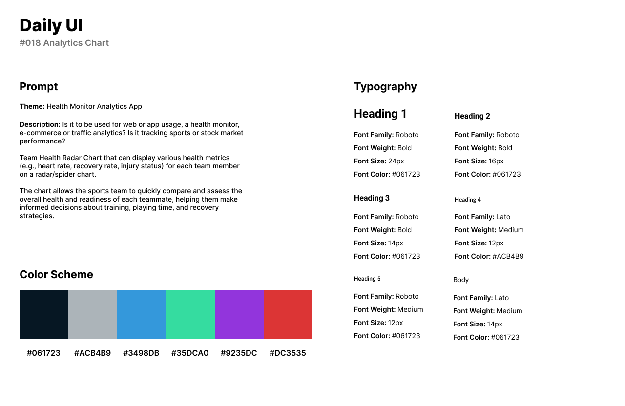
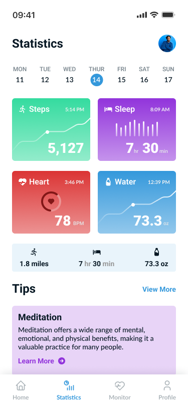
Daily UI’s eighteenth design challenge is an Analytics Chart. For the theme of the analytics design, I chose to design a health monitor analytics app. The app manages users steps, sleep schedule, heart monitor, and water intake.
For the style of the design, I used a colorful and 2D style of design. I used a vibrant blue, green, purple, and red with a dark blue and gray color for text. I used Roboto for headlines and Lato for secondary titles and body text.
The design consists of the Statistics screen with a week to date for the user’s data. The user can view their steps taken on a specific day. The user can see how much time they had slept the previous night. The app can also track the user’s heart monitor, one of the key features of the app. Finally, the user can also track their daily water intake.
Underneath the statistics, the app gives the users suggested tips to help benefit their progress. If the user had a low water intake, the app would give the user tips to keep up with their daily water intake.
#019 | Leaderboard
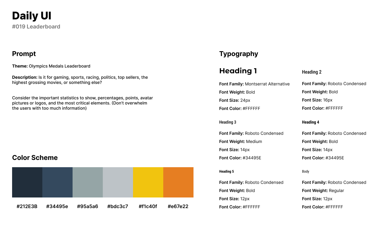
The nineteenth challenge by Daily UI is a Leaderboard UI. For the theme of this design, I chose to create a leaderboard for Olympic medals ranked for every country. The leaderboard screen can is in an Olympics app where users can get the schedule, medals earned, news, and learn information about each sport and country.
The style of the design uses muted navy blues and grayish blues for the overall theme with rusty yellow and orange for the medal icons. Montserrat Alternative is a funky font which I used for the headline, Olympic Medals. Roboto Condensed is a Sans-Serif font used for smaller headlines and titles.
The design of the Leaderboard UI consists of each country’s ranking based on the amount of medals the athletes have earned in the Olympics. The medal icons are from Adobe Photos and the flags are from a Figma Flag plug-in.

#020 | Location Tracker
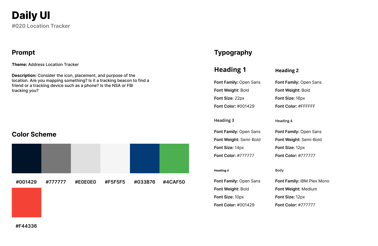
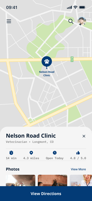
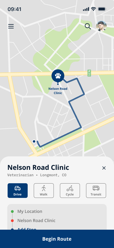
For the twentieth Daily UI challenge, I was tasked to design a Location Tracker UI. I created an app that allows users to map out specific locations and use a GPS tracker to get from one location to another.
The style of the design uses navy blue and a dark gray with green and red for the map instructions. I used Open Sans for headlines and secondary titles with IBM Plex Mono for body text and secondary titles.
The first screen is of the location and includes the hours, length in miles and time, and reviews. Below the business’s information, users can tap on photos taken by other users or the business owner to view the outside/inside of the business’s interior/exterior.
