Daily UI: #021 - #030
#021 | Home Monitoring Dashboard
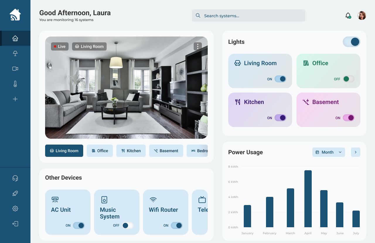
Daily UI’s twenty-first challenge is a Home Monitoring Dashboard UI. For this challenge, I designed a Home Monitoring Dashboard that monitors security cameras, power usage, and devices throughout the user’s home.
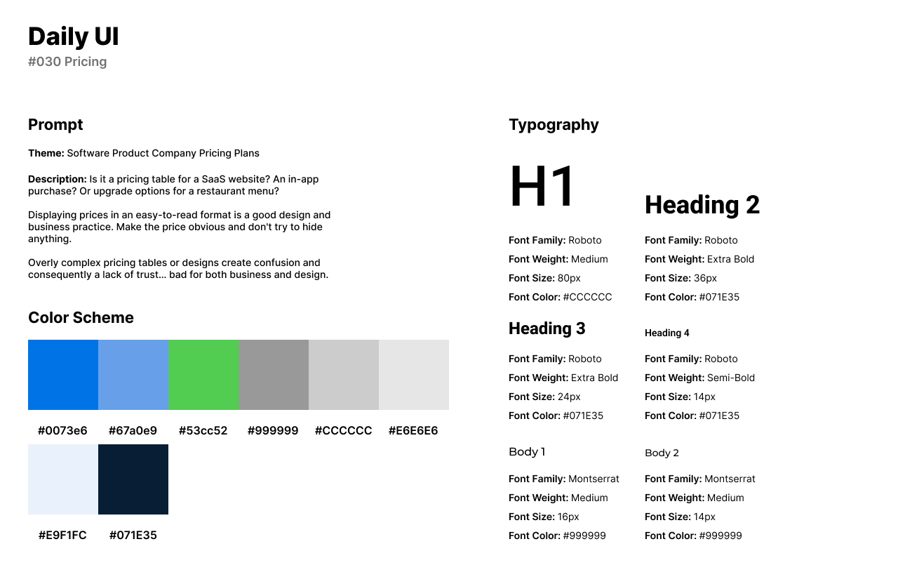
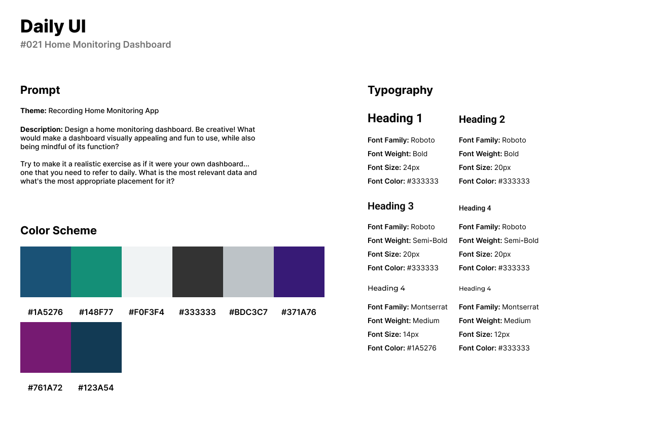
The style of the design consists of vibrant purples and muted blues. The style of the graph elements are 2D with gradient informational cards. Roboto is used for headlines and titles, while Montserrat is used for secondary titles and body text.
The home screen of the Home Monitoring System’s UI is a desktop software where users can monitor their security cameras throughout their property. In the side navigation bar, users can access the home dashboard, technology devices and lights, camera footage or feed, and their thermostat.
The Home Dashboard features an overview of the security camera feed from their living room, to their bedrooms. Users can view other devices connected to the system such as the AC Unit, Music System, Wi-Fi Router, and televisions. Users can turn their lights on or off through the software and view power usage statistics for the current month.
#022 | Search
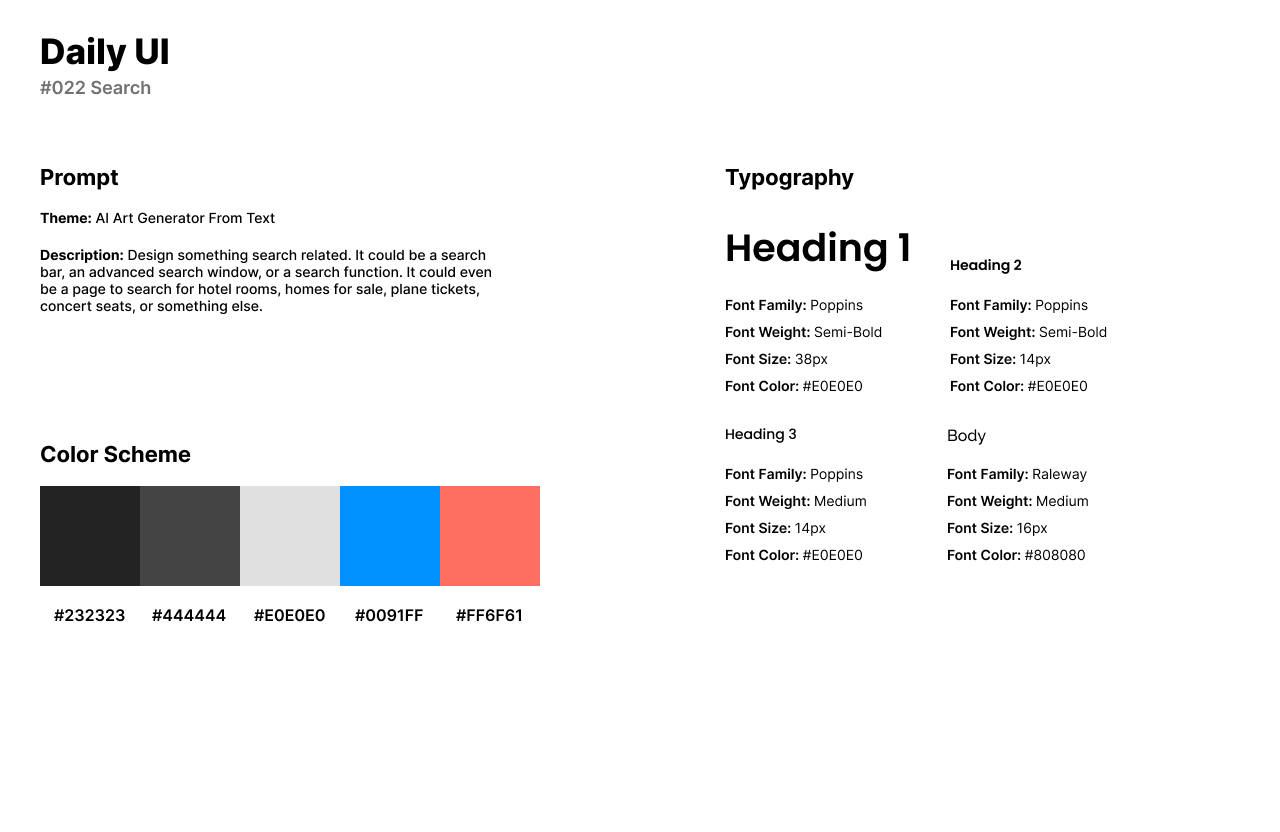
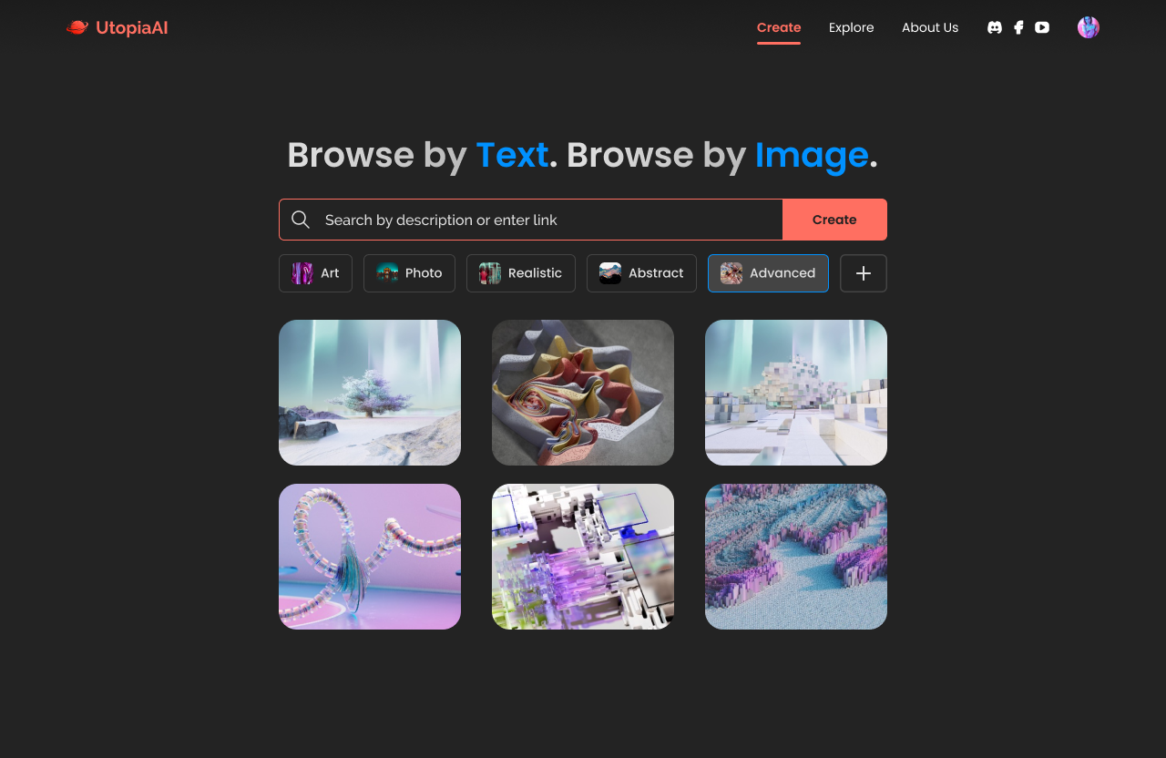
Daily UI’s twenty-second challenge is to design a Search UI. For this design, I designed a search bar for an AI Art Generator from text. The Search bar is the main component because it is heavily needed to generate art.
The style of the UI uses a vibrant blue and orange over a dark themed desktop. Gradients of white and gray are used for headlines with blue and orange used in text as well. Poppins is used for headlines and titles, while Raleway is used for body text.
The AI Art Generator UI consists of a wide search bar as the main component with categories for art style underneath the search bar. In the navigation bar, users can create their own AI art, explore what other users have created, and learn more about the company.
#023 | Onboarding
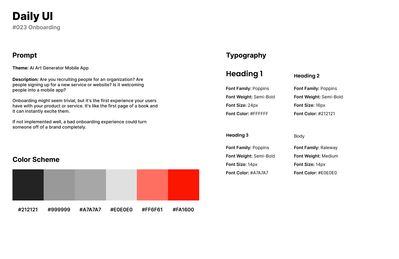
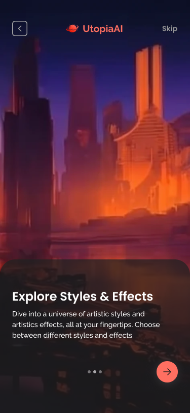
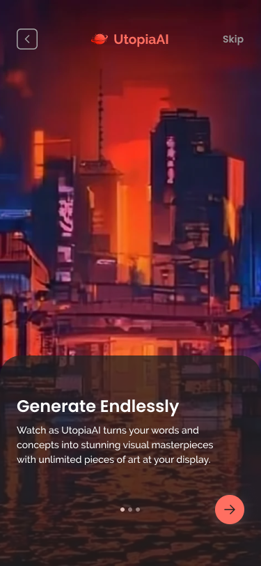
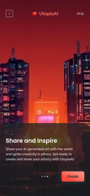
For Daily UI’s twenty-third challenge, I reused the theme of my last design’s AI Art Generator for the Onboarding UI. However, instead of reusing an onboarding screen for a desktop application or website, I designed onboarding screens for a mobile app.
The style of the design reuses the color scheme with a vibrant blue and orange from the previous Daily UI challenge. Poppins is used for headlines, while Raleway is used for CTA buttons and body text.
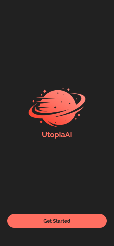
The first screen of the UI has the company’s logo and a CTA to start the application. The three onboarding screens provide tips for the user and show the AI art they can create within their platform.
#024 | Boarding Pass
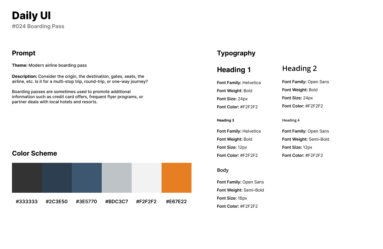
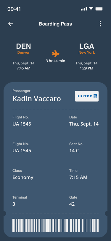
Daily UI’s twenty-fourth challenge is to design a Boarding Pass. For this design’s theme, I designed an airline boarding pass with a dark theme and accessible information for the user to view if they are not familiar with boarding pass designs.
The style of the UI uses navy blue for the background with accents of orange and off-white for titles and body text. Helvetica and Open Sans are used for headlines and secondary titles while Open Sans is used again for body text.
The Boarding Pass UI includes the two airports with the arrival and departure dates. The UI provides the user’s name, flight and seat number, seat class, and the gate and terminal. The pass can be easily scanned by the airport staff through the barcode at the bottom of the boarding pass UI.
#025 | TV App
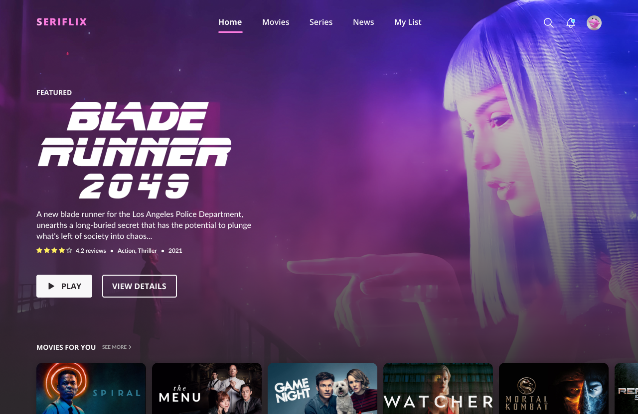
The twenty-fifth challenge by Daily UI is a TV App. For the theme of this challenge, I designed a Movie and TV streaming service called Seriflix. The app streams movies and TV shows to users to view all in one platform.
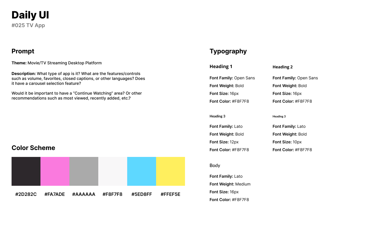
The style of the design consists of a neon pink, blue, and yellow. The inspiration of the design is from Cartoon Network’s color palette which uses vibrant neon colors with a black background. For headlines, I chose Open Sans as a Sans-Serif font for readability and accessibility on a desktop or television platform. For secondary titles and body text, I chose Lato as another readable font when viewing a screen from afar.
The UI consist of a top navigation bar where users can browse movies, tv shows, news, and view their list of saved movies or tv shows. A placement image appears on the screen in place of the background with the content’s description, rating, and reviews. Underneath the main screen, users can browse suggested movies the platform automatically recommends for them.
#026 | Subscribe
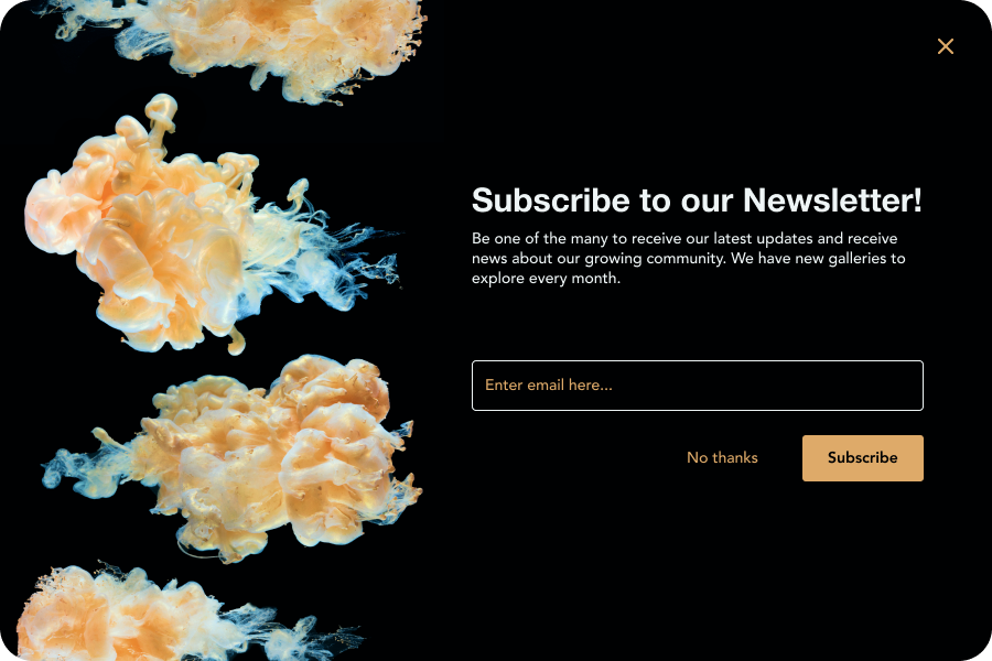
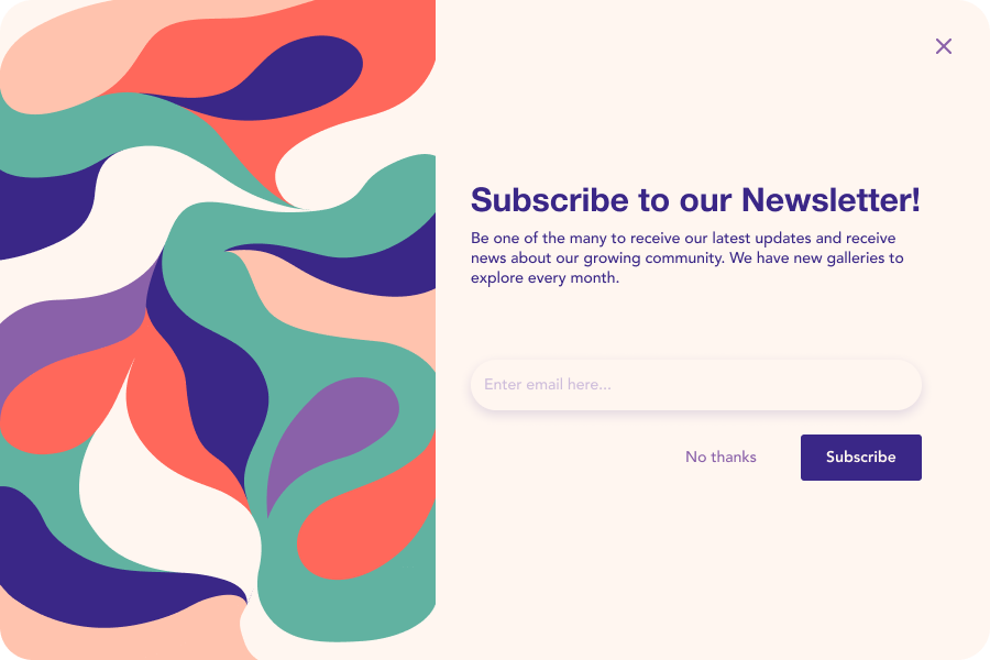
Daily UI’s twenty-sixth UI challenge is a Subscribe Design. For the theme of the challenge, I designed modern and minimalist newsletter subscriptions. I integrated images and illustrations into two different design styles while maintaining the same layout.
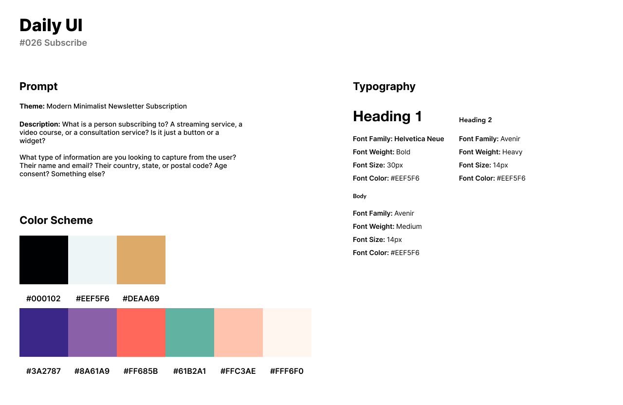
The first design consists of a gold and black color palette. The second design uses a wide range of colors from purple, blue, red, green, and beige. For headlines, I chose Helvetica Neue and Avenir for body text.
The first design has a golden jelly fish image to the left with the input field and description to the right. The second design’s illustration is an abstract swirl. The input field is lifted through a drop-shadow while the first design uses a heavy white stroke.
#027 | Dropdown
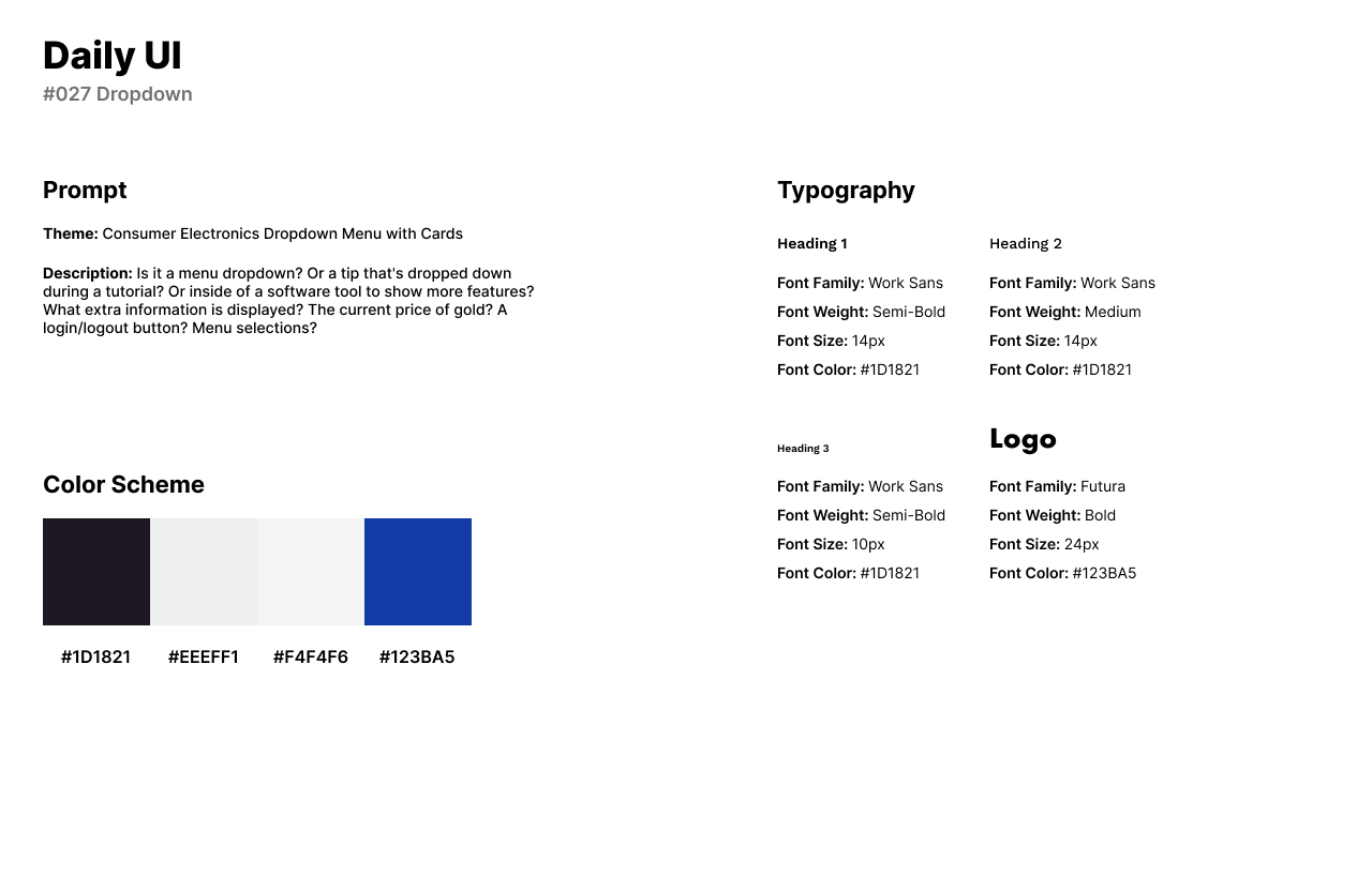
Daily UI’s twenty-seventh design challenge is to design a Dropdown UI. For this design, I wanted to design something more unique than a dropdown menu with links. I created a company called Elexis that sells consumer electronics, similar to Best Buy. I decided to show case products by designing a dropdown menu that has images with titles underneath.
The style of the design uses a dark blue, black, and off-whites. Technology is typically seen through a blue or green lens so I chose to portray the consumer electronics company with a blue color scheme. For fonts, I used Work Sans for headlines. Body text was not needed for this design, although Work Sans would fit in perfectly as a body text if needed. For the logo’s font, I used Futura for the technological feel of the design.
The design provides the user with a navigation bar to shop for products. Under the Shop link, users can browse all types of technology from smartphones to refrigerators. Users can also speak to customer support quite easily and view their shopping cart in the top right of the website.

#028 | Contact Page
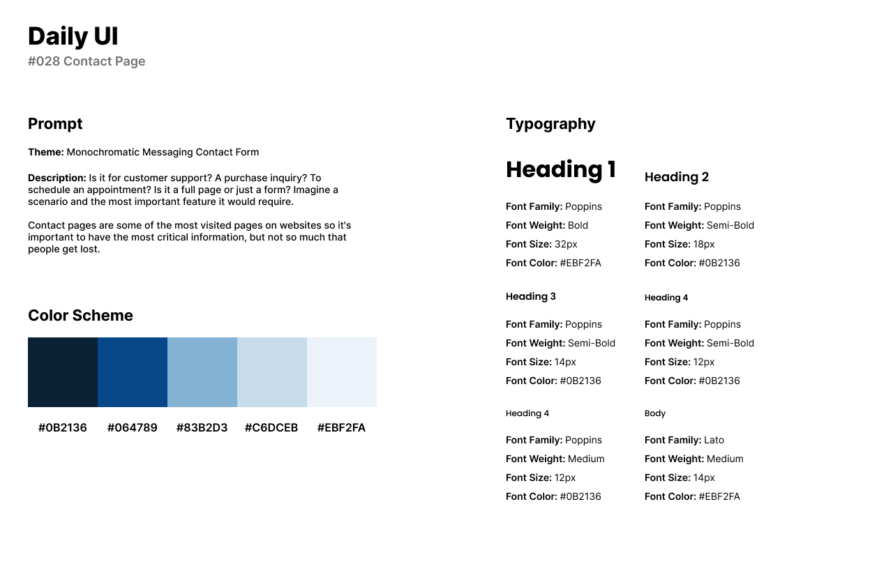
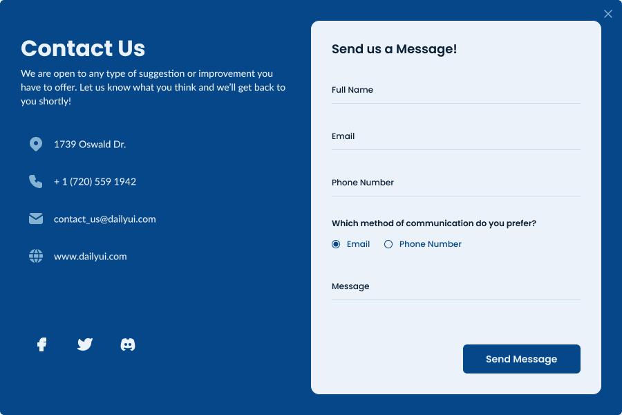
The twenty-eighth design challenge by Daily UI is a Contact Page. For the theme of this design, I chose to design a monochromatic messaging contact form for Daily UI. The contact form can be used for any business when a user has a question that has not been answered on their website.
The style of the design uses different shades of blue. For headlines and secondary titles, I used Poppins with Lato being used for body text. The design consists of a form and information provided for the user.
The form asks the user for their name, email, phone number, and an option to choose their communication method. The user can leave a message or ask a question in the bottom of the form before sending the message.
#029 | Map Design
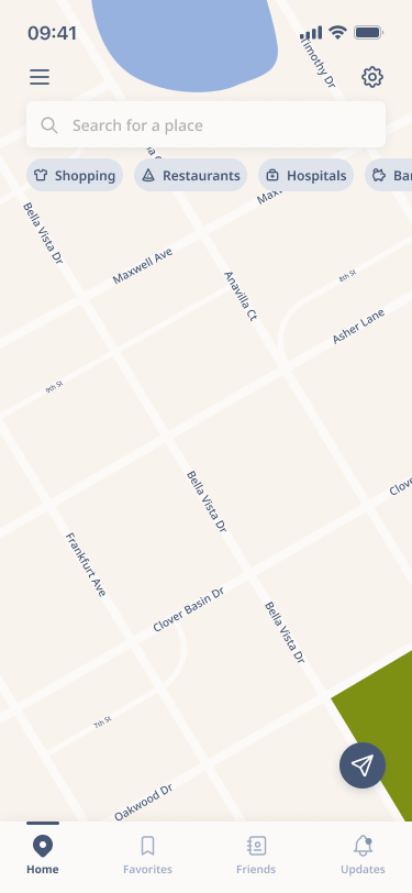
The twenty-ninth design challenge by Daily UI is a Map Design. I designed a GPS Mobile App, similar to the Location Tracker UI. The GPS Mobile app is similar to that of Google Maps or Apple’s Maps app.
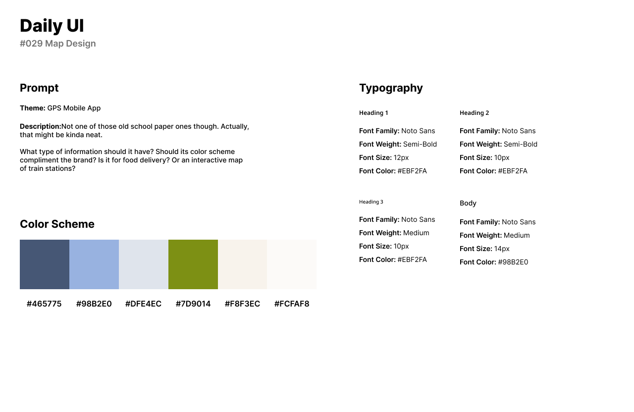
The map UI’s style uses a muted navy blue as the main color choice with other muted color tones as well for the map design. I used Noto Sans for headlines and secondary titles. Noto Sans is also used as body text in the search bar.
I created the map in Illustrator with vector shapes for lakes and grass, and lines for the roads. I imported the map into Figma to place street names using Noto Sans. Users can browse for a location in the search bar or view their friend’s locations and favorite locations.
#030 | Pricing
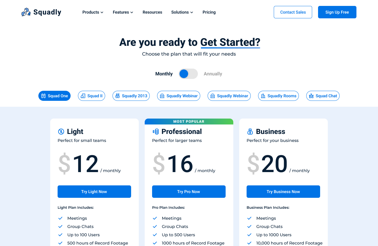
Daily UI’s thirtieth design challenge is to design a Pricing UI. For this challenge, I designed a Pricing Plan for an SaaS company’s pricing plan called Squadly. The pricing page features three different pricing plans to choose from, which is something that is very common in many software services.
The style of the design uses an energetic blue as the primary color with a blue and green gradient for visual effects. I used Roboto for headlines and secondary titles as Roboto is a futuristic font that looks visually appealing for software service websites. Montserrat pairs naturally with Roboto as a friendly font which I used for body text.
The design features Squadly’s logo in the top left corner with an illustration from Adobe Photos. Users can browse through the company’s products, features, resources, solutions, and pricing. The Pricing Plan page allows users to choose payment plans monthly or annually. Users can select different software to purchase through the CTA buttons below the payment options. The three pricing plans consist of cheaper plans to more expensive plans: Light, Professional, and Business.
